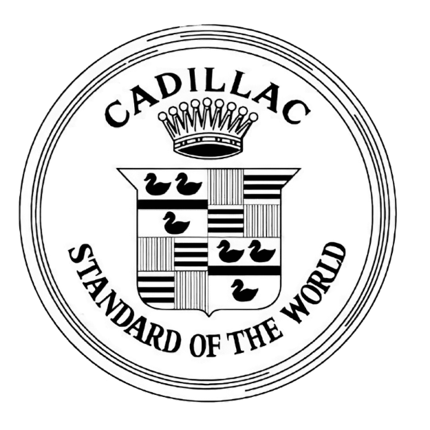
Cadillac Logo
Download JPG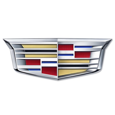
Advertisement
Cadillac, often referred to as the "Standard of the World," is an iconic American luxury automobile brand known for its rich history, innovation, and timeless elegance. Founded in 1902, Cadillac has consistently set the benchmark for automotive excellence. The brand's commitment to cutting-edge technology and exquisite design has made it a symbol of prestige and sophistication.Cadillac's legacy is punctuated by groundbreaking achievements, including the introduction of electric self-starting engines, the V8 engine, and innovations like automatic transmission. These milestones have solidified its position as an industry leader.Today, Cadillac continues to redefine luxury with a modern lineup that combines performance and style. With a focus on bold design, advanced safety features, and an unwavering dedication to craftsmanship, Cadillac vehicles offer a driving experience like no other.For those who appreciate the finer things in life, Cadillac represents an aspirational choice, embodying the spirit of American ingenuity and luxury, making each drive an unforgettable experience.
Meaning and History
-

1902-1905
-
1905-1906
-
1906-1908
-
1908-1914
-
1915-1920
-
1925-1932
-
1932-1939
-
1939-1942
-
1942-1947
-
1963-1980
-
1980-2000
-
2000-2009
-
2009-2014
-
2014-Now


Advertisement
-
1902 - 1905
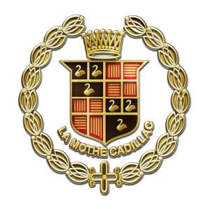
In 1902, the Cadillac logo debuted with a classic and simplistic design that encapsulated the essence of luxury and precision. The iconic crest featured a stylized rendering of the coat of arms of Antoine Laumet de La Mothe, sieur de Cadillac, the French explorer for whom the brand was named. Placed within a circular border, the logo portrayed a merlette, a mythical bird often associated with nobility, perched atop a shield. The shield itself bore a portrayal of the Cadillac family's ancestral arms. This vintage emblem epitomized the brand's commitment to heritage, elegance, and a distinguished automotive legacy, setting the stage for Cadillac's enduring prominence.
-
1905 - 1906
In 1905, the Cadillac logo evolved into an elaborate crest. The iconic crest remained round and bore a distinctive coat of arms associated with the Cadillac brand's namesake, Antoine Laumet de La Mothe. On the shield stands the mythical Merlette, a symbol of nobility and prestige. The shield itself is adorned with the ancestral arms of the Cadillac family, exuding an air of heritage and tradition.
-
1906 - 1908
In 1906, the Cadillac logo underwent subtle refinement, maintaining its circular emblem adorned with the aristocratic symbolism associated with Antoine Laumet de La Mothe, sieur de Cadillac. The mythical merlette and shield persisted, representing nobility and heritage. However, this iteration introduced a cleaner and more polished design, emphasizing the brand's commitment to precision and elegance. The iconic crest became a visual hallmark, embodying Cadillac's dedication to automotive excellence with a touch of refined luxury.
-
1908 - 1914
In 1908, the Cadillac logo retained the round crest, a design that continued to pay tribute to Antoine Laume de La Motte, Count of Cadillac, and his noble lineage. Notably, additional detailing was introduced during this period, replacing the ornate wreath surround with a simple, rounded, circular border, adding a touch of generosity and sophistication.
-
1915 - 1920
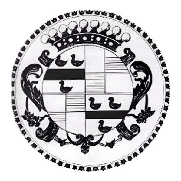
For 1915, the Cadillac emblem was redesigned, a change from the round emblem of previous years. The new design featured a distinctive and bold crest, with leaf-like decorations added around the circular pattern, and black swan squares still spread across it, exuding a sense of nobility and heritage.
-
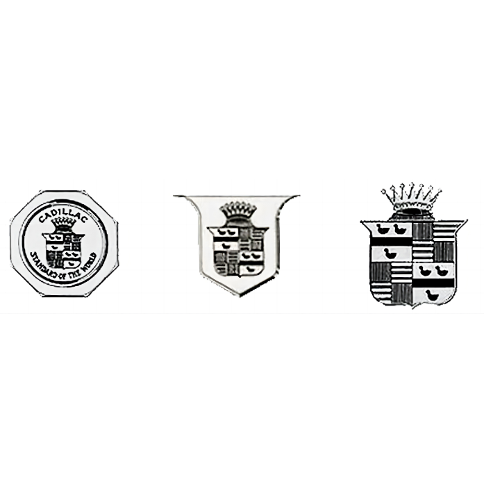
1925 - 1932
The logo for this time period went through three changes, the first being designed in the shape of an octagonal seal with the word Cadillac written at the bottom, which was then redesigned into an emblem style encircled by a shield shaped border with the letters removed, and the third change was to remove the border outright, leaving just the shield emblem in the centre.
-
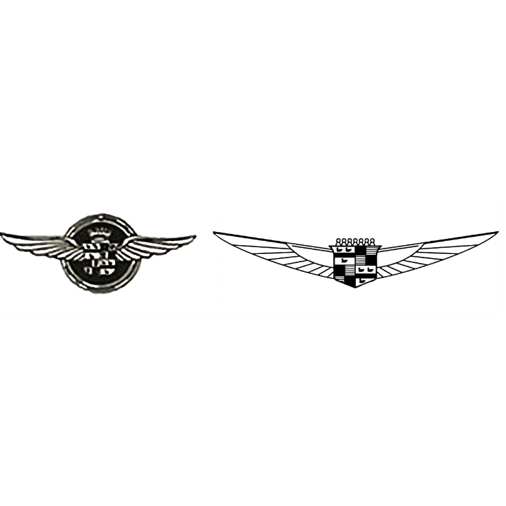
1932 - 1939
In 1932, the Cadillac logo was reconstructed again, breaking the original rules by changing the shield-shaped logo itself into a circle with a pair of wings sprouting out of the middle of the circle to signify the new change, and future changes built on this by showing the complex composition in simpler lines, which made the original crown at the top of the logo surprisingly look a little like a chess piece when it was represented by a line.
-
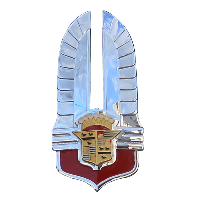
1939 - 1942
In 1939, on the new generation of the Cadillac emblem, the wing element that had been used in the previous two generations was removed, leaving the shield element that had been used in the beginning and extended down from the sides to form a sharp triangle, and the crown element, which had been simplified previously, was re-decorated to depict a more aristocratic look with an overall appearance of gold interspersed with red blocks of colour.
-
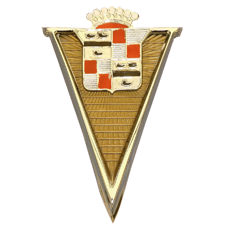
1942 - 1947
Time came in 1942 and more changes were made to the Cadillac logo, the previous triangle was removed and the shield portion was retained, this time extended upwards with two silver rectangles resembling wings and the bottom of the shield was re-added with a reddish outline that complemented the silver colour of the entire logo.
-
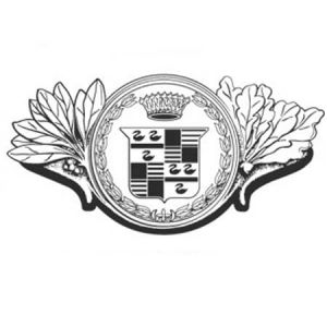
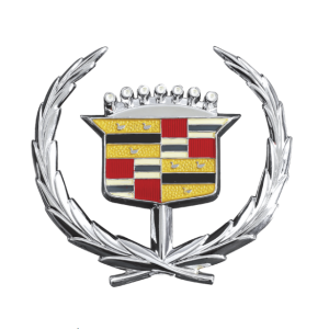
1963 - 1980
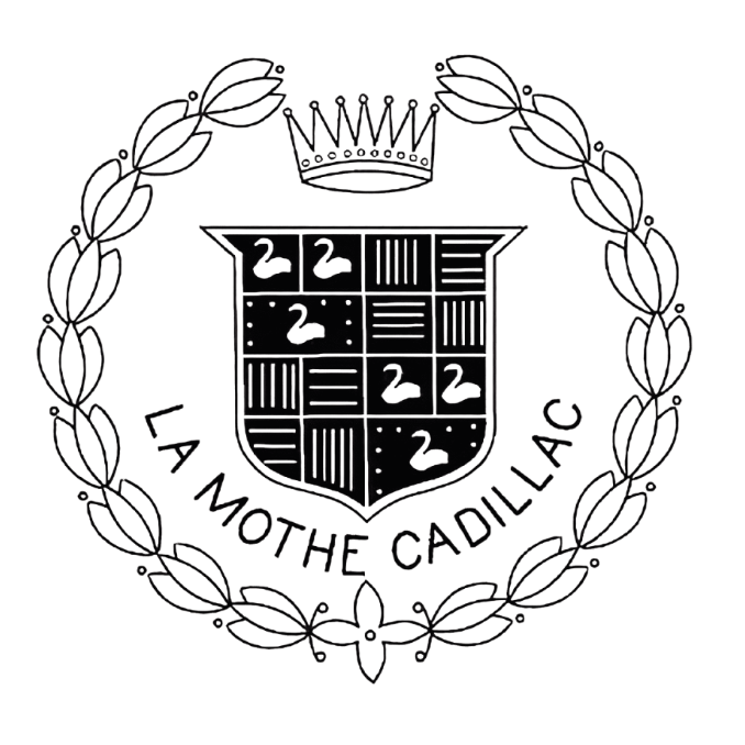
In 1963, the Cadillac logo underwent a subtle change, adding a streamlined, more contemporary look. The emblem became sleeker and more stylised, while a wreath was incorporated into the design, encircling the entire shield.
-
1980 - 2000
In the 1980s, Cadillac modified the yellow filler squares of the previous logo in response to evolving design trends and changing consumer preferences, giving it a more metallic-silver look, while retaining the red portion of the logo with the wreath still surrounding it.
-
2000 - 2009
In 2000, Cadillac introduced a more refined and minimalist logo. wreath elements became more refined, with a flatter overall pattern and lighter colours than before, in keeping with a modern aesthetic and a bold, clean design aesthetic that emphasised its commitment to innovation and the modern luxury experience.
-
2009 - 2014
In 2009, Cadillac introduced a subtle yet significant change to its iconic logo. The emblem, which had evolved over the years, received a more contemporary update. The familiar crest remained at the core of the design, representing the brand's heritage and legacy of luxury. However, the major alteration was in the detailing. The emblem's appearance became cleaner and more streamlined, featuring simplified lines and reduced depth. This modification reflected a commitment to a sleeker, more modern design aesthetic, aligning with Cadillac's ongoing effort to appeal to a new generation of luxury car buyers and maintain its status as a symbol of American innovation and sophistication in the automotive industry.
-
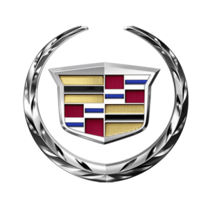
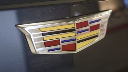
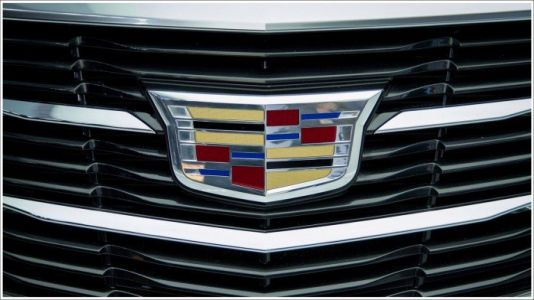
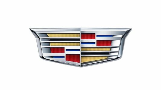
2014 - Now
For 2014, Cadillac's most noticeable change to its logo is the removal of the classic laurel wreath that has encircled the emblem for many years, a modification that gives the logo a cleaner, more streamlined look that is in line with contemporary design aesthetics. The core elements of the logo were retained without destroying the original brand culture, appealing to a younger, more modern audience.
Advertisement
Description
The latest generation of the Cadillac logo has a clean and modern design, with the iconic Cadillac emblem at the centre of the logo in a sleek polished silver or chrome finish. It features a prominent elongated V that extends upward to form the crown of the emblem. The badge itself is enclosed within a strikingly slender border. The colour palette is usually silver or chrome, with a black or dark background that accentuates a sense of luxury and sophistication.
Shape
The shape of Cadillac's newest logo exudes style and modernity. The elongated V-shaped emblem provides a dynamic and forward-looking look. The design is a departure from the ornate and complex designs of the past and aligns Cadillac with the simple and sophisticated design aesthetic of the modern luxury car. The use of a slim border provides a sense of focus and introspection, emphasising the central emblem as the brand's central symbol.
Color
The latest generation of the Cadillac logo features a sophisticated colour palette that reflects the brand's core values of luxury and sophistication. The main colours used in the logo are polished silver or chrome finishes. This colour choice exudes a sense of luxury and modernity, giving the logo a premium metallic sheen. The silver or chrome colour emphasises the concept of quality and craftsmanship, in keeping with Cadillac's reputation for precision engineering and attention to detail.
Emblem
Advertisement
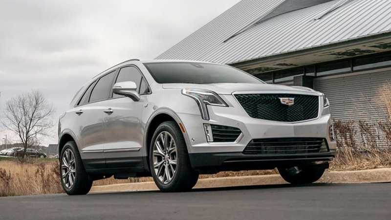
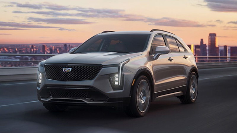
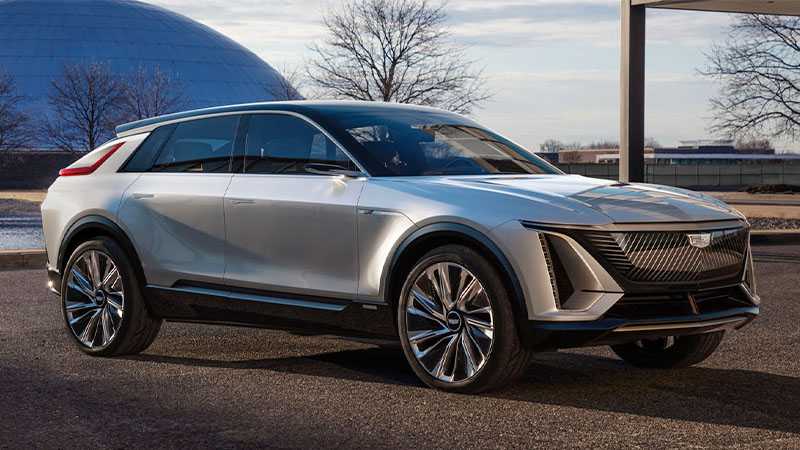
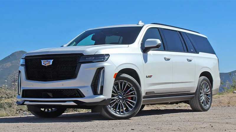
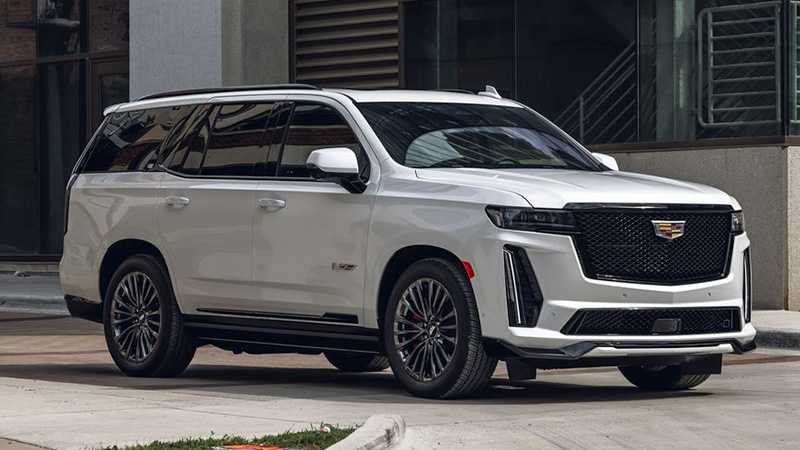
Cars Under This Brand

Advertisement


