Chrysler Logo
Download JPG
Advertisement
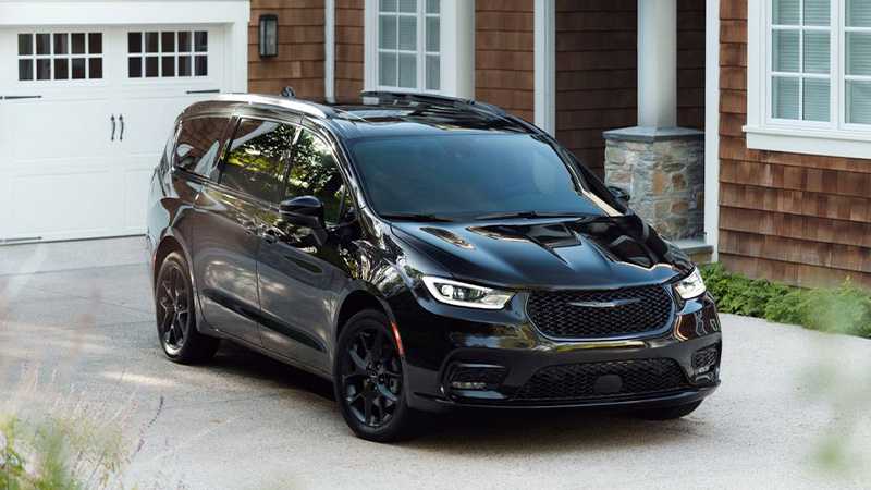
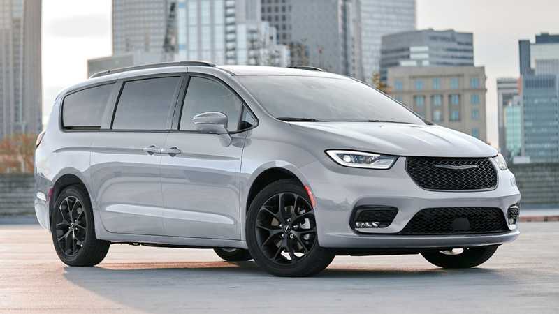
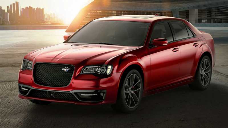
The Chrysler brand, a true American automotive legend, embodies a century of innovation, style, and luxury. Established in 1925, Chrysler has consistently pushed the boundaries of automotive engineering, introducing groundbreaking technologies that have redefined the industry.Known for its commitment to luxury and sophistication, Chrysler offers a range of vehicles designed for those who appreciate both performance and refinement. The Chrysler 300, a modern classic, combines a bold exterior with a spacious, upscale interior, delivering a premium driving experience. Meanwhile, the Pacifica minivan stands as a testament to versatility, featuring advanced safety technologies and family-friendly features.Chrysler's legacy is built on a history of pushing the envelope, from the first mass-produced four-wheel hydraulic brakes to the iconic Hemi V8 engine. Today, the brand continues to evolve, embracing cutting-edge technologies and innovative designs to deliver a driving experience that remains quintessentially American, offering a blend of power, comfort, and style that's second to none.
Meaning and History
-

1924-1928
-
1928-1930
-
1930-1936
-
1936-1950
-
1962-1980
-
1980-1990
-
1990-1993
-
1993-1998
-
1998-2000
-
2000-2009
-
2009-Now

Advertisement
-
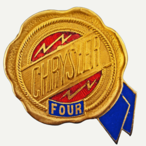
1924 - 1928
Originally designed by a team of Chrysler Corporation engineers, the overall image is a wax seal reference, with a metallic gold colour and the shape of a half blue ribbon peeking out in the bottom right corner giving the logo a very generous look.
-
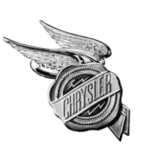
1928 - 1930
In 1928 the Chrysler logo was revamped, the overall wax seal shape remained but a pair of lifelike wings were added to this, the tone was changed from the previous warm metallic tones to a cooler silver lacquer for a more elegant look.
-
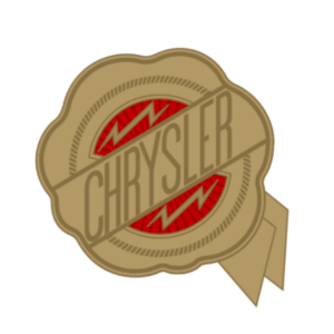
1930 - 1936
Instead of the cooler tones of silver, this year's logo reverted to the warmer tones of the most open metal, which this time no longer contained wings and no longer had the dimpled texture that it had before, weakening the detail of the overall logo decoration and making the brand name in the centre look more obvious.
-
1936 - 1950
In 1936, the Chrysler logo had the previous decoration removed and the wing element was re-added, and then unlike the previous three-dimensionality, this time the wing element resembled more of two stretched silver horizontal frames, and within these two stretched silver frames was placed a scaled-down version of the first generation logo.
-
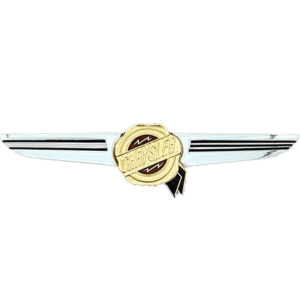
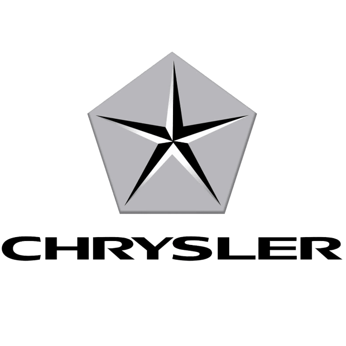
1962 - 1980
In 1962, Chrysler introduced a more modern, three-dimensional version of its logo. The iconic winged design returned, with a bold silver silhouette encompassing a blue and silver stylized pentagon. This emblem highlighted the brand's commitment to cutting-edge technology and innovation.
-
1980 - 1990
In 1980, this time the logo can be called the most concise version, there are no extra border badge elements, nor colour size difference, just the eight letters Chrysler composed of writing, the whole are black lines, so that people can see it at a glance.
-
1990 - 1993
The 1990 logo underwent a transformation from the previous flat letter design to a decorated and textured version. The updated logo features bold capital letters and an elegant three-dimensional design in gold and red on a silver spiked banner. The overall effect looks like two wings.
-
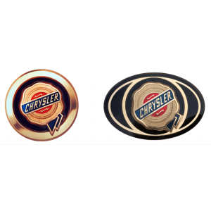
1993 - 1998
In 1993, the Chrysler logo underwent a subtle refinement, returning to its initial wax seal appearance and introducing an oval border around the outer edge. This configuration remained largely unchanged until the following 1998 logo. In this version, the oval border was replaced with a rounded one, and the original black and gold color scheme gave way to a lighter bronze hue. These alterations persisted for approximately three years.
-
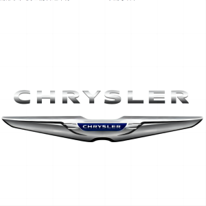
1998 - 2000
In 1998, Chrysler introduced a noteworthy update to its logo, refining its iconic emblem. The emblem retained the recognizable silver winged design, but it underwent a more streamlined and contemporary transformation. The silver wings became sleeker and more dynamic, embodying a sense of movement and modernity. The brand name remained enclosed within a stylized silver pentagon, conveying a sense of unity and strength. This 1998 logo revision aimed to position Chrysler as a forward-thinking, innovative automaker while preserving its historical legacy.
-
2000 - 2009
The latest version of the logo re-emphasises the pentagram element. The entire design now forms a geometric pentagram symbol. Although none of this version of the logo has been in use for very long, the composition gives a more professional and seamless look. Initially, the Chrysler letters were located on the right side, but were later moved to the bottom side.
-
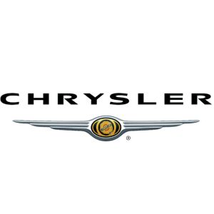
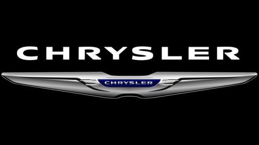
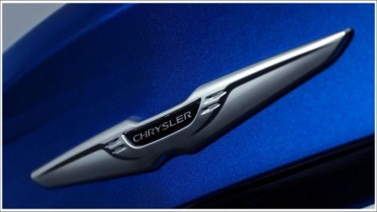
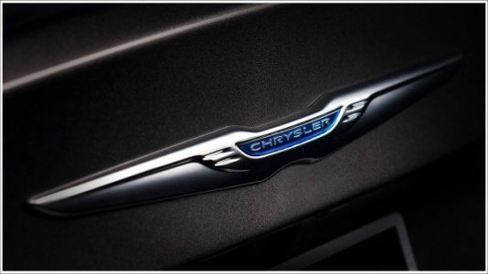
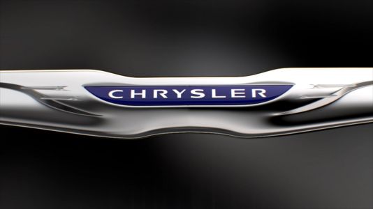
2009 - Now
In 2009, Chrysler unveiled a major change to its logo, signalling a new era for the brand. The iconic silver wings, symbolising the company's heritage, were retained, but underwent a more modern and sophisticated redesign. The wings have been simplified and placed in a blue and silver pentagon, resulting in a more cohesive and contemporary logo. The Chrysler name is displayed below the wings in a striking capitalised font.
Advertisement
Description
The most recent iteration of the Chrysler logo represents a notable departure in design philosophy. Embracing a sleek and modern aesthetic, the logo prominently features a geometric pentagram symbol, symbolizing a harmonious blend of innovation and tradition. The entire composition exudes professionalism and fluidity, reflecting Chrysler's commitment to contemporary elegance.
Shape
The latest generation of Chrysler logos showcases a distinct and contemporary shape, primarily centered around a geometric pentagram symbol. This symbol, a departure from previous designs, takes a central role in the logo's composition, imparting a sense of symmetry and modernity. The lines of the pentagram are clean and well-defined, contributing to an overall sleek and sophisticated aesthetic. The choice of this geometric form suggests a deliberate fusion of innovation and timeless design principles. The logo achieves a harmonious balance, with each segment of the pentagram contributing to a cohesive whole.
Color
The latest generation of Chrysler logos introduces a refined color palette, departing from previous iterations. The predominant hues feature a tasteful combination of lighter bronze tones, exuding a contemporary and elegant vibe. The traditional black and gold elements have made way for this sophisticated color scheme, enhancing the logo's overall modernity. The choice of colors reflects a departure from convention while maintaining a sense of timeless style. The logo's use of subdued and harmonious tones contributes to a visually appealing and cohesive aesthetic, symbolizing Chrysler's commitment to both innovation and a refined sense of automotive design.
Emblem
Advertisement
Cars Under This Brand
Advertisement


