Dodge Logo
Download JPG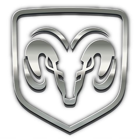
Advertisement
Dodge, an iconic American automotive brand, has a rich history steeped in power, performance, and a rebellious spirit. Known for its distinctive and aggressive styling, Dodge has consistently delivered vehicles that cater to those with a need for speed and a taste for bold design.Dodge's journey dates back to 1900, but it truly came into its own with the introduction of the Dodge Brothers' iconic vehicles in the early 20th century. The brand's muscle cars, like the legendary Challenger and Charger, have become synonymous with raw, unadulterated power. From the growl of a HEMI V8 engine to the unmistakable crosshair grille, Dodge vehicles are built for enthusiasts who crave excitement and adrenaline.In recent years, Dodge has expanded its lineup to include SUVs like the Durango, offering families a blend of performance and practicality. The brand's commitment to innovation, as well as its dedication to the pursuit of high-performance vehicles, ensures that Dodge remains a symbol of American automotive excellence and a top choice for thrill-seekers and performance aficionados. Dodge: Where power meets passion.
Meaning and History
-

1910-1914
-
1914-1928
-
1928-1955
-
1955-1962 (1968)
-
1963-1993
-
1993-2009
-
2010-Now

Advertisement
-
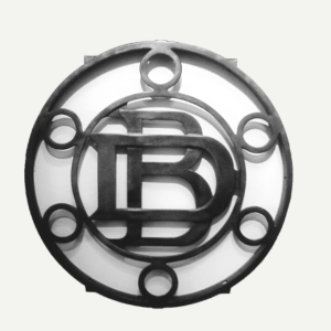
1910 - 1914
In 1910, the very first logo was designed, with an overall large circular frame, with the capital letters D,B representing the brand's founders, the Dodge brothers, placed interlocking in the centre, and six small circular decorations added around it, all made of metal.
-
1914 - 1928
Throughout the long history of Dodge vehicles, the logo has evolved with the times and brand image. Early Dodge logos were simple and bold, centred on a circle with a star on top. Representing the Dodge brand's vision of "reaching for the stars," this logo has been in use since the company's inception in 1914, and it is a testament to the ambitions of the Dodge brothers.
-
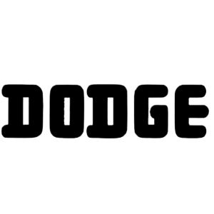
1928 - 1955
In 1928, the Dodge logo was changed from a specific frame and motif to a very simplistic line lettering, with no ornamentation other than the bold capital letters DODGE, in a sleek and recognisable typeface, simply written so that the user could remember it in the shortest possible time.
-
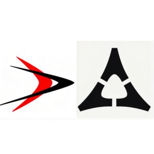
1955 - 1962 (1968)
In 1955, Dodge introduced a new logo that reflected the spirit of the times. The new logos had a cleaner, more modern design with a simpler, bolder approach. They were two superimposed coloured boomerangs (black and red). They symbolise development, movement and technological progress. The triangular black logo was also used in the centre, but it did not last long as it was not very recognisable!
-
1963 - 1993
The logo for this time period did not change much from the previous pure letter logo, from the original black font to a red font, which looked clearer and more understandable. The font was still bold letters, which were very recognisable, and the bright colours brought energy and passion.
-
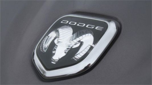
1993 - 2009
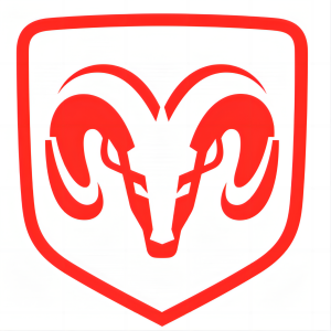
In 1993, Dodge updated the logo once again with a more stylised and modern form. This time it was the familiar ram's head, which was outlined in red and looked clear and dynamic. This red goat head was also used for quite some time.
-
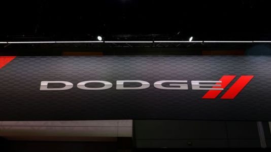
2010 - Now
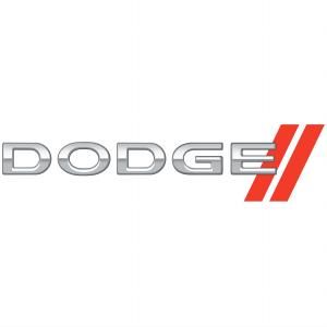
2011- In the 2010s, Dodge updated the logo again. It is a silver font with two red diagonal stripes at the end. The double diagonal lines symbolise agility and speed, reflecting the brand's sporty qualities. Dodge's commitment to adapting to changing design trends and customer expectations while maintaining its heritage marked a pivotal moment in the brand's ongoing evolution.
Advertisement
Description
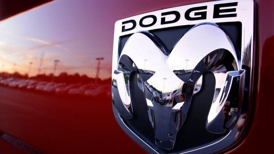
The new Dodge logo uses silver or chrome colours on a contrasting background to give the logo high visibility, especially on the front grilles of Dodge vehicles. This modern design coincides with Dodge's mission to maintain its prominence and relevance in the automotive industry, appealing to a wide range of consumers who appreciate the perfect blend of power and style. The newest Dodge logo is exquisitely styled with silver or chrome accents, underscoring the brand's spirit of boldness, innovation and sophistication.
Shape
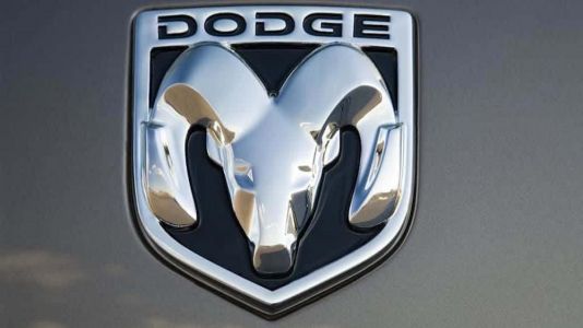
The badge itself retains the distinctive shape of the ram's head, which is bold, powerful and instantly recognisable. The ram's head has a streamlined shape that gives it a modern and timeless appearance. The design is characterised by smooth curves and clean lines that make it more visually appealing and versatile, ensuring that it looks just as good on the grille of a muscle car as it does on an SUV. The shape symbolises the brand's commitment to maintaining its identity and heritage while adapting to the ever-changing automotive market.
Color
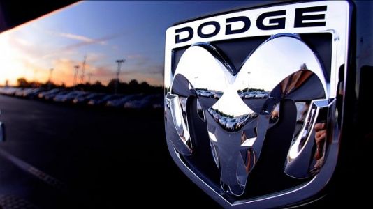
The latest generation of the Dodge logo features a modern and sophisticated design that continues to pay homage to the Dodge brand's iconic ram's head logo. The logo exudes modernity and sophistication with a sleek polished silver or chrome finish. The choice of silver or chrome adds a touch of elegance to the emblem, symbolising the brand's commitment not only to delivering power, but also a degree of sophistication to its vehicles.
Emblem
Advertisement
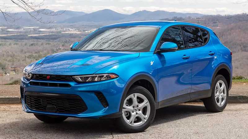
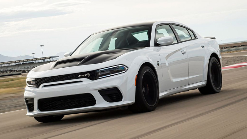
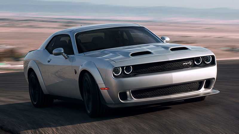
Cars Under This Brand

Advertisement


