FIAT Logo
Download JPG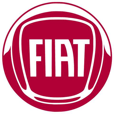
Advertisement
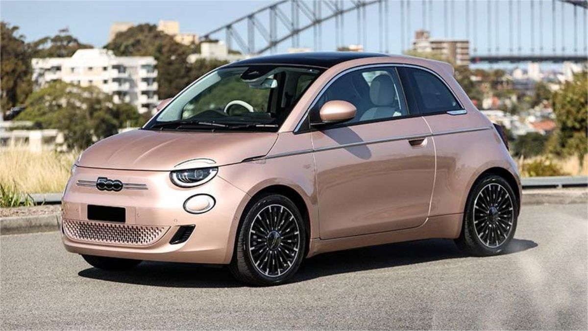
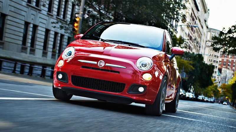
Fiat has introduced iconic models like the Fiat 500 and the Fiat Panda, which have become symbols of compact and practical urban mobility. The brand's commitment to design and engineering excellence is evident in its various achievements in the world of motorsports and innovative technologies.Fiat's influence extends beyond Italy, with a global presence and a reputation for producing vehicles that cater to a wide range of consumer needs, from compact cars to spacious family vehicles. The brand's enduring legacy continues to reflect a fusion of Italian flair and automotive ingenuity, making it a well-recognized and respected name in the automotive world.
Meaning and History
-

1899-1901
-
1901-1903
-
1903-1908
-
1908-1921
-
1921-1931
-
1931-1968
-
1968-1982
-
1982-1999
-
1999-2003
-
1999-2006
-
2003-2006
-
2006-now
-
2020-now


Advertisement
-
1899 - 1901
The badge used by the car brand Fiat in 1899 marked the inception of an iconic automotive manufacturer. It featured a circular emblem adorned with an intricate design. At its center was the acronym "F.I.A.T.," representing "Fabbrica Italiana Automobili Torino," enclosed within a laurel wreath. The laurel wreath symbolizes victory and honor, an apt choice for a brand striving for excellence in the nascent automotive industry. Surrounding this were more ornate elements that imparted a sense of elegance and sophistication. This emblem captured Fiat's ambition to produce exceptional Italian automobiles and set the stage for a legacy of design and engineering prowess that continues to influence the automotive world today.
-
1901 - 1903
It only featured the abbreviation of the company name, four letters with gaps in between. The design was used with a blue-enamelled rectangular plate with a merely stretched upper edge. The font used for the logo became a trademark for Fiat.This new badge reflected Fiat's growing focus on simplicity and functionality, in line with the evolving design trends of the early 20th century.
-
1903 - 1908
It was composed of gold lettering, placed on a light blue rectangular, which was located on a dark blue background decorated with gold ornaments. It features a circular design with the company’s name inscribed in the centre, surrounded by laurel leaves and a ribbon. The intricate design showcases a classic style that was popular during the early 20th century. The Fiat 1903-1908 logo is a testament to the brand’s longstanding legacy and serves as a reminder of its rich history.
-
1908 - 1921
The badge used by the car brand Fiat in 1910 marked a shift towards a more refined and stylized design. It featured the brand's acronym, "F.I.A.T.," elegantly rendered in an Art Nouveau-inspired script, enclosed within an oval frame. The oval shape symbolized unity and continuity, reflecting Fiat's commitment to producing reliable and well-crafted automobiles. The ornate script added a touch of sophistication and aesthetic appeal, showcasing Fiat's growing focus on design.
-
1921 - 1931
Between 1921 and 1931, the Fiat logo underwent minor changes, with the same design elements being used throughout. The logo featured a silver frame with leaf ornaments and original lettering, the only difference was the colour scheme. From 1929 to 1931, the logo had a dark blue background colour. However, in 1931, the company announced another logo with the same design, but this time with a dark red background instead.
-
1931 - 1968
The company revamped its car radiators in 1931 and decided to mark this change with an unprecedented logo design refresh. The big shift in the design resulted in a rectangular-shaped logo with rounded corners. This design was used from 1938 to 1968, for almost three decades. However, the logo was refreshed thrice with minor changes to its shape, texture, and font, during the aforementioned period.The horizontally striped pattern was added to the red background of the Fiat badge in 1959. As for the framing, its contours were a bit refined and balanced, with the black outline making the badge look more distinctive and confident. The lettering became thinner and darker, to give a more harmonized image with the new shades of the background.
-
1968 - 1982
In 1965 the company decided to bring back its circular badge from the 1930s, but with some modifications. First of all, the silver framing was refined and drawn in a more minimalist way. Secondly, the lettering was executed in a bright yellow color, with a white outline. And, finally, the redesign background gained more shades and gradients, giving volume and dynamics to the image.
-
1982 - 1999
In 1972, Fiat refined its geometric logo, replacing the dark parallelograms with bright-blue ones and removing the silver outline.It is now composed of four rectangles, connected to each other. Every letter is placed in a separate cell. The color palette is black and silver, which makes the Fiat logo look elegant and strict. To enhance the logo’s visual appeal, the white letters were positioned at a slight distance from each other, making the design look cleaner and more lightweight.
-
1999 - 2003
The iconic four parallelograms with letters on them came back in 1999. They were still colored blue, but now it was a three-dimensional version of the recognizable badge. The squares became darker and gained gradient shades, while the letters were written in light silver, looking glossy and bright.
-
1999 - 2006
After the experiment with a circular logo, the brand decided to bring back the version of 1968, making it three-dimensional and adding some silver tones into its palette.
-
2003 - 2006
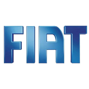
Since 2003, Fiat has used a simple yet memorable crest consisting of three-dimensional letters in gradient blue on a plain white background. These letters use the easily recognizable Fiat lettering, but with thicker lines and a smoother, softer profile.
-
2006 - now
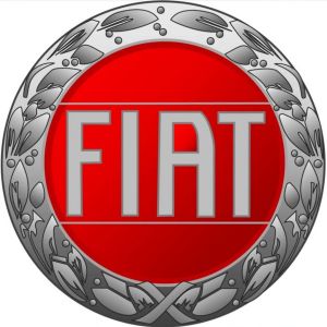
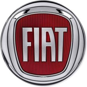
Drawing inspiration from the early versions of the emblem, Fiat created a new logo featuring a silver circle with a red shield inside and a silver wordmark. The elegant elongated letters of the wordmark repeat the typeface created a long time ago, but now it looks cleaner and more stylish.It is a reflection of the brand’s value of design and quality, its free spirit and its vision.
-
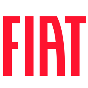
2020 - now
The 2020 redesign retains the original style and typeface of the Fiat logo designed in 2003, but straightens the lines of the letters and lifts the hue to a very distinct red. It reflects the passion and power of the brand.
Advertisement
Description
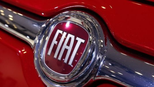
The Fiat badge is a symbol of Italian automotive heritage and innovation. It features a circular emblem with a silver border, encompassing the brand's name, "FIAT," in bold white lettering set against a vibrant red background. The design is clean, contemporary, and visually striking. The white lettering on red creates a strong contrast, making the brand name highly visible and memorable. This logo exudes a sense of energy, style, and forward-thinking design. It captures Fiat's commitment to producing cars that are not only practical but also exude a sense of dynamism, making it a brand emblematic of Italian flair and automotive excellence.
Shape
The Fiat badge is characterized by a simple yet distinctive circular shape. The emblem is enclosed within a circular border, creating a sense of unity and completeness. This circular design imparts a timeless quality to the logo, emphasizing Fiat's enduring legacy in the automotive industry. The circular shape symbolizes a well-rounded and balanced approach to design and functionality, reflecting the brand's commitment to producing reliable and versatile vehicles. It adds a touch of classic elegance and sophistication, making the Fiat badge instantly recognizable and memorable. This shape embodies Fiat's fusion of Italian style and automotive ingenuity, encapsulating the brand's identity as a symbol of enduring quality and performance.
Color
The Fiat badge prominently features a striking color combination of vibrant red and bold white. The circular emblem itself is outlined in silver, adding a touch of metallic sheen. The brand's name, "FIAT," is rendered in bright white lettering, which stands out prominently against the red background. Red symbolizes energy, passion, and vitality, reflecting the brand's Italian heritage and flair. White, on the other hand, signifies purity and sophistication, underlining Fiat's commitment to innovation and modern design. This harmonious interplay of colors in the Fiat badge creates a dynamic and memorable visual identity, capturing the essence of the brand's style and vibrancy.
Emblem

Advertisement
Cars Under This Brand
Advertisement


