GMC Logo
Download JPG
Advertisement
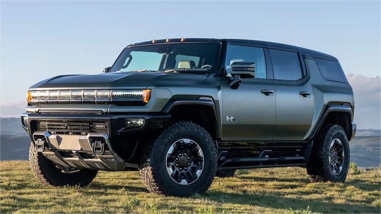
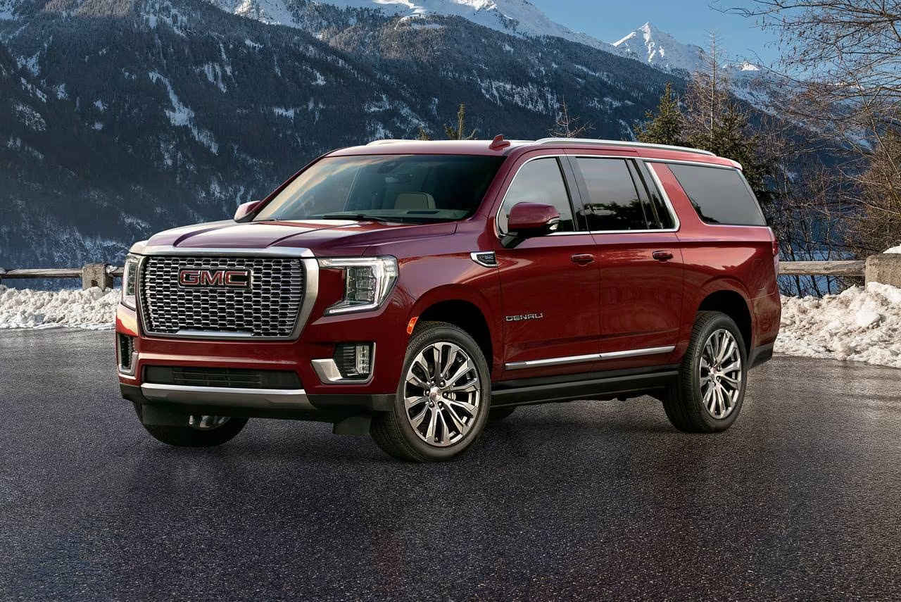
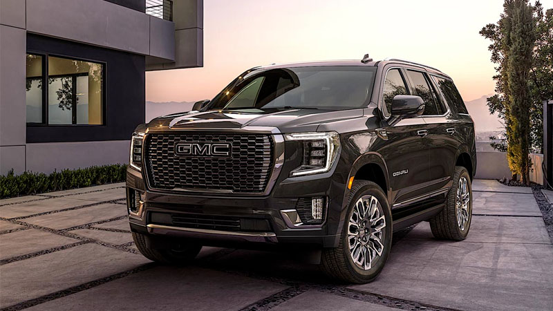
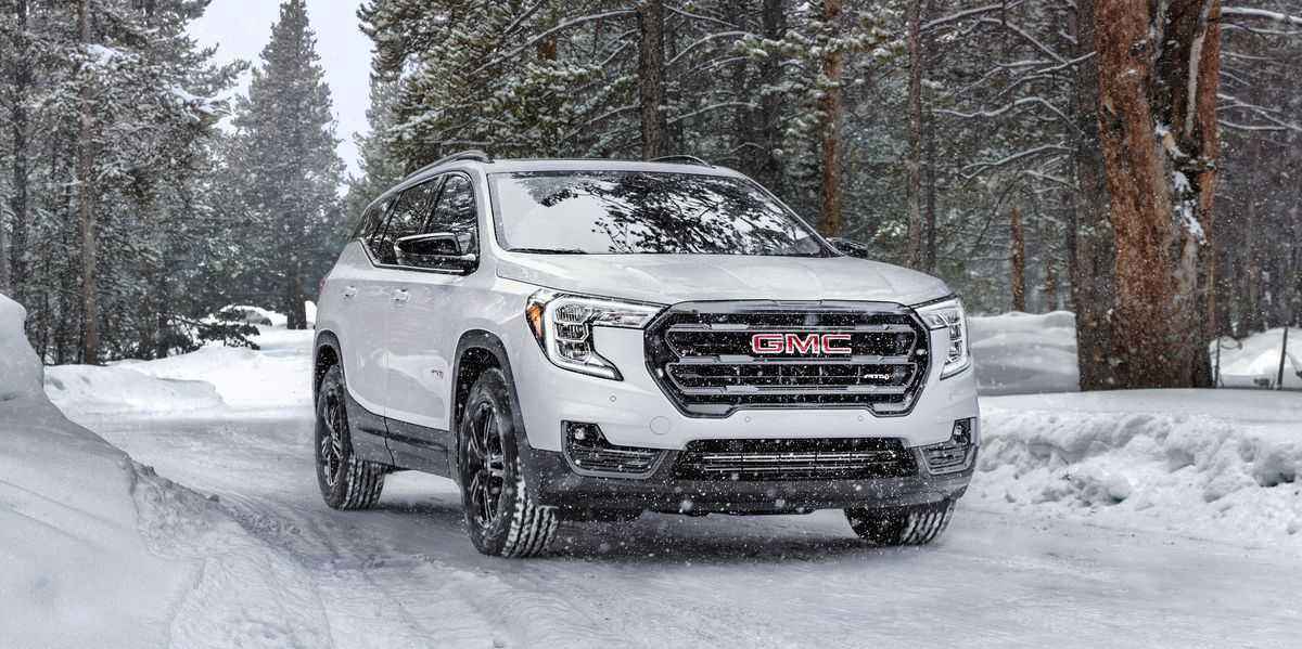
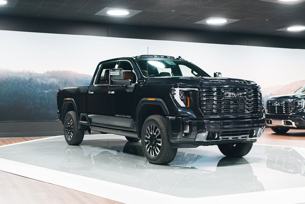
GMC, an iconic American automotive brand, is renowned for its rugged and dependable vehicles that blend power with style. With a rich history dating back to 1902, GMC has earned its reputation as the professional-grade division of General Motors. The brand's dedication to precision engineering and innovation is evident in its diverse lineup of trucks and SUVs.GMC vehicles are known for their bold and distinctive design, commanding road presence, and an array of advanced features that cater to the needs of drivers who demand more from their vehicles. Whether it's the Sierra pickup trucks with impressive towing capabilities, the versatile Terrain SUV, or the luxury-infused Yukon, GMC offers a vehicle for every lifestyle.GMC's commitment to quality and performance is evident in its professional-grade engineering, ensuring that their vehicles can withstand the toughest challenges. The brand's enduring legacy is a testament to its ability to combine style, strength, and innovation, making GMC a beloved choice for drivers seeking both capability and refinement on and off the road.
Meaning and History
-

1911-1947
-
1947-1960
-
1960-1967
-
1975-1979
-
1979-2014
-
2014-Now
Advertisement
-
1911 - 1947
The first GMC logo design was relatively simple but distinctive. The initials "GMC" are set in a circular emblem. The letters were in a beautiful regular script font, reflecting the fashion sense of the early 20th century. Even in the early days of the brand, the logo was a testament to the brand's commitment to quality and professionalism. Although relatively ornate compared to modern designs, it embodies the elegance and craftsmanship of the era, setting the stage for the brand's evolution over the decades into a symbol of rugged dependability and strength, with subsequent changes to the logo reflecting the shift in design and branding.
-
1947 - 1960
In 1947, GMC's logo was changed, with the rounded outer frame eliminated in favour of the striking 'GMC Trucks' lettering, a redesign that emphasised the rugged image and fitted perfectly with the brand's focus on trucks and commercial vehicles. The logo began with a typeface that would later become the brand's iconic image. The word "truck" was soon omitted, leaving only the GMC logo.
-
1960 - 1967
By 1960, the GMC badge received a replacement, which was simplified to leave only the letters GMC because the previous logo looked too complicated, a design shift that marked a departure from the more complex logos of previous decades and symbolised the brand's entry into a new era, with the overall shape of the logo being wider and appearing to be placed within a rectangular border.
-
1975 - 1979
For 1975, the GMC logo retained the iconic shape introduced in the 1960s, continuing to emphasise strength and reliability. However, there were subtle improvements to the design. The overall letters were widened and rendered white, appearing more contoured against the red background below, as GMC adapted its ability to stay true to its core logo while adapting to its evolving design sensibilities.
-
1979 - 2014
This time, the logo has been modified from the original by removing the box previously used to enclose the letters, leaving the three GMC letters neatly presented, still in red. A border has been added around each of the three striking red letters, but it is not obvious.
-
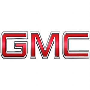
2014 - Now
In 2014, GMC introduced a logo that maintained the iconic shield shape, preserving the brand's image of strength and dependability. However, the design received a contemporary makeover. The shield became more refined and three-dimensional, with sleek metallic accents that added a modern touch. The "GMC" typography at the center was embossed and made bolder, enhancing its prominence. This logo emphasized precision engineering and innovation, aligning with the brand's commitment to offering both power and sophistication.
Advertisement
Description
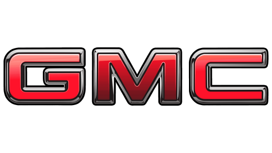
The latest generation of the GMC logo features a clean, minimalist design. The logo is now clearer, with clean, straight lines and a sharp, modern look. The design embodies precision and modernity, signalling the brand's commitment to cutting-edge engineering and innovation. The overall shape of the logo remains familiar to GMC enthusiasts, reflecting both the brand's continuity and its ongoing evolution.
Shape
The "GMC" lettering in the centre is more fluid and modern, with clean lines and sharp edges. This modern typography reinforces the brand's commitment to keeping up with design trends while continuing to convey its rugged, professional-grade image. Overall, the newest GMC logo proves that the brand can adapt to changing times while maintaining its core values of precision, strength and innovation, making it an enduring symbol of quality and performance.
Color
In terms of color, the latest GMC logo adopts a monochromatic palette, primarily using a sleek, metallic silver or chrome finish. This choice of color adds a sense of sophistication and luxury to the logo, enhancing the brand's image as a premium and high-quality automotive manufacturer. The single-color approach allows for a versatile application of the logo on various backgrounds and surfaces, ensuring its visibility and impact across different platforms.
Emblem
Advertisement
Cars Under This Brand

Advertisement


