Honda Logo
Download JPG
Advertisement
Honda is a name synonymous with innovation, precision engineering, and a relentless pursuit of excellence in the world of automobiles and beyond. Established in 1948, Honda has risen to become a global icon in the automotive industry, renowned for its cutting-edge technology and a commitment to improving lives through mobility. With a heritage rooted in Japan's rich manufacturing traditions, the brand's core values revolve around quality, reliability, and forward-thinking design.
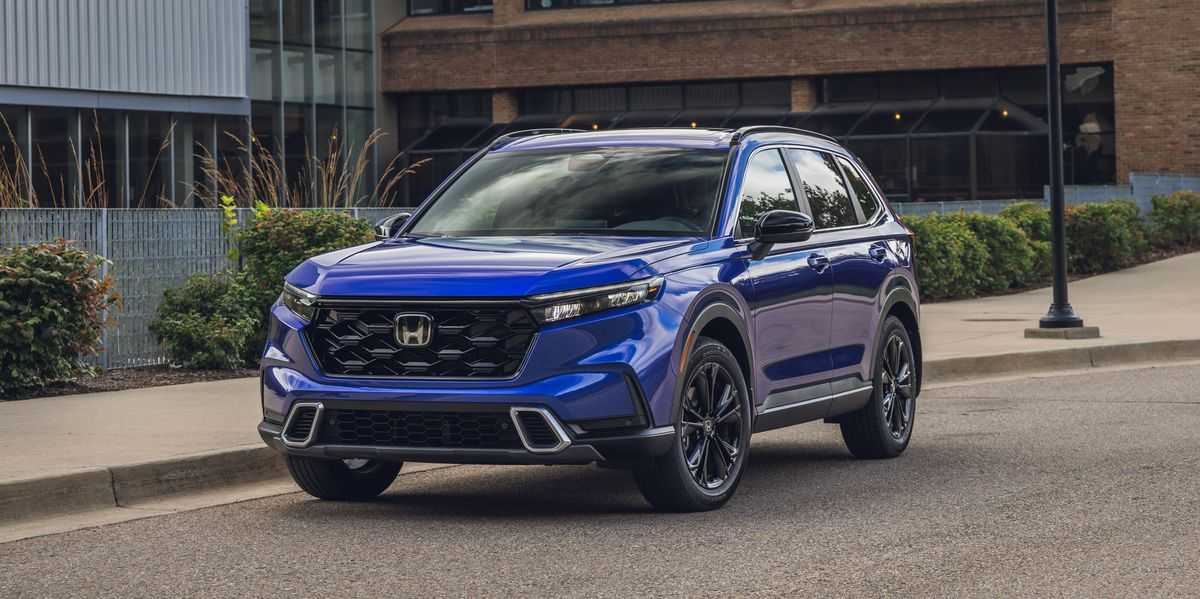
From the groundbreaking Civic and Accord to the high-performance, race-bred NSX, Honda's vehicle lineup showcases an impressive blend of efficiency, style, and performance. Yet, Honda's influence extends far beyond the road, with the brand venturing into robotics, motorcycles, and environmental sustainability.
Meaning and History
-

1961-1969
-
1969-1981
-
1981-2000
-
2000-Now


Advertisement
-
1961 - 1969
In 1961, Honda Motor Company created its first badge and kept it until 1969. This badge is a dark burgundy rectangle with two light blue and almost white elements. The top of the badge is adorned with a large programmed letter "H" with vertical bars drawn diagonally from the center. The logo sits above the capitalized logo in a sophisticated traditional serif font, and the letters are fully formed and clearly defined.
-
1969 - 1981
In 1969, Honda Motor Company redesigned its emblem for the first time, retaining the emblem as the sole element of visual identity and removing the logo from it. The redesign not only changed the style and shape of the Honda logo, but also placed the rectangular badge vertically and transformed the letter "H" into a narrower and taller letter. The color palette was also redesigned, with the combination of burgundy and blue being replaced with a single color, showing the white "H" on a solid black background.
-
1981 - 2000
The 1981 redesign resulted in finer lines and a color palette that was reversed from the previous one - the black "H" stood out against the white background. The shape of the letters was refined and the new emblem was more square, with a thick black frame and rounded corners. The logo now sits on top of an enlarged black logo in a strong, bold serif typeface with a strong geometric outline and large square serifs.
-
2000 - Now
In 2000, Honda's visual identity underwent an improvement in volume and color. The logo was redrawn so that the lines of the letter "H" were elongated so that they now meet the frame. The badge was changed from a monochrome color to a gradient metallic grey with a smooth and matte finish. The color of the logo has also been changed to red, with slimmer, more elegant lines. The size of the letters was resized to make the whole image look more balanced.
Advertisement
Description

Honda's current logo is a testament to modernity and simplicity. The emblem features a flat, stylized letter "H" with clean lines and sharp edges. The letter is enclosed within a square, creating a sense of balance and order. The bold, silver "H" against a black background exudes a sense of elegance and sophistication. This logo design is minimalist, versatile, and instantly recognizable. It signifies Honda's commitment to innovation and its ability to adapt to an ever-evolving automotive landscape. The emblem exudes a contemporary and timeless aesthetic while maintaining the brand's strong identity and legacy of quality, making it a symbol of trust and reliability.
Shape
Honda's current logo shape features a highly recognizable and simplified letter "H" within a square emblem. The "H" is precise and geometric, emphasizing sharp angles and clean lines. The square provides a structured frame, creating a sense of stability and balance. This logo shape embodies modernity and clarity, reflecting Honda's commitment to innovation and precision engineering. The bold and unembellished design is versatile and adaptable, ensuring instant brand recognition across various applications. The square's symmetry and the sharp-edged "H" create a contemporary and timeless aesthetic, symbolizing Honda's enduring legacy of quality, trustworthiness, and its position as a major player in the global automotive industry.
Color
Honda's current logo features a striking and modern color scheme. The emblem primarily consists of a silver or chrome-colored letter "H" set against a bold black background. The silver symbolizes sophistication, innovation, and a sense of technological advancement, which aligns with Honda's position as a pioneer in the automotive industry. The black background adds a touch of elegance and a contemporary aesthetic, emphasizing the brand's versatility and adaptability. This monochromatic color combination reflects Honda's commitment to delivering cutting-edge, high-quality vehicles while maintaining a timeless and sleek appearance. It is a visual representation of Honda's enduring legacy and its ability to stay relevant in a rapidly evolving automotive landscape.
Emblem


Advertisement
Cars Under This Brand


Advertisement


