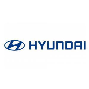
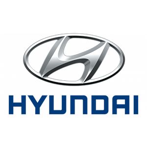
Hyundai Logo
Download JPG
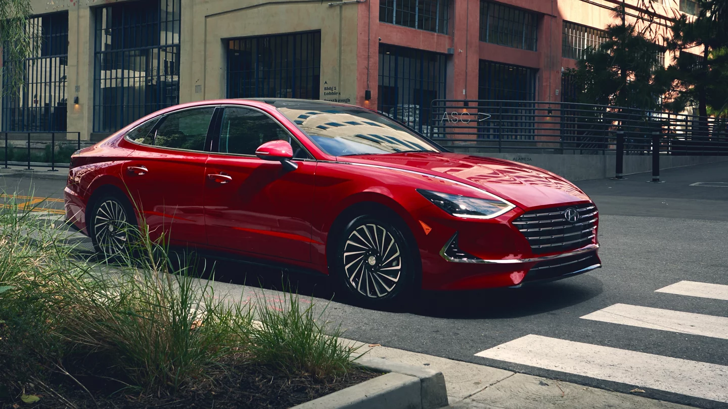
Advertisement
Hyundai, a South Korean automotive powerhouse, has firmly established itself as a global leader in the automotive industry. With a rich history dating back to its founding in 1967, Hyundai has become synonymous with innovation, quality, and affordability. Today, it's one of the largest and most recognized automobile manufacturers in the world, offering a diverse range of vehicles that cater to the needs and preferences of customers across the globe.
Hyundai's journey to prominence has been marked by several key milestones, including its partnership with Ford in the early years, which helped the company gain a foothold in the international market. However, it was Hyundai's commitment to research and development, coupled with a dedication to producing high-quality vehicles, that truly set it apart.
One of Hyundai's defining characteristics is its commitment to pushing the boundaries of technology and design. The brand has consistently invested in cutting-edge research and development, resulting in groundbreaking advancements in safety, efficiency, and performance. Hyundai is not only a pioneer in hybrid and electric vehicle technology, but it's also a leader in developing vehicles with advanced safety features and smart connectivity.
Meaning and History
-

1967-1970
-
1970-1978
-
1978-1992
-
1990-Now
-
2003-Now
-
2011-2017
-
2017-Now


Advertisement
-
1967 - 1970
The Hyundai logo, introduced in 1967, reflects the brand's roots and aspirations. The stylized "H" emblem represents a company that aspires to become a global force in the automotive industry. The bold and simple "H" design is inspired by the company's original name, Hyundai Engineering and Construction Co., highlighting its industrial background and heritage. The oval shape encircling the "H" signifies the brand's global expansion and its commitment to providing quality vehicles to a worldwide audience. Over time, this emblem has evolved, but it remains a symbol of Hyundai's journey from a regional industrial powerhouse to a globally recognized automotive leader.
-
1970 - 1978
During the years 1970 to 1978, Hyundai adopted a logo with a distinct and minimalistic design. The emblem featured a bold, slanted "H" enclosed within a hexagonal frame. This logo embodied the brand's focus on innovation, progress, and modernity. The hexagonal shape symbolized a "diamond," representing both durability and refinement. It was an era of transformation for Hyundai, as they transitioned from an industrial company into the automotive industry, and the logo change reflected this evolution. This logo remained a transitional symbol, foreshadowing Hyundai's journey toward becoming a global leader in the automotive world.
-
1978 - 1992
The modern logo from 1978 to 1992 marked a key stage in the company's development. It is characterized by the "HD" enclosed in an oval. Although the "D" has a solid color fill, the letters "HD" are even and clear. Both logos are located within a rectangular frame. On the right side there is an inscription in Korean. The logo symbolizes Hyundai's desire to reach new heights and become a global automaker. The stylized "H" inside symbolizes the company's commitment to progress and innovation. The simple yet bold design reflects Hyundai's focus on quality and refinement. This era saw Hyundai's entry into the international automotive market, and the logo reflects the brand's transformation into a respected global automaker.
-
1990 - Now
The Hyundai logo, designed in 1990, is a stylized "H" that represents the company's name and also symbolizes two people shaking hands. The stylized "H" is meant to convey a sense of trust and cooperation, while the handshake represents the company's commitment to its customers.
-
2003 - Now
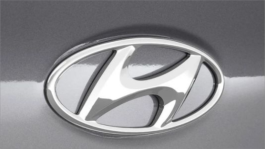
The Hyundai logo introduced in 2003 is a refined and stylized letter "H" enclosed within an elliptical shape. It represents a company in constant motion, symbolizing progress and a commitment to innovative design. The oval shape signifies a global perspective, as Hyundai expanded its presence worldwide. The clean, minimalist design exudes modernity and elegance, reflecting the brand's pursuit of quality and sophistication. It is a symbol of Hyundai's transformation into a global automotive leader, emphasizing trust, reliability, and a strong customer-brand relationship. This emblem reflects Hyundai's evolution into a respected and forward-thinking automaker in the 21st century.
-
2011 - 2017
The Hyundai logo from 2011 to 2017 displayed a sleek, silver letter "H" enclosed in an oval. This emblem represents a company at the pinnacle of innovation and sophistication, signifying a modern, progressive, and global perspective. The oval shape denotes a worldwide presence, underlining Hyundai's commitment to a broad customer base. The minimalist and elegant design highlights the brand's focus on quality and advanced technology. This emblem reflects Hyundai's transformation into a respected global automotive leader, emphasizing trust and reliability. It is a symbol of Hyundai's commitment to a strong and enduring relationship with its customers.
-
2017 - Now
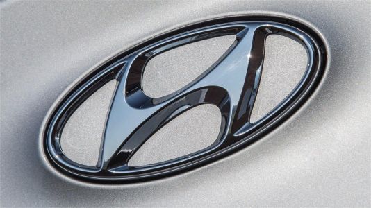
Hyundai Motor's logo from 2018 to 2023 represented a significant shift in the brand's identity and aspirations. The emblem, designed to be more than just a static image, adopted a digital and dynamic form. It symbolizes the brand's commitment to innovation, modernity, and a sustainable future.The logo is characterized by a stylized, italicized "H" that creates a sense of movement and progress. It is designed to resemble two individuals shaking hands, representing the strong and enduring relationships that Hyundai aims to build with its customers, partners, and society as a whole.
Advertisement
Description
Hyundai Motor's logo has evolved significantly from its establishment in 1967 to the present. The original logo featured a stylized "H" within an oval, representing the company's aspirations for global expansion. Over the years, the logo transformed to symbolize innovation, sophistication, and trust. The 1990-present logo, a stylized "H" in an oval, represented a handshake, signifying customer trust and a global outlook. In 2023, Hyundai unveiled a digital, dynamic logo symbolizing innovation and a sustainable future. Throughout these changes, the brand's commitment to progress, quality, and its global presence has remained a consistent theme in the logo's evolution.
Shape
The shape of the Hyundai car logo holds profound significance. The oval design symbolizes Hyundai's global vision, highlighting its commitment to a worldwide customer base. The stylized "H" represents the brand's name and encapsulates qualities of quality and innovation. In its modern iteration, the logo takes the form of a dynamic and digital emblem, signifying Hyundai's transition into a smart mobility solutions provider, focusing on electric vehicles, autonomous driving, and sustainability. This shape reflects the brand's forward-looking vision, emphasizing innovation and its dedication to building enduring relationships with customers and partners, all while embracing a more sustainable and connected automotive future.
Color
The colors of Hyundai's car logo have meaning and significance. The silver or chrome hue in the logo represents modernity, sophistication, and innovation, reflecting the brand's commitment to advanced technology. Silver suggests a high-quality, premium experience for Hyundai's customers. The logo's blue elements are symbolic of reliability, trust, and a commitment to sustainability. Blue also represents Hyundai's vision for a cleaner, more eco-friendly future, including electric and hydrogen-powered vehicles. The combination of these colors communicates Hyundai's core values: quality, innovation, trust, and a sustainable approach to automotive technology, all integral to the brand's identity and mission.
Emblem
Advertisement
Cars Under This Brand


Advertisement


