Kia Logo
Download JPG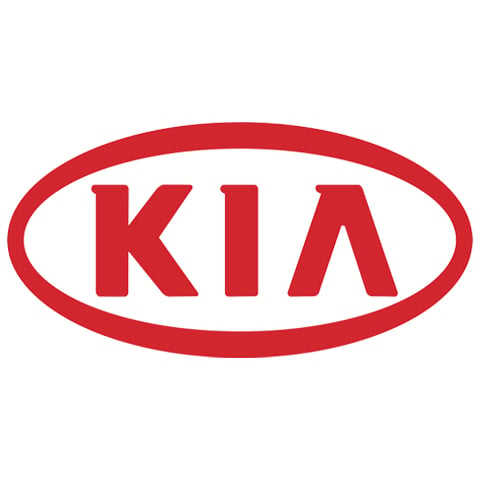
Advertisement
Kia, a dynamic and innovative automobile manufacturer, has emerged as a prominent player in the global automotive industry. Founded in 1944 in South Korea, Kia has consistently delivered a diverse range of vehicles, each known for its quality, affordability, and performance. Over the years, Kia has evolved from a regional brand to a globally recognized automotive powerhouse.
Kia's commitment to excellence is reflected in its cutting-edge design, advanced technology, and a dedication to customer satisfaction. The brand's extensive lineup includes compact cars, SUVs, hybrids, electric vehicles, and more, catering to a wide range of preferences and lifestyles.
Kia's rise to prominence is underpinned by a focus on safety, sustainability, and innovation. It has ventured into the electric vehicle market with models like the Kia Soul EV and Niro EV, while consistently earning accolades for safety features.
With a global presence and a commitment to pushing the boundaries of automotive technology, Kia continues to create vehicles that inspire and empower people on their journeys, establishing itself as a trusted and forward-thinking brand in the world of automobiles.
Meaning and History
-

1944-1964
-
1964-1986
-
1986-1994
-
1994-2012
-
2012-2020
-
2020-Now


Advertisement
-
1944 - 1964
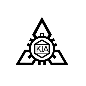
Kia's original logo, in use from 1944 to 1964, featured a bold, angular design with a sharp arrowhead shape. The emblem's unique design was inspired by the symmetry and balance of traditional Korean architecture, symbolizing harmony and stability. The sharp edges of the logo's arrowhead reflected the brand's commitment to precision and progress. During this period, Kia primarily produced bicycles and steel tubing, and the logo highlighted the brand's industrial heritage. While the logo has evolved over the years to match Kia's transition into the automotive industry, this early emblem represented the company's beginnings and its dedication to quality and precision.
-
1964 - 1986
Kia's logo from 1964 to 1986 was a stylized, circular emblem with a unique design. The logo featured an inner oval shape surrounded by an external oval, all enclosed within a circular border. The inner oval represented the Earth, symbolizing Kia's global aspirations and presence. The external oval denoted the company's focus on innovation and technology, embracing new horizons. The circular border reflected unity and continuity, illustrating Kia's commitment to quality and enduring relationships. During this period, Kia was expanding into various industries, and the logo encapsulated the brand's ambition to become a global leader in diverse sectors, including the automotive industry.
-
1986 - 1994
The Kia logo from 1986 to 1994 marked a significant shift in brand identity. The logo has a vibrant and modern design with the company name "Kia" written in bold capital letters. Smooth italicized fonts are paired with a blue rectangular background. The logo signifies Kia's transition into the automotive industry and represents the brand's determination to embrace the future. The blue background symbolizes passion and energy, while the bold letters convey confidence and commitment to quality. It reflects Kia's desire to become a globally recognized automaker, showcasing a bold and forward-thinking brand.
-
1994 - 2012
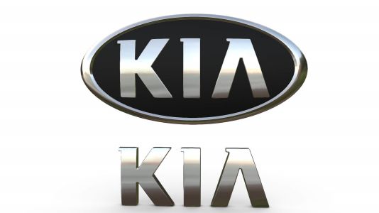
From 1994 through 2012, Kia introduced a unique and memorable logo. It featured a red exterior placing the brand name "Kia" within a red oval. The oval represents the earth and symbolizes Kia's global ambition and reach. The red font embodies modernity and sophistication, in line with the brand's pursuit of advanced technology and innovation. The red oval represents passion and energy, emphasizing Kia's commitment to delivering high-quality, dynamic vehicles. The logo represents Kia's growing position as a respected and innovative automaker on a global scale, highlighting the brand's dedication to progress, style and customer satisfaction.
-
2012 - 2020
The Kia logo for 2012 to 2020 introduces a simpler, more sophisticated design. It displays the brand name "Kia" in a clean, modern capitalized font. The oval that now contains the name represents the Earth. The color change in the font symbolizes innovation and refinement, reflecting the brand's commitment to advanced technology and quality. The logo symbolizes Kia's evolution into a respected and dynamic global automaker with a strong focus on customer satisfaction and forward-thinking design. It showcases an established brand that embodies progress and a commitment to meeting the needs of the ever-changing automotive segment.
-
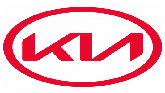
2020 - Now
Kia's logo, introduced in 2020, marked a significant shift in the brand's identity. It retained a minimalist, all-lowercase "kia" in a sleek, modern typeface. The most prominent change was the removal of the oval background, signifying a break from traditional automotive design. This emblem represents Kia's focus on transformation, innovation, and disruption within the industry. The absence of the oval symbolizes a break from convention, emphasizing the brand's intention to lead the way in smart mobility and sustainable technologies. This logo encapsulates Kia's evolution into a forward-thinking, innovative, and progressive automaker, committed to shaping the future of the automotive world.
Advertisement
Description
The evolution of Kia's logo, spanning from 1944 to 2023, embodies the brand's journey from its industrial origins to its emergence as a global automotive leader. The distinct designs across the decades reflect Kia's evolving identity, with symbols like harmony, precision, and progress. From its original arrowhead logo to the modern, dynamic "Kia" emblem, each iteration symbolizes the company's aspirations and values. The removal of the oval background in 2020 marks a break from tradition, signifying Kia's dedication to innovation, sustainability, and transformative leadership in the automotive industry. Throughout its history, Kia's logos have reflected its commitment to quality, progress, and global success.
Shape

Kia's car logo shape, which has evolved over the years, is a symbol of the brand's transformation and commitment to excellence. From the arrowhead design of its early years, reflecting precision and industrial roots, to the modern, dynamic shape of the current emblem, the logo has embodied Kia's journey into the automotive industry. The oval and circular forms in various designs represented Kia's global vision, technological innovation, and its goal to establish lasting relationships with customers. The shape of Kia's logo has consistently mirrored the brand's progress, modernity, and drive to create vehicles that align with the evolving needs of a diverse and dynamic market.
Color
Kia's car logo color has evolved to reflect the brand's values and vision. Over the years, the logo has featured various colors, but in its recent iterations, silver, red, and black have been prominent. Silver symbolizes modernity, sophistication, and technological advancement, underlining Kia's commitment to innovation. Red conveys passion and energy, reflecting Kia's dedication to delivering dynamic vehicles. Black, when used for the logo, adds a touch of elegance and luxury, emphasizing the brand's premium offerings. These colors collectively embody Kia's mission to create high-quality, innovative, and stylish automobiles that resonate with a global audience, making Kia a respected and forward-thinking automaker.
Emblem
Advertisement
Cars Under This Brand


Advertisement


