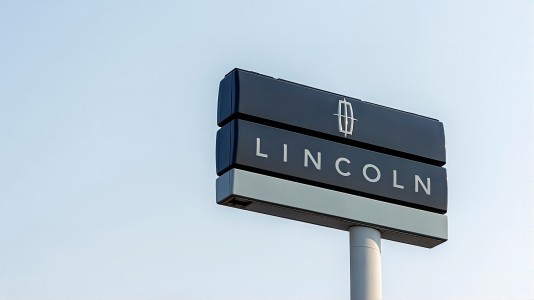
Lincoln Logo
Download JPG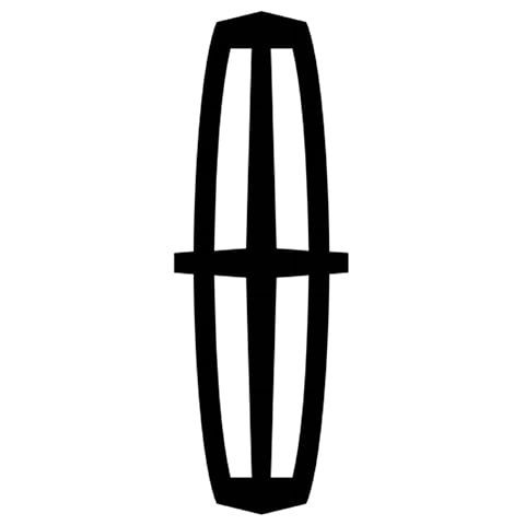
Advertisement
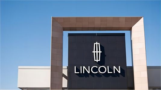
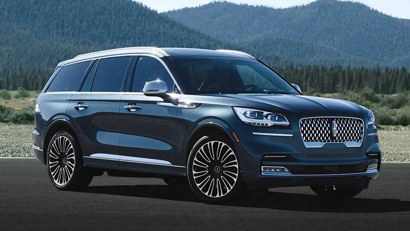
Welcome to the epitome of American luxury and automotive excellence—Lincoln. With a legacy dating back to 1917, Lincoln has consistently set the standard for refined craftsmanship, innovation, and unparalleled comfort. Nestled within the Ford Motor Company family, Lincoln stands as the beacon of sophisticated design and cutting-edge technology.
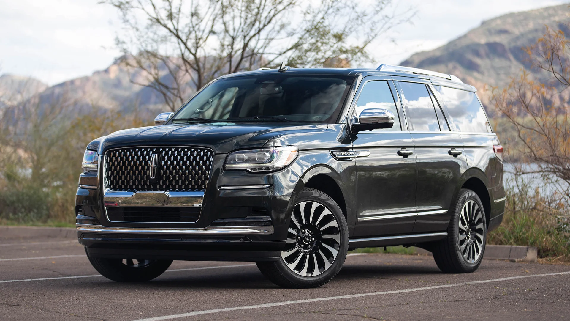
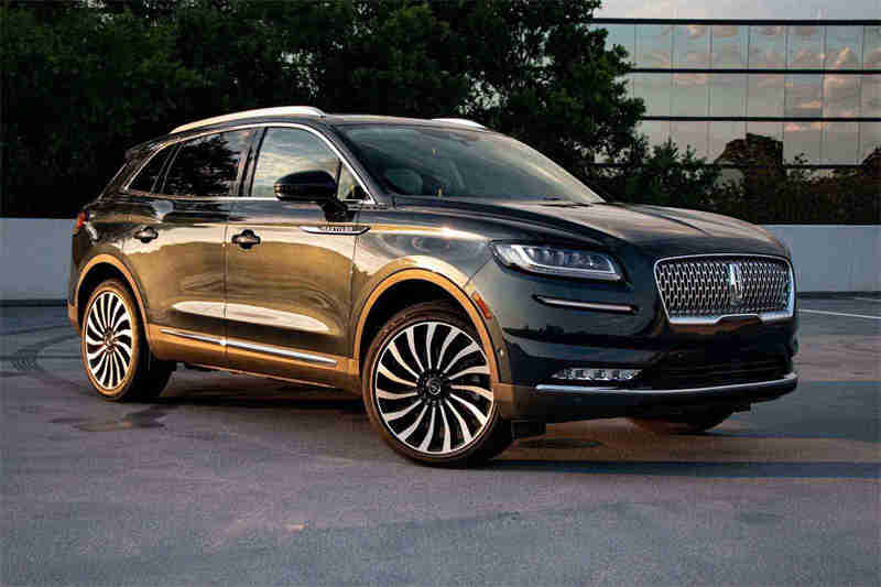
Each Lincoln vehicle is a masterpiece in its own right, seamlessly blending iconic design elements with modern aesthetics. From the sleek lines of the Lincoln Continental to the commanding presence of the Lincoln Navigator, every model is a testament to the brand's commitment to creating an extraordinary driving experience.
Step inside a Lincoln, and you'll find meticulously crafted interiors that elevate comfort to an art form. The attention to detail is not just in the materials but in the thoughtful design that caters to the discerning tastes of those who appreciate the finer things in life.
As you embark on a journey with Lincoln, you're not just driving; you're indulging in a harmonious fusion of performance and luxury. Join the legacy of those who appreciate the finer details, and let Lincoln redefine your expectations of automotive sophistication.
Meaning and History
-

1917-1922
-
1922-1939
-
1939-1954
-
1954-1964
-
1964-1972
-
1972-2012
-
2012-Now
Advertisement
-
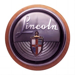
1917 - 1922
In the automotive landscape of 1917, the inaugural Lincoln logo made its debut—a rounded corner badge adorned with a captivating inscription. This emblem, marked by its distinctive design, became the sole representation of the Lincoln brand under the ownership of Henry Leland. Serving as a visual hallmark during this era, the logo encapsulated the essence of Lincoln's identity, embodying the brand's commitment to elegance and quality craftsmanship. It stood as a symbol of distinction, gracing every vehicle with a unique charm that resonated with the values upheld by Henry Leland. This early logo not only marked the genesis of Lincoln's visual legacy but also reflected the brand's unwavering dedication to making a bold and stylish statement in the world of luxury automobiles.
-
1922 - 1939
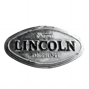
Following Lincoln's integration into the Ford family, a transformative redesign reshaped its visual identity. The emblem underwent notable alterations, including the incorporation of the words "Ford Detroit" onto the badge. This modification not only signified Lincoln's association with the esteemed Ford brand but also emphasized its roots in the vibrant automotive hub of Detroit. The badge itself underwent a structural metamorphosis, evolving into a diamond shape with rounded corners and a substantial border. This redesigned emblem served as a visual testament to Lincoln's renewed identity within the Ford legacy, combining elements of prestige and geographical pride. The diamond shape, with its refined corners and bold border, became an emblematic representation of Lincoln's commitment to distinctive design and its enduring connection to the rich automotive heritage of Detroit.
-
1939 - 1954
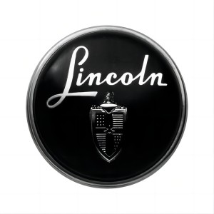
In 1939, Lincoln's logo underwent a transformative shift, adopting a circular design. Featuring a white cursive word mark and the distinguished coat of arms, this emblem became the exclusive visual identity for the next 15 years. The circular shape symbolized continuity and timeless elegance, reflecting Lincoln's commitment to refined aesthetics. During this period, the logo represented the brand's dedication to a harmonious fusion of sophistication and simplicity, setting the tone for Lincoln's enduring legacy in the automotive landscape.
-
1954 - 1964
From 1954 to 1964, Lincoln's logo remained circular in shape, representing the brand name succinctly in capital letters, and became richer and more distinctive in colour, a period that underscored Lincoln's commitment to contemporary design trends, while maintaining a focus on a clear and readable brand image. This shift reflected an era of modernity and innovation, in keeping with Lincoln's ongoing quest for automotive excellence and visual sophistication.
-
1964 - 1972
From 1964 to 1972, Lincoln's logo underwent a noteworthy evolution. The iconic Lincoln Star made its debut, representing a significant departure from previous designs. This stylized and elegant emblem, inspired by the Art Deco movement, became an enduring symbol of the brand's commitment to modernity and sophistication. The introduction of the Lincoln Star during this period marked a pivotal moment in Lincoln's visual identity, solidifying its status as a trailblazer in automotive design. The emblem not only reflected the spirit of the times but also laid the foundation for Lincoln's continued pursuit of timeless elegance and innovation in the luxury automobile landscape.
-
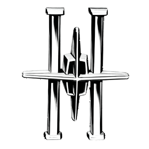
1972 - 2012
A notable evolution is underway in the brand's visual identity, with the incorporation of a distinctive wordmark and a refined logo. The all-capital "Lincoln" wordmark, presented in a sans-serif font with clean lines and generous spacing, adds a contemporary touch to the brand's aesthetic. Concurrently, the logo undergoes a transformation, embracing a more geometric and modern design. Its clear and confident shape ensures versatility, looking equally impressive in both monochrome and silver when adorning a car. Remarkably, this logo has stood the test of time for four decades, emerging as a powerful symbol of American strength and resilience, solidifying its status as an enduring icon within the automotive landscape.
-
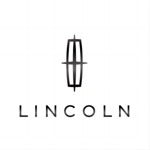
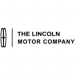
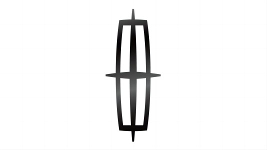
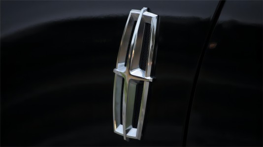
2012 - Now
In 2012, the legendary Lincoln logo underwent a redesign that ushered in a new era of elegance and modernity. The wordmark received a refined touch, achieving a harmonious balance through the use of thicker, shorter lines. Simultaneously, the star emblem underwent a transformation, now encapsulated within a frame with shortened lines, imbuing the logo with a graphic and contemporary aesthetic. This four-pointed star, symbolic of Lincoln's global influence and excellence in quality and design, serves as a representation of luxury and the esteemed status of the brand. Embodying a minimalist and clean design, the logo is not just visually appealing but also carries profound meaning, encapsulating the essence of a well-known and prestigious automotive brand.
Advertisement
Description
The Lincoln logo, evolving since its inception, represents a journey of refinement and sophistication. From the iconic Art Deco-inspired Lincoln Star in the 1960s to the contemporary, sleek design of today, the logo mirrors Lincoln's commitment to timeless elegance. The current emblem, featuring a four-pointed star enclosed in a frame with refined lines, symbolizes the brand's global impact, quality, and design expertise. Its minimalist, balanced wordmark and geometric shape embody Lincoln's position as a prestigious and influential force in the luxury automotive landscape, standing as a visual testament to the brand's enduring legacy and commitment to excellence.
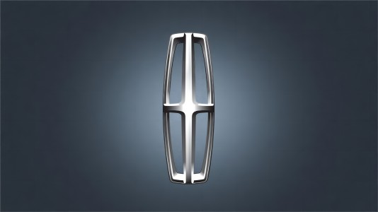
Shape
Lincoln's current logo boasts a sleek and refined design, showcasing a four-pointed star enclosed within a contemporary frame. This geometric shape, featuring shortened lines, symbolizes the brand's global influence, emphasizing quality and design expertise. The minimalist and balanced wordmark, with thicker, shorter lines, contributes to the logo's modern aesthetic. Beyond aesthetics, the emblem signifies Lincoln's commitment to sophistication, echoing the brand's luxurious identity and global presence. The thoughtfully crafted shape serves as a visual embodiment of Lincoln's enduring legacy and its role as a distinguished player in the realm of luxury automobiles.
Color
In Lincoln's current logo, the color palette is a reflection of sophistication and modernity. The predominantly silver hue evokes a sense of luxury and elegance, highlighting the brand's commitment to refined aesthetics. The choice of silver enhances the logo's versatility, complementing various surfaces, especially on cars, where it exudes a contemporary and premium feel. The monochrome approach adds a timeless quality, emphasizing simplicity and clarity. This intentional color selection in Lincoln's logo not only aligns with the brand's visual identity but also underscores its enduring commitment to delivering a sense of opulence and prestige in the world of luxury automobiles.
Emblem
Advertisement
Cars Under This Brand

Advertisement


