Lotus Logo
Download JPG
Advertisement
Lotus, a storied marque in the automotive realm, epitomizes precision engineering and performance. Renowned for crafting lightweight, high-performance sports cars, Lotus represents a legacy of speed, agility, and unparalleled driving experiences. With a relentless pursuit of innovation and aerodynamic excellence, each Lotus model embodies a harmonious blend of cutting-edge technology and racing heritage. From iconic designs to track-focused masterpieces, Lotus continues to push boundaries, captivating enthusiasts worldwide with its commitment to delivering thrill-inducing, adrenaline-fueled driving dynamics, making it a revered name among passionate automotive aficionados.
Meaning and History
-

1948-1984
-
1984-1986
-
1986-1989
-
1989-2010
-
2010-2019
-
2019-Now

Advertisement
-
1948 - 1984
In 1948, Lotus introduced its first logo, which was a black circle with a thin outline outside the circle. Inside the circle was placed a triangular outline that had rounded corners and a slightly arched base. Within this outline were the letter combinations and the name of the brand, the letter combinations were placed above the outline, a "C" intertwined with the letters "ACB", which stood for the name of the brand's founder, Anthony Colin Bruce Chapman. Underneath this motif is the word "Lotus".
-
1984 - 1986
In 1984, the logo was redesigned and changed considerably from its original shape, but it is easy to see that it still retains the design of its predecessor. The outermost circle was removed and the triangular outline was retained, elongated on both sides to give the appearance of an oval. The color of the logo has been redesigned to green, with the word "Lotus" in gold inside the logo, and the outside of the triangular outline echoing it in gold.
-
1986 - 1989
In 1986, an old element from 1948 was added to the logo, with the combination of the letters "ACBC", also in gold color, directly above the "Lotus". This change did not alter the style and recognizability of the logo, but rather added a touch of sophistication and luxury.
-
1989 - 2010
In 1989, the logo was changed again, with the triangular outline repositioned within the circle, and the overall structure was similar to that of the 1948 logo, except that the colors were changed: the circle was changed to yellow, the triangular outline was filled in with green, and the outer circle of the triangular outline and the "Lotus" and the "ACBC" within it were whitish-gray.
-
2010 - 2019
In the 2010 redesign, the iconic logo underwent a vibrant and refined transformation. Enhancements included gradient effects and shimmering silver details, while delicate shading added depth to the frame and letters. While the overall composition and color palette remained consistent, a subtle adjustment lightened the yellow hue within the emblem, refreshing its appearance while preserving its original essence.
-
2019 - Now
In the 2019 update, the logo underwent a simplification process, adopting a flattened appearance devoid of silver details. The emblem's elements were refined, clearing away intricate outlines. The "Lotus" wordmark now aligns in a straight line, employing a new restrained sans-serif font for a more modern look. Additionally, the letter combination adopts a sleek sans-serif font, subtly resembling a steering wheel, reflecting the brand's evolution while maintaining a minimalist and refined aesthetic.
Advertisement
Description
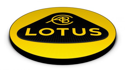
Lotus's current logo signifies a sleek, refined evolution. A flattened emblem devoid of silver details displays minimalist elegance, with clean outlines enhancing its simplicity. The "Lotus" wordmark stands in a straight line, adopting a modest sans-serif font, imparting a contemporary touch. The letter combination also adopts a fine sans-serif font, subtly echoing a steering wheel, showcasing the brand's automotive essence. This emblem, with its minimalistic yet symbolic design, embodies the brand's evolution, embracing modernity while preserving its distinctive identity in the realm of precision engineering and high-performance sports cars.
Shape
Lotus's current logo boasts a streamlined and refined shape, representing a departure from intricate details to embrace minimalism. The emblem features a flattened and simplified design, eschewing elaborate silver elements for a sleeker appearance. Its contours display clean lines and a more straightforward silhouette, exuding a sense of sophistication and modernity. The "Lotus" wordmark aligns linearly, adopting a restrained sans-serif font, imparting a contemporary touch. Additionally, the letter combination adopts a fine sans-serif font, subtly evoking the semblance of a steering wheel, echoing the brand's automotive legacy. This updated shape symbolizes Lotus's evolution, blending minimalist aesthetics with its heritage of precision engineering in sports cars.
Color
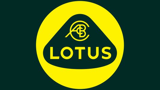
Lotus' current logo features a sophisticated color scheme that is clean and refined. The logo features a minimalist color palette with muted tones of green and yellow. the 'Lotus' lettering exudes an understated elegance with its restrained yellow hue set against a green background. Complementing this, the letter combinations are in similar muted tones, maintaining a harmonious color balance. This understated yet impactful color scheme highlights Lotus' timeless and sophisticated visual identity in the high-performance sports car segment.
Emblem