McLaren Logo
Download JPG
Advertisement
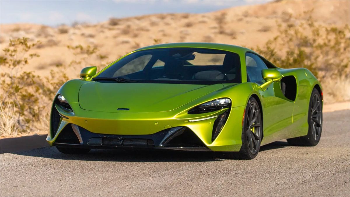
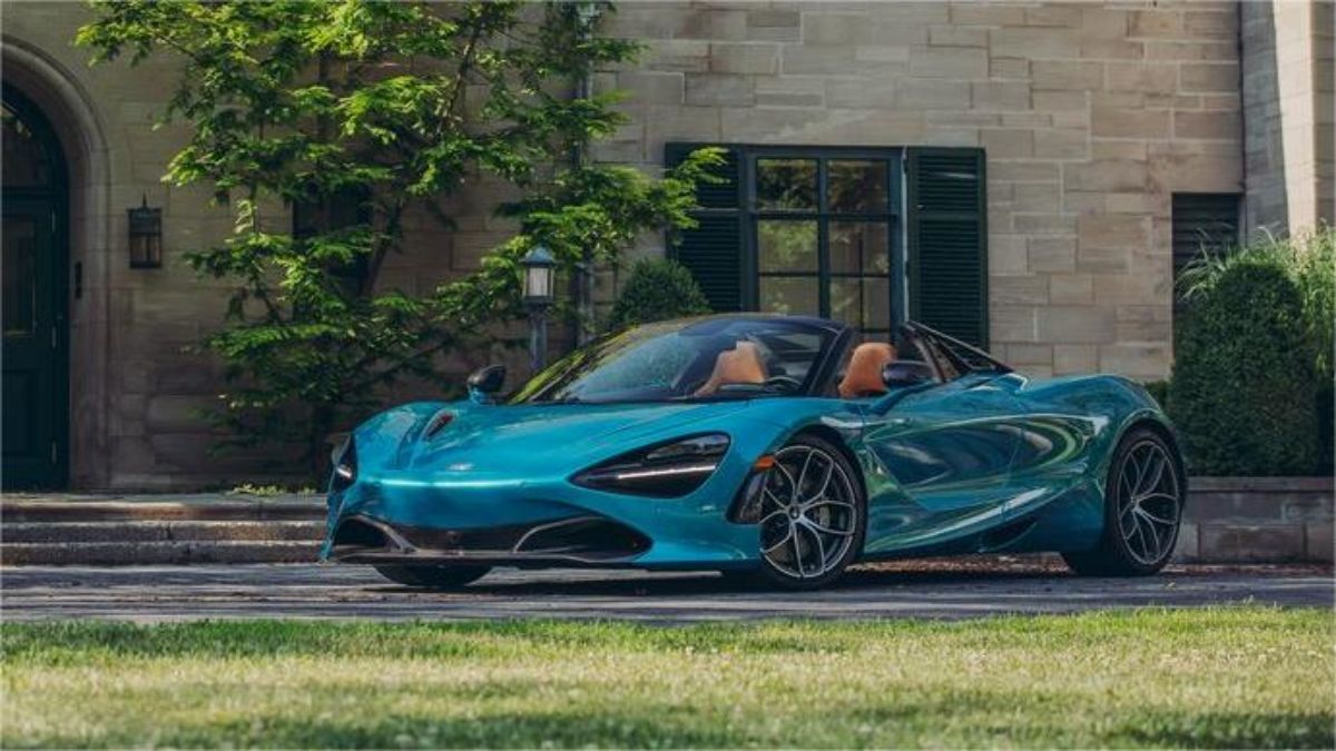
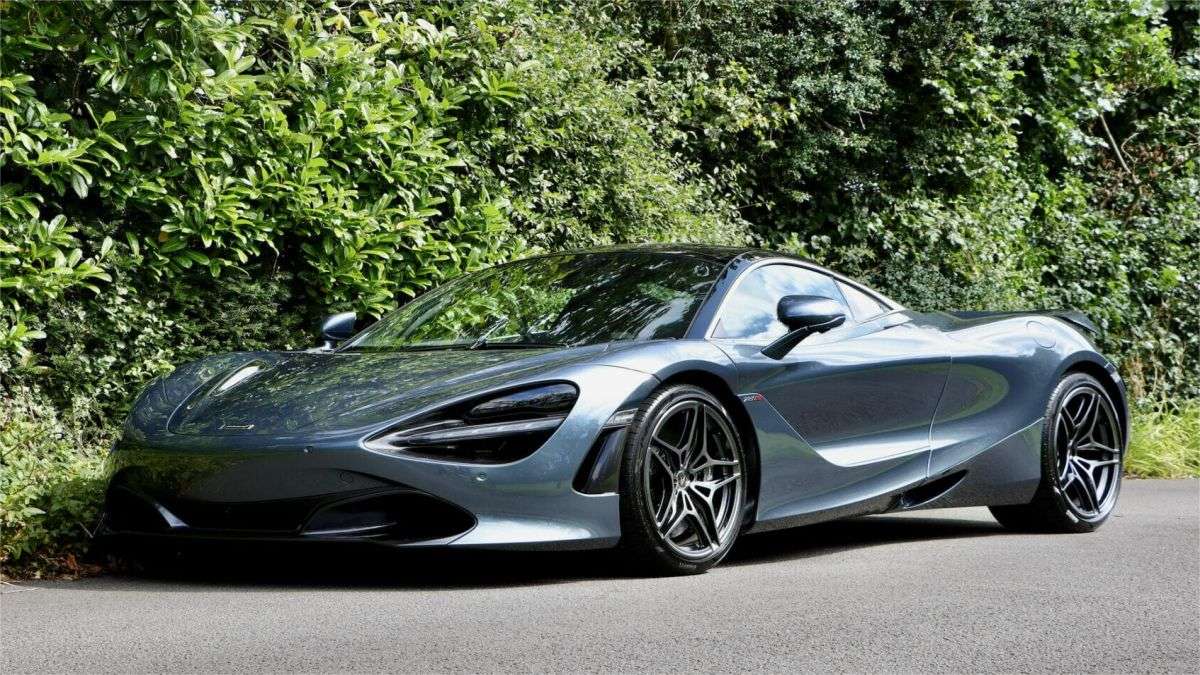
McLaren, a luminary in the automotive realm, represents the epitome of high-performance and precision engineering. Founded in 1963 by Bruce McLaren, the brand has been synonymous with Formula One excellence. McLaren's road cars, exemplified by models like the 720S and the iconic McLaren F1, seamlessly blend cutting-edge technology with aerodynamic prowess. Renowned for lightweight construction and distinctive design, each McLaren is a testament to speed and innovation. With an illustrious racing heritage and a commitment to pushing automotive boundaries, McLaren stands as a beacon of unrivaled craftsmanship, elevating driving experiences to unparalleled heights in the world of supercars.
Meaning and History
-

1963-1967
-
1967-1981
-
1981-1991
-
1991-1998
-
1998-2012
-
2012-2018
-
2018-Now


Advertisement
-
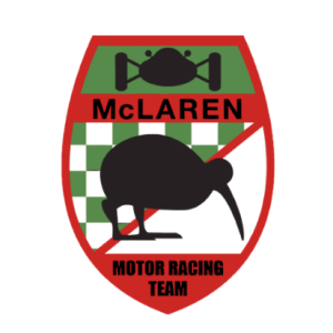
1963 - 1967
Crafted upon McLaren's inception in 1963, the initial logo, envisioned by designer Michael Turner, featured a crest-like design. Displaying a color palette of green, red, and white, it showcased a black silhouette of a kiwi bird—a homage to the homeland of the company's founder, Bruce McLaren.
-
1967 - 1981
The 1966 logo adopts a stylish and modern approach, showcasing a stylized abstract rendering of a kiwi bird, earning the moniker "Speedy Kiwi." This emblem has evolved into a enduring symbol for the McLaren race team, retaining its relevance even today. The sleek black depiction of the bird resonates exceptionally well on both white and the brand's signature orange backgrounds, exuding a strong sense of confidence and expertise. This iconic emblem not only reflects McLaren's racing legacy but also serves as a timeless representation of the brand's enduring commitment to speed, precision, and excellence.
-
1981 - 1991
In 1981, the Speedy Kiwi underwent a transformation, giving way to a bold and dignified logo designed by Raymond Loewy. This resolute and masculine emblem features a prominent black wordmark complemented by a stylized tricolor (black-red-white) checkered flag. The amalgamation of the powerful wordmark and the dynamic flag symbolizes both strength and speed, encapsulating the essence of McLaren's identity. This design shift marked a pivotal moment in the brand's visual representation, marrying sophistication with a dynamic racing spirit.
-
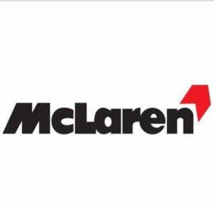
1991 - 1998
The checkered flag gave way to a single red chevron, infusing the logo with a more modern and balanced aesthetic. While the color palette remained unchanged, the typeface underwent a subtle refinement. This evolution retained the brand's classic identity while introducing a contemporary touch, aligning the logo seamlessly with the ever-evolving design landscape.
-
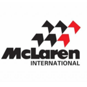
1998 - 2012
In a significant transformation, the sharp-angled chevron yielded to a smooth swoosh symbol, adhering to the brand's classic color scheme. Functioning as a dynamic speed mark, the swoosh introduces a fluid and contemporary aesthetic. The bold yet soft lines of the wordmark contribute to a more harmonized overall logo, departing from the geometrical emblems of the past. The pivotal change in 2003 centered on the typeface, adopting more delicate and elegant lines with a futuristic flair, evoking a sense of motion. The iconic swoosh emblem endures, maintaining its association with the brand, alongside the timeless color palette.
-
2012 - 2018
In the 2012 overhaul, the McLaren logo underwent a notable redesign, introducing a distinctive rectangular framing. This addition marked a significant evolution in the brand's visual identity. The modern and succinct McLaren logo aptly mirrors the brand's powerful and progressive approach to manufacturing and design. The inherent simplicity of the visual identity contributes to the overall sense of luxury and style, encapsulating McLaren's image in a refined and contemporary manner.
-
2018 - Now
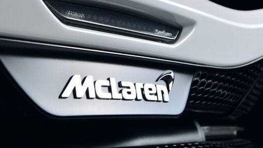
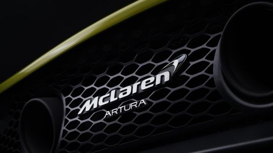
The contemporary McLaren logo epitomizes a sleek and minimalist design. The logo maintains a laconic and modern aesthetic, aligning with the brand's progressive stance in manufacturing and design. With its clean lines and bold lettering, the McLaren logo exudes a sense of power and sophistication, capturing the essence of the brand's high-performance ethos. This emblem stands as a visual representation of McLaren's commitment to innovation, speed, and a forward-thinking approach in the realm of luxury sports cars.
Advertisement
Description

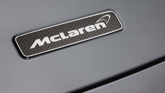
The McLaren Speedmark, an iconic emblem representing the brand, carries various interpretations. One version pays homage to the original Speedy Kiwi logo, resembling a stylized kiwi head with a smoother design. Another rendition features a contemporary and understated chevron pattern, inspired by the brand's logo during its Marlboro sponsorship era.
Shape
The primary font on the central McLaren badge boasts a bold custom sans-serif typeface, characterized by a smooth and robust title character shape. The closest fonts resembling the one employed for the McLaren badge are likely Snasm Heavy and Strelka Ultra, albeit with some customized outline modifications.
Color

Regarding McLaren's visual identity color palette, black and red dominated until 2012. However, in the latest redesign, red was replaced entirely by black. The use of white fonts on plain black banners occasionally incorporates a light gray color, exuding a cool and professional aesthetic.
Emblem

Advertisement
Cars Under This Brand

Advertisement


