Mercedes-Benz Logo
Download JPG
Advertisement
Mercedes-Benz is a world-renowned luxury car brand, which was founded in 1926. It has more than 100 years of history and has become a symbol of German precision manufacturing and high-end technology. Mercedes-Benz has always adhered to the concept of "best or nothing" and implemented it in every car model. The vehicles are designed and produced with exquisite craftsmanship, quality and reliability, and are widely used in luxury sedans, luxury SUVs, luxury buses and other fields.
Meaning and History
-

1902-1909
-
1909-1916
-
1916-1926
-
1926-1933
-
1933-Now
-
1933-1989
-
1989-2009
-
2009-2011
-
2011-Now


Advertisement
-
1902 - 1909
The first presentation of the Mercedes-Benz logo was constructed from a serious and formal oval emblem. Placed horizontally, the badge is inscribed with bold sans-serif text markings, and all the letters display different sizes, enlarging towards the center and then diminishing in size as they move to the right. The badge has a double outline, with the document appearing in monochrome and the crest in dark blue and silver.
-
1909 - 1916
In 1909, the Mercedes-Benz logo was given an elegant and ornate design. Its traditional circular emblem, with its thick double outline, depicted a programmed wreath of flowers. The sans-serif "Mercedes-Benz" is delicately placed on a white background in the inner circle, and the color of the lettering is black, while at the same time demonstrating the strength and vitality of the brand. This magnificent logo undoubtedly represents the nobility and honor of the brand.
-
1916 - 1926
During this period, the brand's logo underwent a design change: in 1916, a new logo was created with a white star in the center, placed on a burgundy background. At the same time, the star was delicately enclosed in a thick, circular frame, which was depicted in white with wordmarks and delicate leaf decorations. The design symbolizes the style, sophistication and strength of the brand with its elegant color palette and delicate decorations.
-
1926 - 1933
In 1926 the brand adopted a very elegant badge with a burgundy red background and a black and white star placed in the center and enclosed in a thick circular frame. The textual markings and leafy decorations in the badge are painted in white, and the overall style demonstrates the style, sophistication and strength of the brand.
-
1933 - Now
The burgundy background was changed to a lighter gray, and the colors of the stars were changed to white and gray, while the thick blue frame remained virtually unchanged. Meanwhile, the leaves on the frame were redrawn to a slightly larger size than the previous version of the logo.
-
1933 - 1989
In 1933, a badge was born on the stage of history. The design of this badge is unique in that it is presented in a black tone that is simple yet futuristic. A white circle serves as the background, giving a bright visual effect. Inside the circle there is a stylized thin and sharp three-pointed star, which has a smooth and firm line with a strong visual impact. The black outline adds a heavy texture to the star that is both striking and very distinctive. The design was undoubtedly bold and innovative for its time, and the meaning it represents is far-reaching and wide-ranging and thought-provoking.
-
1989 - 2009
In 1989, the badge underwent a three-dimensional transformation. The tone of the emblem was replaced by a gradation of gray, a shade that gave it a calm and regal feel. The symbol now features a shiny metallic texture, which creates a beautiful reflective effect when exposed to light, making the entire badge appear more three-dimensional and vivid. Underneath the emblem, an enlarged black serif font is placed, which has bold and strong lines, giving it a solid and substantial feel. The elegantly crafted inscription is vaguely shaded, adding volume and style to the overall image and giving it a modern feel.
-
2009 - 2011
During the period from 2009 to 2011, the design style shifted from three-dimensional to flat design. The logo and text markers were redrawn in a solid gray color, and the overall design was cleaner and more bold. While the tweak did not change the font style, the lines began to look slimmer due to the removal of the shading effect. This simple design style makes the whole logo look cleaner, sharper and more in line with modern aesthetic trends.
-
2011 - Now
In 2011, the brand underwent a striking rebranding of its visual identity. The new logo clearly carries on the DNA of the logo introduced in 1989, but it has been redesigned to present a more rugged, modern and energetic image. The circular frame of the logo has become thicker, giving it a solid and powerful feel, while the lines of the wordmark have become slimmer, creating an elegant and sophisticated visual effect. The choice of typeface seems to take a cue from the Corporate A font family, a typeface known for its timeless elegance and classic design, which has become the new visual symbol of the brand.
Advertisement
Description

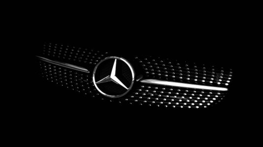
The Mercedes-Benz logo consists of a three-pointed star enclosed within a circle. The three points of the star represent the brand's original focus on universal motorization - on land, sea, and air. The circle surrounding the star symbolizes the brand's commitment to engineering excellence and innovation. The logo has a simple and elegant design, reflecting the brand's reputation for luxury, quality, and technological advancement. It is instantly recognizable and has become an iconic symbol of automotive excellence.
Shape

The Mercedes-Benz logo features a simple yet elegant shape, consisting of a three-pointed star encased within a circle. The star has three distinct, sharp points, and the circle surrounding it is perfectly round. This combination of geometric shapes creates a balanced and harmonious visual representation. The overall design is sleek and timeless, reflecting the brand's commitment to luxury, precision engineering, and innovation. The logo's shape is instantly recognizable and has become synonymous with the Mercedes-Benz brand identity.
Color
The color of the Mercedes-Benz logo is a metallic silver or chrome. This color choice aligns with the brand's image of luxury, sophistication, and modernity. The metallic finish gives the logo a sense of premium quality and elegance, which resonates with the high-end positioning of Mercedes-Benz vehicles. Additionally, the reflective nature of the silver or chrome color adds to the logo's visibility and impact, especially when displayed on the front grille of vehicles or in marketing materials. Overall, the color of the Mercedes-Benz logo complements the brand's identity as a symbol of automotive excellence and prestige.
Emblem