MINI Logo
Download JPG
Advertisement
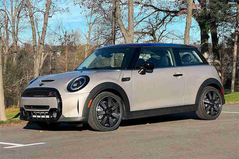
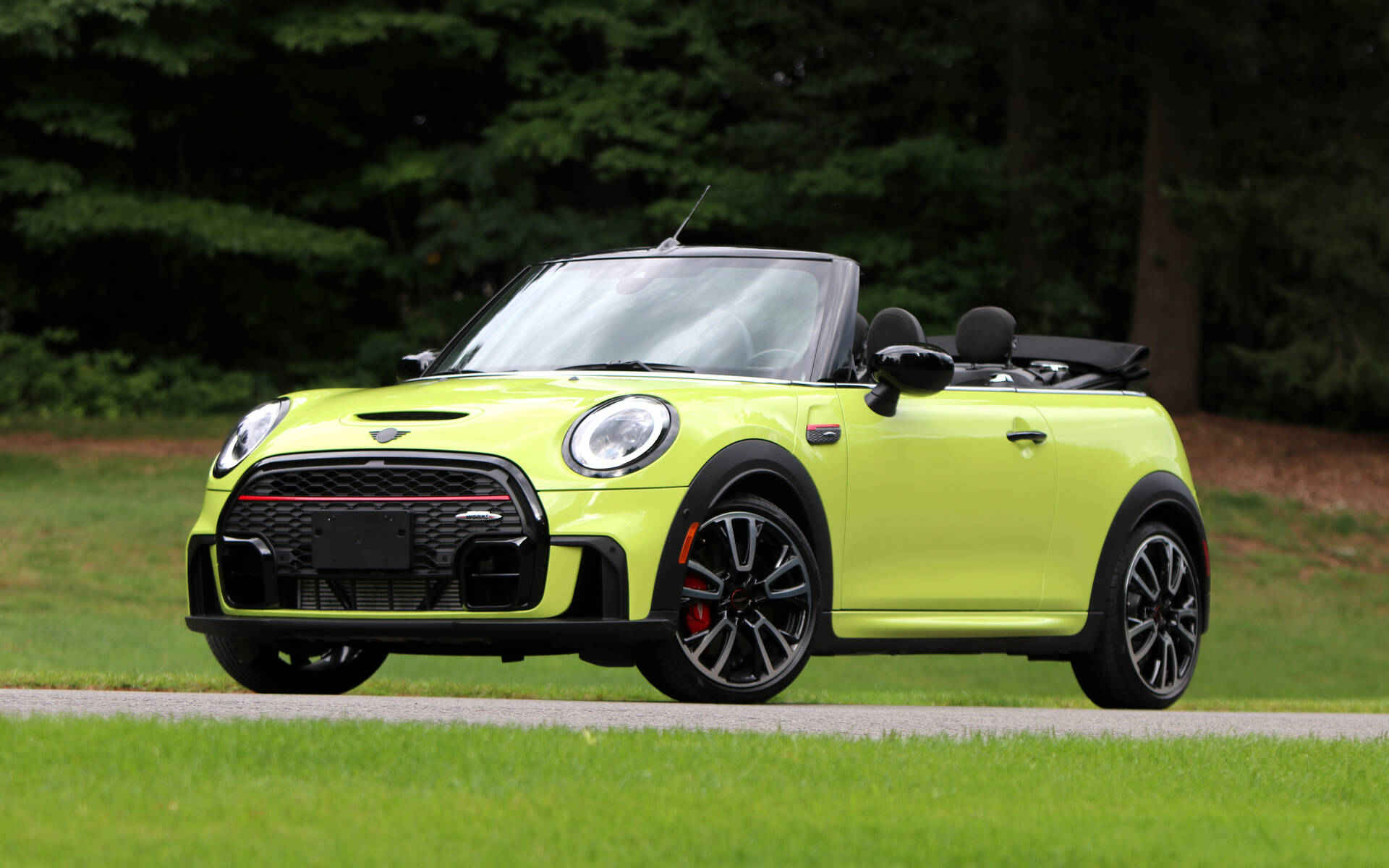
Mini, the iconic British automotive brand, is the embodiment of style, agility, and innovation on four wheels. With a rich history dating back to the 1950s, Mini has redefined the way we think about compact cars. Renowned for its unmistakable retro design, the Mini Cooper remains a symbol of timeless coolness.Mini isn't just about looks; it's a driving experience like no other. Its compact size and nimble handling make city streets your playground, while spirited engines deliver exhilarating performance. From the classic Hardtop to the versatile Countryman, Mini offers a range of models to suit every lifestyle.But Mini is more than just a car; it's a lifestyle. Owners join a community of enthusiasts who appreciate the brand's quirky charm and spirited driving dynamics. Mini is not just a car; it's a statement, a commitment to standing out and enjoying the journey.In a world of mundane transportation, Mini stands out as a brand that celebrates individuality, making every drive an adventure worth having.
Meaning and History
-

1959-1962
-
1962-1968
-
1968-1969
-
1969-2001
-
2001-2018
-
2018-Now


Advertisement
-
1959 - 1962
Throughout its long history, the Mini logo has undergone several changes, reflecting the brand's evolution and adaptation to contemporary design trends. The original logo was introduced in the late 1959s with the first Mini Cooper, with the word 'MINI' wrapped in a simple rectangular border. This minimalist logo embodied the practical and space-efficient design of the car, emphasising practicality and economy.
-
1962 - 1968
In the 1962s, the Mini logo received its first major update, introducing the iconic winged wheel design. The word "MINI" was positioned beneath a stylized winged wheel, emphasizing the car's racing heritage and dynamic performance. This change aligned with the Mini's growing popularity in motorsport and its emergence as a symbol of youthful rebellion and freedom.
-
1968 - 1969
As the 1968s rolled in, the Mini logo took on a simpler, cleaner appearance. The winged wheel was replaced with a streamlined, black-and-white design, while the brand's nameplate remained the central focus. This shift signaled a move towards a more modern, straightforward image, emphasizing Mini's timeless appeal and broadening its market reach.
-
1969 - 2001
In 1969, Mini made significant changes to its logo, signalling a shift in its visual identity. The overall image became a shield interspersed with a black, blue background and bold MINI lettering in white, which looked more striking, in keeping with the design sensibilities of the time and emphasised Mini's timeless appeal.
-
2001 - 2018
The 2001s witnessed another significant transformation in the Mini logo. The black-and-white simplicity was replaced with a more vibrant and three-dimensional logo. The brand name "MINI" was now enclosed within a chrome-like circular frame, giving the logo a premium and contemporary feel, mirroring Mini's position as a high-quality compact car manufacturer in the 21st century.
-
2018 - Now
2019-In 2018, Mini introduced a subtle yet impactful update to its iconic logo. The most notable change was the elimination of the three-dimensional effects that had characterized the previous version. The logo transitioned to a flatter, minimalist design, aligning with contemporary design trends and the digital age. While the circular shape and the brand name "MINI" remained central, the removal of the three-dimensionality rendered the emblem cleaner and more adaptable for various digital platforms. This change demonstrated Mini's commitment to maintaining its classic image while staying current and versatile in the ever-evolving landscape of the automotive industry and branding in the 21st century.
Advertisement
Description

The latest Mini logo, unveiled in 2018, showcases a refined and minimalist design that symbolizes the brand's timeless identity while adapting to contemporary design trends. The logo maintains its classic circular shape, an enduring symbol of unity and completeness. It's a shape that harks back to Mini's heritage while expressing its continued relevance in the 21st century. This circular emblem embodies a sense of continuity, reminding us of the brand's iconic history while signifying its evolution into the modern era.
Shape

The design of the latest Mini logo is characterised by its flat and two-dimensional appearance. This design choice is in line with the modern trend of minimalist, flat logos, making them usable on a variety of digital platforms, such as websites and mobile apps. With no depth or shadows, the logo is clearer and remains visually appealing wherever it is displayed. With its timeless rounded, monochromatic palette and flat design, the latest Mini logo captures the essence of Mini's enduring appeal and its ability to adapt and stay relevant in a rapidly changing world.
Color

In terms of colors, the latest Mini logo is characterized by a harmonious blend of black and white. The black circular background serves as a bold backdrop, providing contrast to the white brand name "MINI" that occupies the center. This monochromatic color scheme emphasizes simplicity, sophistication, and timelessness, giving the logo a clean and versatile appearance. The deliberate choice of black and white underscores Mini's ability to bridge its storied past with a contemporary and adaptable image that appeals to a broad audience.
Emblem


Advertisement
Cars Under This Brand


Advertisement


