Mitsubishi Logo
Download JPG
Advertisement
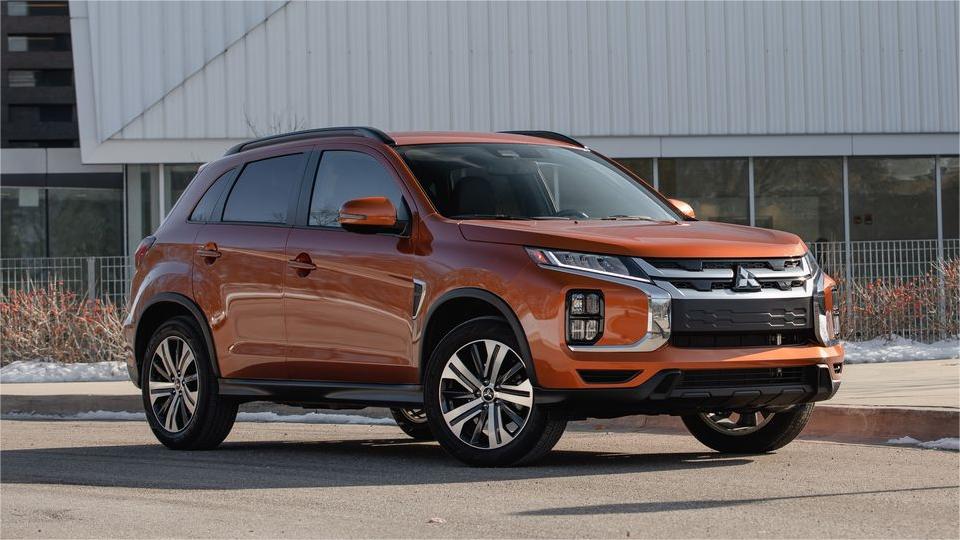
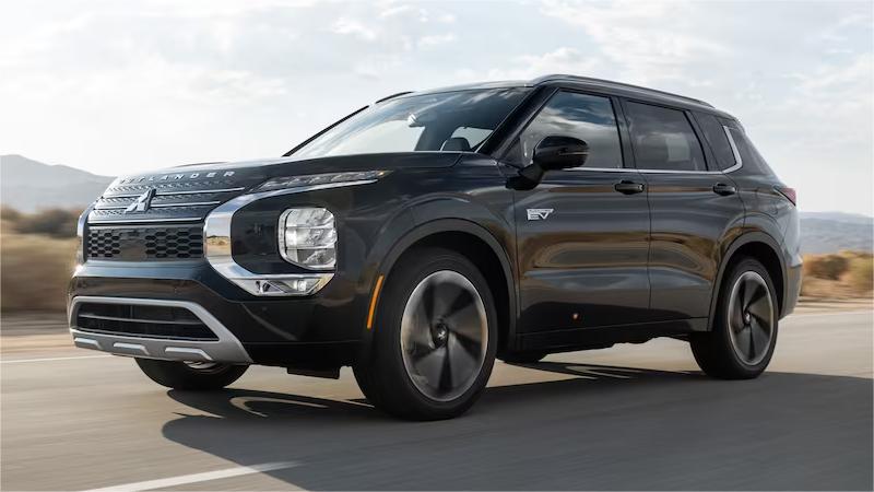
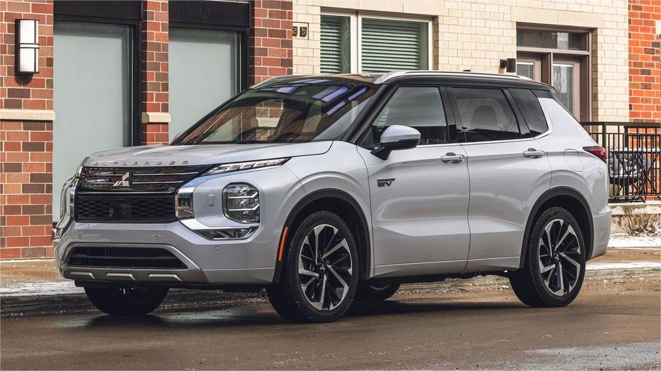
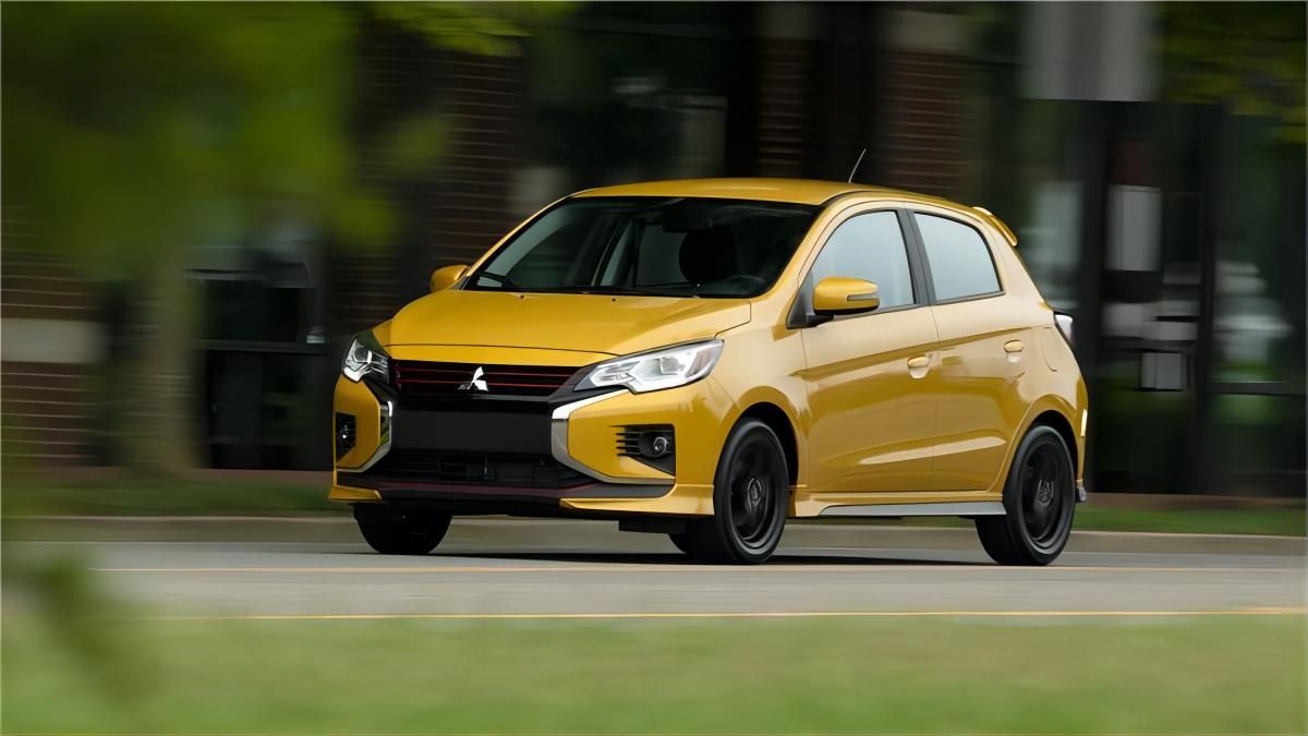
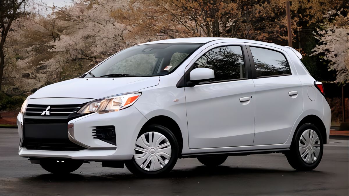
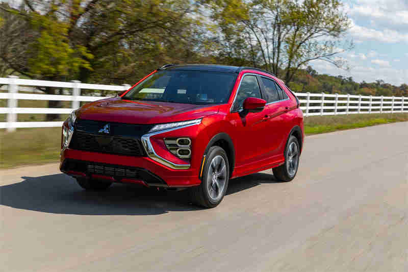
Mitsubishi Motors Corporation is a Japanese multinational automobile manufacturer headquartered in Minato, Tokyo, Japan. Founded in 1917, Mitsubishi Motors is the sixth largest Japanese automaker and the eighteenth largest in the world.Mitsubishi Motors has a wide range of vehicles, including sedans, SUVs, trucks, and minivans.The company was one of the first to introduce all-wheel drive technology to the automotive industry. Mitsubishi Motors has also been a leader in the development of electric vehicles.The company has a strong presence in Asia, North America, and Europe. Mitsubishi Motors is committed to providing customers with high-quality, reliable, and fuel-efficient vehicles.
Meaning and History
-

1870-1873
-
1873-1914
-
1914-1964
-
1964-1985
-
1985-now


Advertisement
-
1870 - 1873
In the nascent stages of the company's existence, for the first three years, the combined emblems of the Iwasaki and Tosa families served as the company's visual representation. This absence of textual identifiers emphasized the significance of the company's heritage and its deeply rooted connections to the founding families. Rather than merely serving as a branding element, this combination of emblems represented a symbolic homage to the company's foundational principles and the individuals who had laid the groundwork for its success.
-
1873 - 1914
In 1873, Mitsubishi Motors Corporation unveiled its now-iconic emblem, a design that has become synonymous with the company's enduring legacy of innovation and excellence. The emblem features three elegant and slender rhomboids, symbolizing the unification of the Iwasaki and Tosa families, the company's founding clans. These rhomboids converge gracefully at the center of the emblem, encircling a small circle that represents unity and harmony.
-
1914 - 1964
In 1955, the Mitsubishi emblem underwent a significant evolution, marking a pivotal moment in the company's visual identity. The central circle, formerly depicted as a delicate ring, was transformed into a solid red dot, exuding a bolder and more assertive presence. This subtle yet significant change imbued the Mitsubishi logo with a sense of strength, confidence, and unwavering determination, perfectly aligning with the company's growing global presence and its steadfast commitment to innovation.
-
1964 - 1985
In 1964, the Mitsubishi emblem underwent a substantial reshaping, resulting in the familiar design we recognize today. The rhomboids, once depicted in a slightly asymmetrical arrangement, were refined and balanced to create a more harmonious and cohesive composition. This transformation imbued the logo with a sense of equilibrium and stability, reflecting the company's unwavering commitment to reliability and expertise.
-
1985 - now
The Mitsubishi wordmark appears on the logo in 1985. The capital letters of the nameplate are executed in a traditional sans serif typeface with masculine straight lines, which are clean and direct. The wordmark features black color, which makes the logo strong and bright.Later the nameplate changes to “Mitsubishi Motors”, but the typeface and color scheme remain untouched.The classic powerful red black and white combination is a perfect choice for a minimalist and geometrical Mitsubishi logo. The straight lines and sharp angles reflect the brand’s energy and passion, evoking a sense of strength and authority.
Advertisement
Description
The now-iconic Mitsubishi emblem, crafted in the 1870s, stands as a testament to the company's rich heritage and enduring legacy. The composition of three elegantly poised red diamonds, instantly recognizable worldwide today, serves as a graphical representation of the company's name meaning. The emblem's origins trace back to the fusion of two family crests: the three rhombuses, symbolizing the Iwasaki family, the founders of Mitsubishi, and the three oak leaves, representing the Tosa Clan, the early employers of Yataro Iwasaki.
Shape
Mitsubishi's emblem is a distinctive three-diamond design that has been in use since the company's founding in 1870. The diamonds are said to represent the three families that came together to form Mitsubishi: the Iwasaki family, the Tosa Clan, and the Yataro Iwasaki family. Each diamond is also said to symbolize strength, reliability, and advancement.The Mitsubishi logo has undergone several changes over the years, but the basic diamond shape has always remained the same. The current logo was introduced in 1996 and features a more modern and streamlined design. The three diamonds are now closer together and the red color is slightly brighter.
Color
The Mitsubishi logo is one of the most recognizable in the world, and its distinctive red color is a major part of its identity. The red is said to symbolize passion, energy, and vitality, qualities that Mitsubishi believes are essential to its brand. The red color has been used in the Mitsubishi logo since the company's founding in 1870. The original logo was much simpler than the current one, featuring just three red diamonds. The shade of red has also varied over the years, but it has always been a bright and vibrant color.The red color is not just a visual aesthetic for Mitsubishi; it is also a symbol of the company's values. Mitsubishi believes that red is a color that represents strength, courage, and determination, qualities that the company strives to embody in its products and services.
Emblem