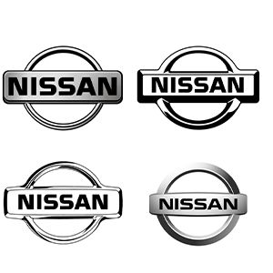
Nissan Logo
Download JPG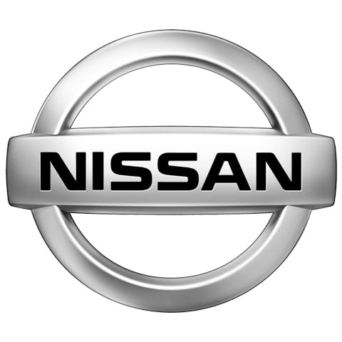
Advertisement
Nissan, a global automotive giant, boasts a rich history dating back to its founding in 1933. Based in Yokohama, Japan, Nissan has become renowned for its innovative and diverse vehicle lineup, including sedans, SUVs, and electric cars. With a presence in over 100 countries, Nissan is a symbol of Japanese engineering excellence. The brand is at the forefront of automotive technology, known for innovations like the Nissan Leaf electric vehicle. Nissan's commitment to sustainability and quality has solidified its place in the competitive automotive industry, making it a trusted choice for millions of drivers worldwide.
Meaning and History
-

1930-1940
-
1940-1950
-
1950-1960
-
1960-1970
-
1970-1988
-
1988-1989
-
1989-1990
-
1990-2012
-
2012-2020
-
2020-Now
Advertisement
-
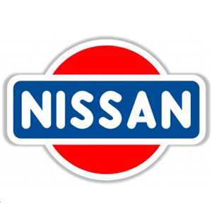
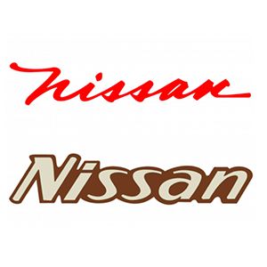
1930 - 1940
Nissan's first badge features a blue rounded rectangle design that is eye-catching and rich in substance. In the center of the badge, the company name is strikingly presented in white sans-serif font. The capitalization of the font adds to the expressiveness of the title. Against this background, a striking red circle stands, symbolizing the rising sun and paying tribute to the rich traditions and culture of the Japanese nation. Originally, the word "Datsun" was part of Nissan's history, consisting of "DAT" (an acronym for investor Den, Aoyama and Takeuchi) and "sun." Later, the name "Nissan" became associated with the hieroglyphs "ni" ("sun") and "ssan The name "Nissan" is then harmoniously blended with the hieroglyphs "ni" ("sun") and "ssan" ("birth") to symbolize the harmonious birth of a brand that has become synonymous with innovation and automotive excellence.
-
1940 - 1950
The logo was redesigned in 1940 to feature a more stylized geometric shape. The wordmark was executed in a hand-drawn, friendly typeface, with an enlarged letter "A". The "rising sun" emblem previously used by Nissan also appeared in this version of the logo, just above the wordmark.
-
1950 - 1960
In 1950, Nissan redesigned the logo again with a cleaner, more modern design. A rectangle replaced the previous rectangle, and the word mark was changed to a more fluid font. By 1959, the red rectangles were diminishing, and the rounded corners and light-colored outlines at the corners had disappeared.
-
1960 - 1970
In 1960, the logo was changed again by removing the original background geometry and opting for the original handwritten font, with the word "Nissan" highlighted in a series of red letters, and after 1967, the logo was changed to an italicized inscription of uneven thickness in a predominantly brown color.
-
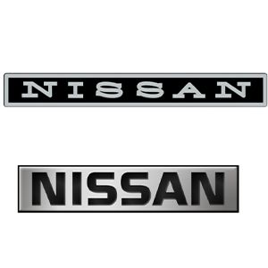
1970 - 1988
In 1970, the original rectangular frame returned, with a new badge with a black base and a silver outline, and a unified font for the word "Nissan".In 1978, the colors of the logo were changed, the black base was replaced with silver, and the outline became black, with the word "NISSAN" in bold black inside the silver nameplate.
-
1988 - 1989
In 1988, theThe original rectangle got a color adjustment and the letters became white-gray. The entire rectangle was placed across a silver-gray circle, and the entire border became wider and unevenly colored, bringing out the 3D effect.
-
1989 - 1990
In 1989, the logo was simplified, leaving the word "Nissan" in bold black against a blank background, with no unnecessary embellishments or complex fonts, just to make the Nissan logo more memorable.
-
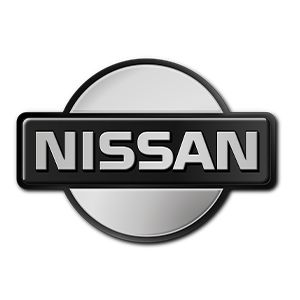
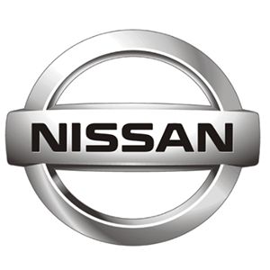
1990 - 2012
In 1990, a new logo similar to the 1988 logo appeared; there is not much difference between the two years in terms of outline, the difference being that the '90 logo has a black inscription on a silver rectangle, connected at the top and bottom by two half rings. The black outline and gradient give the image a three-dimensional feel. In later years, the Nissan logo built on this outline with various adjustments, and by 2001, the logo had become three-dimensional, consisting of a wide ring (background), a convex rectangle (center) and the word "Nissan".
-
2012 - 2020
In 2012, a new version of the logo was reintroduced with a different color scheme than before. It has more light gray, white highlights and gradients.
-
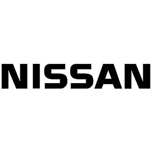
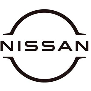
2020 - Now
Nissan's new logo is sleeker and more dynamic than its predecessor, with the company name in a simpler font and a thinner circle. the word "Nissan" appears on a blank white background, and the logo symbolizes Nissan's commitment to innovation, electrification, and a new brand image for the future.
Advertisement
Description
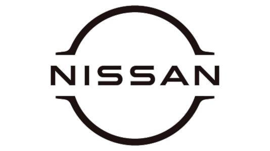
Nissan's logo is a sleek and modern design that reflects the brand's commitment to innovation and progress. The emblem features the company's name, "Nissan," rendered in a clean and bold sans-serif font. Surrounding the company name is a distinctive, thin circle. This circle, while subtle, adds a dynamic and forward-looking element to the logo. The thinner circle design symbolizes movement, progress, and Nissan's transition to a more electric and sustainable future. Nissan's logo is a visual representation of the brand's dedication to cutting-edge technology, quality, and a refreshed, contemporary brand image, making it a symbol of trust and innovation in the automotive world.
Shape
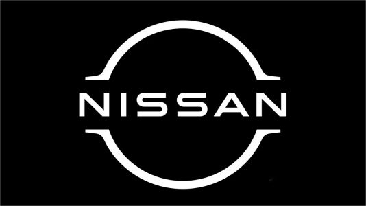
Nissan's logo shape is a harmonious blend of simplicity and modernity. The central element of the logo is a sleek, thin circle, encompassing the company's name. This circle symbolizes movement, progress, and innovation, reflecting Nissan's commitment to staying at the forefront of automotive technology. The thin and refined nature of the circle adds a sense of lightness and dynamism to the logo, making it visually appealing and evoking a feeling of forward motion. Nissan's logo shape is a testament to the brand's dedication to innovation and a more sustainable future, while retaining a contemporary and timeless aesthetic that represents its enduring legacy in the automotive industry.
Color
The Nissan logo is primarily based on a clean and modern color scheme. The company name "Nissan" is usually in eye-catching white, and the circle around the company name is also in white, conveying a sense of simplicity, clarity and modernity. White symbolizes purity and openness, and reflects Nissan's commitment to transparency and quality in its products and operations. Among the colors of the Nissan logo, white not only represents a commitment to quality and precision, but also highlights the brand's pursuit of modernity and sustainability, making it a symbol of trustworthiness and reliability in the automotive world.
Emblem
Advertisement
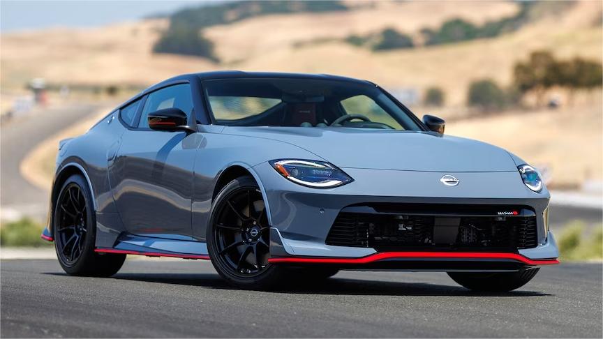
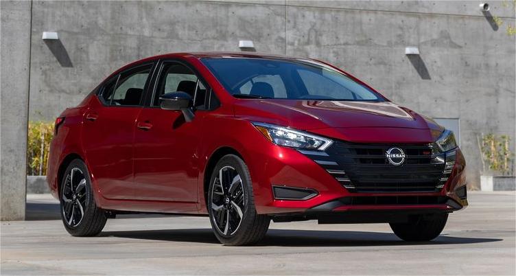
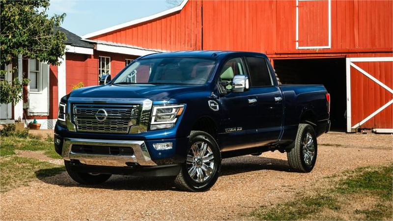
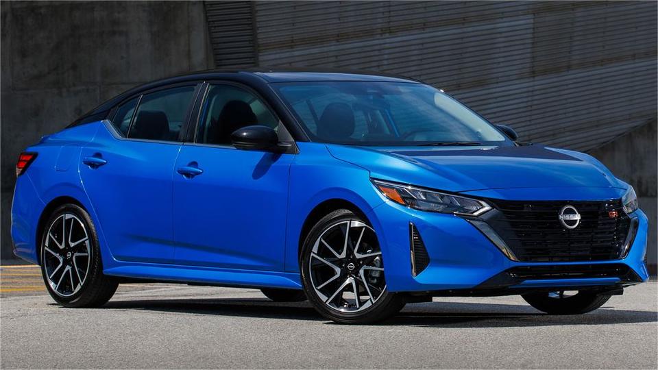
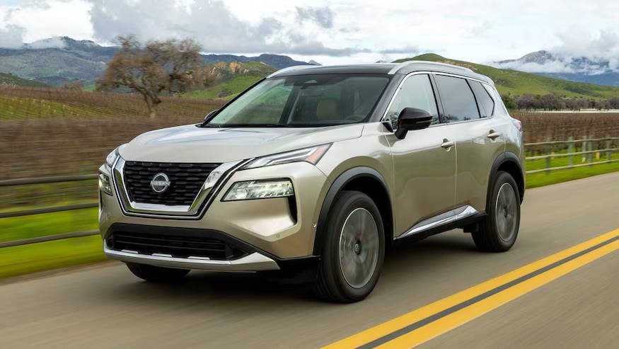
Cars Under This Brand

Advertisement


