Audi Logo
Download JPG
Advertisement
Audi is a renowned German automobile manufacturer, celebrated for its commitment to innovation, engineering excellence, and a rich automotive heritage. Founded in 1909, Audi has consistently pushed the boundaries of automotive technology, earning a reputation for producing high-quality, luxury vehicles. Known for its iconic four-ring logo, Audi is a subsidiary of the Volkswagen Group and is headquartered in Ingolstadt, Germany.
Audi's product lineup includes a diverse range of vehicles, from compact sedans to high-performance sports cars and SUVs. The brand is synonymous with cutting-edge technology, featuring advanced driver-assistance systems, impressive performance engines, and distinctive design. Audi's dedication to sustainability and electric mobility is evident in its development of electric and hybrid models.
With a global presence and a commitment to customer satisfaction, Audi has a loyal and discerning customer base, making it a symbol of automotive excellence, innovation, and sophistication.
Meaning and History
-

1909-1909
-
1909-1932
-
1932-1949
-
1949-1969
-
1969-1995
-
1978-1995
-
1995-2009
-
2009-2016
-
2016-Now


Advertisement
-
1909 - 1909
"Audi's first logo, introduced in 1909, was a forerunner version consisting of an oval outline with a handwritten inscription in diagonal lines. The logo was finished in dark gray, giving it a professional and austere appearance.
-
1909 - 1932
In 1909, Audi introduced two nearly identical emblems. The former looks like a huge number "1" coming out of a sphere half-hidden behind a black triangle, pointing downwards. The word "Audi" is written in narrow white cursive on a black background. In the latter case, the original Audi font has been changed to white cursive with thick, smooth lines along the top line of the geometric figure.
-
1932 - 1949
In 1932, a prototype of the Audi Circle appeared, with four equal-sized rings arranged in a "one" and linked together, each painted with the logo of one of the four brands, Audi, DKW, Horch, and Wanderer Motors, in blue.
-
1949 - 1969
In 1949, the Four Rings logo underwent a major simplification. This simplification removed the branding from the emblem and replaced it with a very slender horizontal rectangle that crosses the circle in the center, creating a clean and modern visual effect. This new logo is topped with a capitalized sans-serif inscription that stands out and contrasts with the clean lines of the horizontal rectangle and the circle. The design of this new logo retains the recognizability of the Four Rings brand while giving it a new, modern image for the future.
-
1969 - 1995
In 1969, the Auto Union officially changed its name to Audi, which led to another change in the logo. This time the rectangular banner in the logo was removed, making the whole emblem more simple and modern. The Audi emblem, now consisting of four thIn 1969, the Auto Union officially changed its name to Audi, which led to another change in the logo. This time the rectangular banner in the logo was removed, making the whole emblem more simple and modern. The Audi emblem, now consisting of four thick blue rings connected to each other, displays a tightly knit symbol of strength and confidence. These four rings not only represent Audi's excellence and craftsmanship as an automobile manufacturer, but also convey Audi's strong confidence in its future development and unlimited potential.During the same period, Audi also introduced an oval logo with the word "Audi" in customized sans-serif bold white lettering placed inside a solid black oval.
-
1978 - 1995
In 1978, the original black oval was given new life and it became even more striking. The original black became brighter with the addition of a vibrant red color, and the addition of a thin double white and red outline added layers and dimension to the shape.
-
1995 - 2009
In 1995, the four rings were combined with the word "Audi" in the form of four silver three-dimensional ring symbols with bold red lettering directly below.
-
2009 - 2016
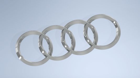
In 2009, the logo was changed once again, with the four circles enlarged, the word "Audi" reduced and placed in the lower left corner of the circles, and the typeface changed to the traditional sans-serif typeface, with a slightly lengthened shape.
-
2016 - Now
In 2016, the logo went through a simplification. All three-dimensional effects were eliminated, the iconic symbol was rendered in solid black and no longer contained additional letters. At the moment, the four rings leave more space in the overlapping areas and glow with a stronger and sleeker vibe.
Advertisement
Description

The Audi badge, often recognized as one of the most iconic emblems in the automotive world, consists of four interlocking rings. These rings represent the four founding companies that merged in 1932 to form Auto Union, which eventually evolved into the Audi we know today. In its current form, it showcases a clean, minimalist design with no additional lettering, rendered in pure black. This emblem exudes a sense of strength, sophistication, and modernity, while the four rings signify the unity of the brand's history and its commitment to excellence in the present day.
Shape
Audi's logo features a striking and instantly recognizable design, comprising four interlocking rings. These rings are arranged in a simple, horizontal fashion. The symmetry and geometric precision of the logo give it a sense of balance and unity. The emblem's shape is clean, minimalist, and iconic, with no extraneous details. The circles, representing the four founding companies that merged to create Auto Union, which later became Audi, project a sense of cohesion and continuity in the brand's history. The logo's shape is both timeless and modern, embodying Audi's commitment to innovation and its rich automotive heritage in a visually appealing and memorable form.
Color
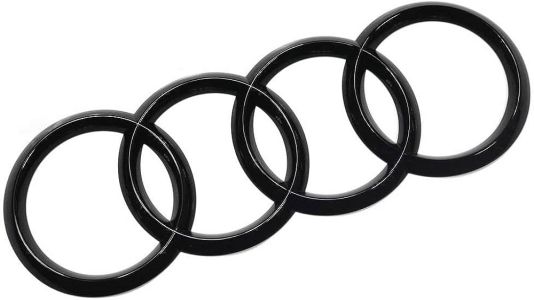
Audi's logo is characterized by its use of a pure, sleek black color. This black hue imparts a sense of elegance, sophistication, and professionalism to the emblem. The choice of black underscores Audi's commitment to a timeless and refined aesthetic. It creates a strong visual contrast against the white or silver backgrounds often found on Audi vehicles, enhancing the logo's visibility and making it stand out with a striking monochromatic contrast. The black color evokes a sense of prestige, representing the brand's dedication to quality and luxury. It complements the emblem's geometric design, resulting in an iconic and enduring symbol of automotive excellence.
Emblem


Advertisement
Cars Under This Brand


Advertisement


