Rolls-Royce Logo
Download JPG
Advertisement
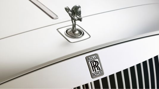
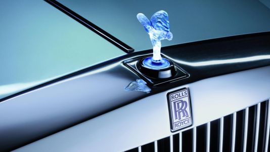
Rolls-Royce, the epitome of automotive luxury, effortlessly marries craftsmanship and innovation. With a storied heritage dating back to 1904, this British marque has consistently set the standard for opulence on wheels. Each Rolls-Royce vehicle is a masterpiece, meticulously handcrafted with unparalleled attention to detail at their Goodwood facility. The iconic Spirit of Ecstasy adorns the grille, symbolizing the brand's commitment to grace and elegance. Behind the wheel, the experience transcends mere transportation; it's a journey in bespoke comfort, where cutting-edge technology seamlessly integrates with timeless design. Rolls-Royce remains synonymous with exclusivity, catering to a discerning clientele that demands not just a car, but an unparalleled statement of affluence. Beyond the exquisite automobiles, Rolls-Royce maintains its status as a symbol of prestige, a testament to a legacy of excellence that continues to shape the future of automotive luxury.
Meaning and History
-

1906-1934
-
1911-1934
-
1911-1973
-
1911-2020
-
1973-1998
-
1998-Now
Advertisement
-
1906 - 1934
Rolls-Royce's inaugural logo, born in 1906, stands as a testament to the early essence of the brand. The original emblem, characterized by magnificence and refinement, effectively conveyed the passion and power inherent in Rolls-Royce vehicles. Crafted in the form of a grand emblem, the logo encapsulated the luxury synonymous with the brand. Notably, the double R logo made its debut during this period but was not yet employed as an independent entity; instead, it was positioned at the heart of the emblem. This strategic placement emphasized the centrality of Rolls-Royce's commitment to precision engineering, encapsulating the spirit of collaboration between Sir Henry Royce and Charles Rolls in the early years.
-
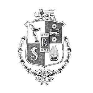
1911 - 1934
In the intervening years, 1911, Rolls-Royce introduced a change to the logo, with the overall shape of the emblem being elongated and the decorative elements removed and replaced by two majestic lions standing proudly on either side of the logo. Despite these changes, the distinctive double R logo remains at the center, preserving the brand's basic identity. The redesigned logo is even more luxurious than its predecessor, offering a more refined and elegant aesthetic. The inclusion of the lion symbolizes strength and majesty, in keeping with the brand's commitment to producing cars that embody power and refinement.
-
1911 - 1973
Beginning in the 1930s, Rolls-Royce did away with the coat of arms, retaining only the iconic symbol. During this period, Rolls-Royce began to adopt a monochromatic color palette that emphasized the brand's professionalism and authority. The refined logo became the quintessential symbol of elegance and high quality. In the following years, the brand made some subtle adjustments, incorporating silver tones and refining the lines for a more polished look. Despite these updates, the original style and tradition inherent in the logo remained intact.
-
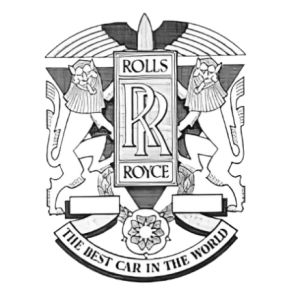
1911 - 2020
The 1911 badge for this iconic brand has been in use for a relatively short period of time, but the image of the goddess of celebration on the badge has been perfectly integrated into the visual identity of the luxury brand. The overall feel of the badge is chic and sophisticated with its light gray, dark blue and white color palette. This combination not only enhances the aesthetics of the logo, but also reinforces the brand's commitment to a sophisticated, stylish image. The image of the goddess on the badge and the carefully chosen color palette has become an integral and distinctive element of the luxury brand's visual narrative.
-
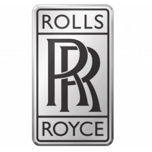
1973 - 1998
In the year 1973, the Rolls-Royce logo underwent a significant redesign, departing from intricate patterns in favor of a more streamlined approach. The new design featured a straightforward blue square with the iconic "RR" letters in silver and white, presented in a distinctive signature font. Notably, the letters "RR" are subtly extended at the end of the line, contributing to a unique and recognizable visual identity. The deliberate contrast of silver and white against the blue backdrop, coupled with the elegant lines, imparts a sense of sophistication to this simplified badge.
-
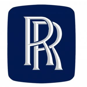
1998 - Now
In 1998, Rolls-Royce updated its logo again, from the original blue background to a sleek silver color. The shape of the logo has also changed, from a square to a vertically oriented rounded rectangle. In the center, the iconic "RR" letters are in striking black, surrounded by a thin black outline. The brand name is now elegantly etched along the top and bottom of the logo in a modern medium-sized sans-serif uppercase font. A symbol of style and luxury for many years, Rolls-Royce will adopt this new style as it continues to evolve and maintain its legendary status in the realm of sophistication and luxury.
Advertisement
Description
The latest iteration of the Rolls-Royce logo showcases a refined and modern design that reflects the brand's commitment to contemporary elegance. The iconic emblem has transitioned from its original blue background to a luxurious silver hue, radiating sophistication. The shape has evolved into a vertically oriented rounded rectangle, presenting a harmonious balance of form. At the logo's center, the distinctive "RR" letters command attention in bold black, skillfully integrated within the sleek design. A subtle black outline frames the letters, contributing to the logo's polished appearance. The brand name is tastefully incorporated along the top and bottom sections, rendered in a modern medium-weight, sans-serif, uppercase font.
Shape
All Rolls-Royce logos showcase the distinctive double R emblem, a graceful and symmetrical composition of two intertwined capital Rs. This deliberate design embodies the brand's unwavering dedication to precision and craftsmanship, accentuating a harmonious balance. The use of cursive or calligraphic styling for the letters contributes an additional layer of sophistication to the overall aesthetic. Notably, these iconic badges are frequently encased in a circular or shield-like frame, a deliberate choice that imparts a timeless and classic design sensibility. This framing technique not only enhances the visual appeal but also underscores Rolls-Royce's commitment to a heritage of enduring elegance. In amalgamating these design elements, Rolls-Royce consistently reinforces its image as a symbol of luxury, precision, and timeless automotive artistry.
Color
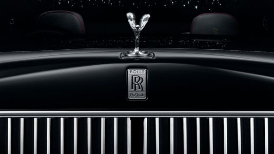
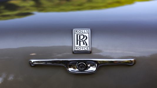
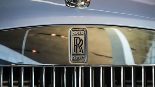
Historically, the Rolls-Royce emblem has consistently conveyed the brand's dedication to luxury and sophistication through its silver or chrome finish. The iconic double R logo is typically positioned against a backdrop of black or dark colors, a deliberate choice that not only boosts visibility but also contributes to cultivating an ambiance of opulence. This design tradition underscores Rolls-Royce's unwavering commitment to crafting vehicles that epitomize not just mechanical excellence but also an aesthetic of refined elegance. The intentional contrast between the emblem and its background serves to emphasize the brand's timeless pursuit of unparalleled quality and distinction. In adhering to this design language, Rolls-Royce continues to reinforce its image as a symbol of automotive prestige and exclusivity.
Emblem
Advertisement
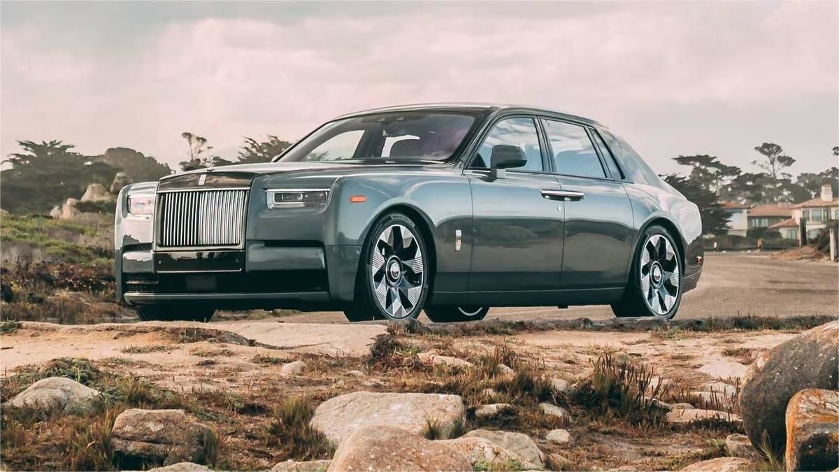
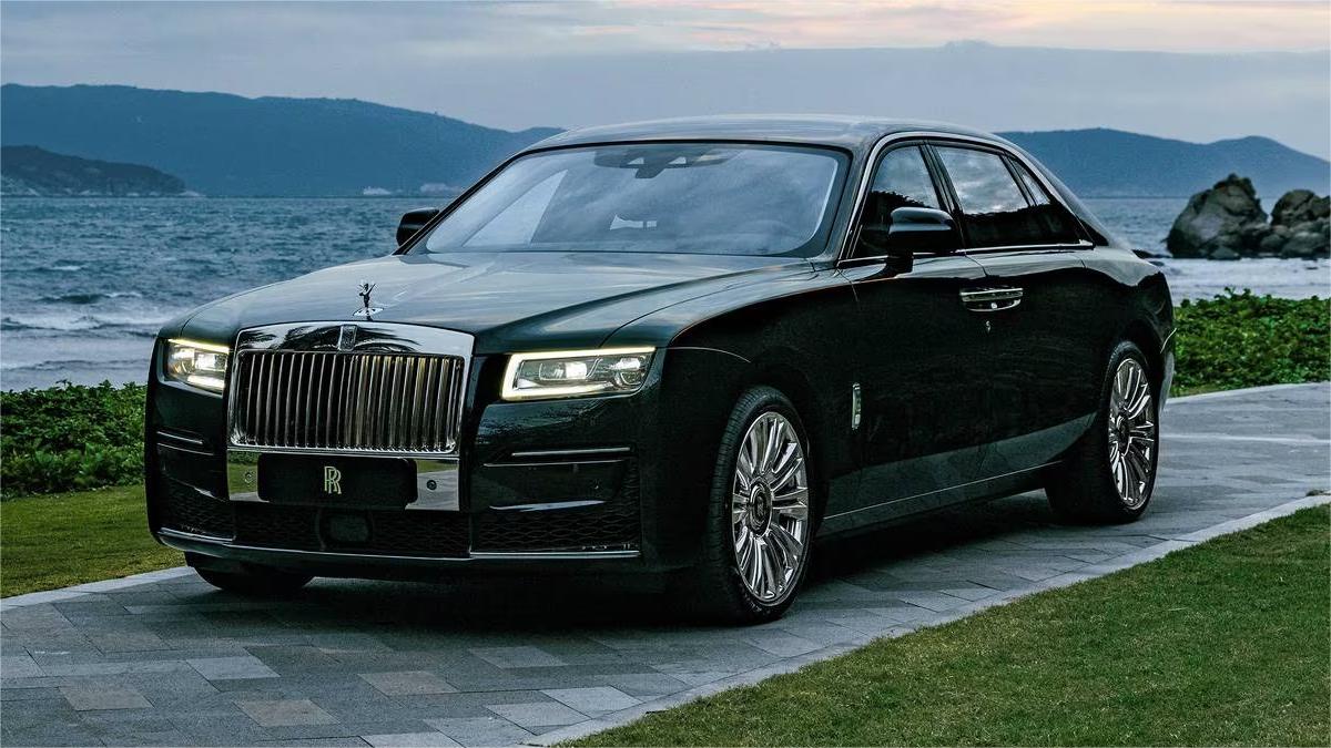
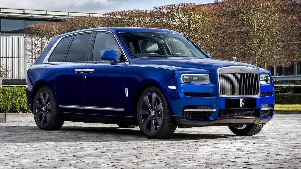
Cars Under This Brand
Advertisement


