Toyota Logo
Download JPG
Advertisement
Toyota is a renowned and globally recognized automobile brand that has left an indelible mark on the automotive industry since its inception. Founded in 1937 by Kiichiro Toyoda, Toyota has evolved into one of the world's largest and most influential automakers. Headquartered in Toyota City, Japan, the company has consistently set industry standards for innovation, quality, and efficiency, earning a sterling reputation for its commitment to producing reliable vehicles.Toyota's success can be attributed to its unwavering dedication to the principles of "continuous improvement" and "lean manufacturing." The company's production system, often referred to as the Toyota Production System, has become a benchmark for efficiency and quality control in manufacturing across various industries. This methodology emphasizes reducing waste and optimizing production processes, resulting in vehicles known for their durability and affordability.
Meaning and History
-

1935-1948
-
1949-1957
-
1958-1978
-
1989-Now

Advertisement
-
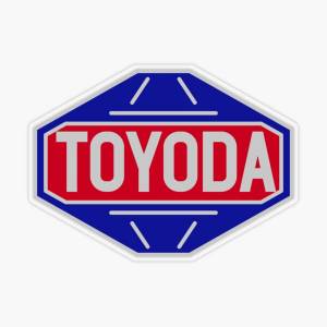
1935 - 1948
Since the G1 truck and the AA model were developed by the automotive division of Toyota Automatic Loom Works, Ltd. (before the division was spun off as Toyota Motor Corporation), the model names are preceded by the Toyota brand name.
-
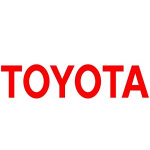
1949 - 1957
In 1936, the Toyota car brand introduced a logo that marked a significant shift from its earlier emblem, reflecting the evolving ethos of the company. This logo featured the company's name in Japanese characters, "トヨタ自動車," prominently displayed within a stylized, circular frame. The circular motif symbolized the sun, alluding to Japan's "Land of the Rising Sun." It was a departure from the earlier three-oval logo and showcased the company's patriotic spirit. This change aimed to present Toyota as a distinctly Japanese brand, emphasizing its deep-rooted heritage and commitment to Japanese craftsmanship. The 1936 logo represented a pivotal moment in Toyota's branding, laying the foundation for its identity in the years to come.
-
1958 - 1978
In 1958, toyota redesigned its logo for the American market. Only red lettering outlined in broad strokes was used, with a white background. It was a simple and strict look, while at the same time explaining the brand's identity. By 1978, the font color had changed to red. The lines were bolder and more balanced.
-
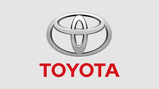
1989 - Now
In 1989, Toyota introduced a logo that represented a transformational phase in the brand's image. The logo retained the company name "Toyota" but adopted a more modern geometric design. The wordmark featured bold capital letters placed outside an oval border, symbolizing a sense of openness and global connectivity. The oval has been likened to the orbit of the earth, signifying Toyota's global presence and commitment to mobility on a global scale. The updated logo moves away from traditional Japanese symbolism and emphasizes Toyota's position as a contemporary international automotive leader. It symbolizes Toyota's ambition to transcend national boundaries and strengthen its position in the global automotive industry.
Advertisement
Description
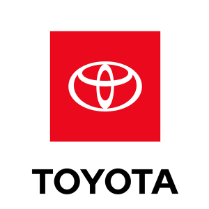
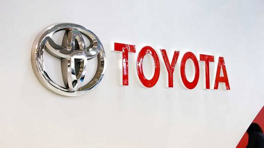
Toyota introduced an upgraded logo in 2020, marking a significant shift in its brand identity. This update aimed to modernize the emblem while still paying homage to the company's rich heritage. The redesigned logo comprises two main components: the iconic three-oval symbol and the wordmark "Toyota." The concept behind this upgrade can be described as a fusion of tradition and evolution.
Shape
The three-oval symbol, which has been synonymous with Toyota since its inception, remains a central element of the logo. It represents three core values - the heart of the customer, the heart of the product, and the heart of progress. This continuity ensures that Toyota's heritage and principles are not lost in the transition but are revitalized.
Color

The red color in the Toyota logo is often associated with energy, passion, and excitement. It reflects the brand's dynamism and innovation in the automotive industry. Additionally, red is known to symbolize reliability and strength, reinforcing Toyota's commitment to producing dependable and durable vehicles. The white background, on the other hand, represents simplicity and purity, highlighting the brand's focus on quality, safety, and the environment.
Emblem

Advertisement
Cars Under This Brand


Advertisement


