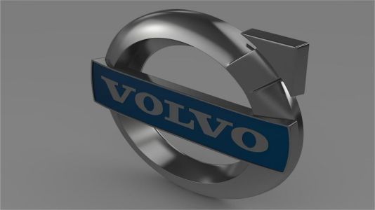
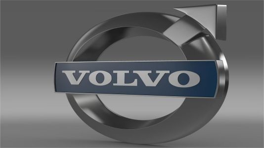
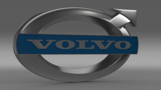
Volvo Logo
Download JPG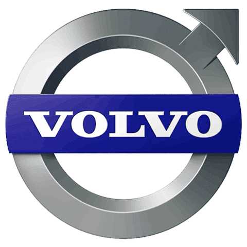
Advertisement
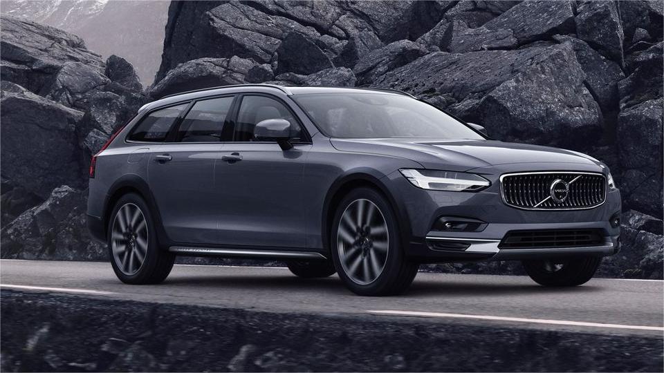
Volvo, a renowned Swedish automaker, stands as a symbol of safety, innovation, and Scandinavian design excellence. Established in 1927, Volvo has a rich legacy of producing vehicles that prioritize the well-being of both drivers and passengers. The brand's commitment to safety innovation is legendary, having introduced groundbreaking features like the three-point seatbelt, which has become an industry standard.
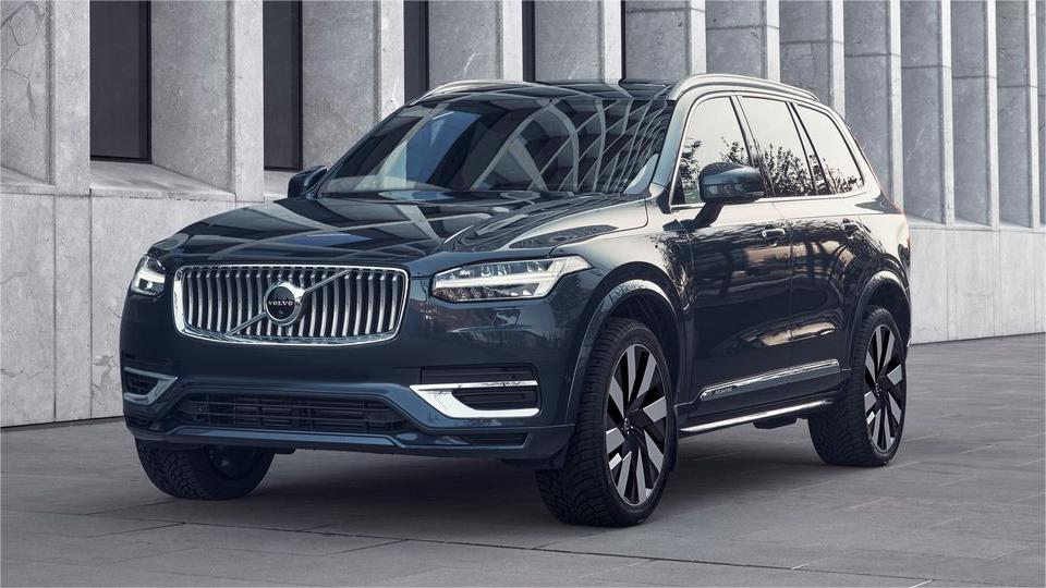
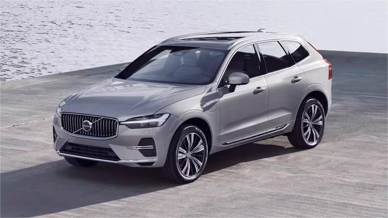
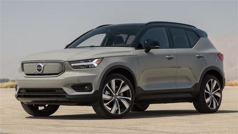
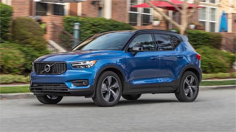
Volvo's contemporary lineup of vehicles showcases a seamless fusion of performance, sustainability, and luxurious comfort. With a strong emphasis on electric and hybrid technology, Volvo is at the forefront of environmental responsibility.
Marrying elegant design with advanced engineering, Volvo consistently produces cars that are both stylish and dependable. Volvo's mission is to provide a safe, sustainable, and luxurious driving experience, and it continues to make strides in achieving this goal.
Meaning and History
-

1927-1930
-
1930-1959
-
1959-1970
-
1970-1999
-
1999-2013
-
2013-2014
-
2014-2021
-
2021-2023
Advertisement
-
1927 - 1930
From 1927 to 1930, Volvo's logo was a straightforward yet impactful design. It featured a circular emblem with a diagonal, iron-like slash across it. This emblem bore the symbol of Mars, the Roman god of war, signifying Volvo's dedication to creating robust and durable vehicles. The iron-like appearance denoted strength and dependability, values at the core of Volvo's identity. This early logo emphasized Volvo's commitment to producing cars that could withstand the toughest conditions and represented the brand's reputation for building vehicles renowned for their reliability and resilience. It was a clear reflection of Volvo's mission to deliver dependable and durable automobiles.
-
1930 - 1959
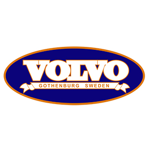
From 1930 to 1959, the Volvo logo was located on a thick horizontal line through the center of the circle, the left half of which was "cut" into three thinner lines, symbolizing movement. The Volvo typeface is written in all red capitals, and the contrast between red and silver symbolizes Volvo's passion and power. The contrast between red and silver symbolizes Volvo's passion and strength. Over the years, the design of the emblem has become more streamlined and stylized. The logo's association with Mars reflects the brand's commitment to the safety and durability of its cars, embodying Volvo's core values. The logo clearly reflects Volvo's mission to become synonymous with safety in the automotive industry by producing vehicles that can withstand the challenges of the road and prioritize the well-being of their occupants.
-
1959 - 1970
From 1959 to 1970, the designers retained the shape of the arrow of the previous logo, but placed the banner with the name inside the circle. During this period, the design of the logo became more streamlined, presenting a cleaner and more modern look. It continues to represent Volvo's mission to produce cars that prioritize the well-being of drivers and passengers. The logo symbolizes Volvo's reputation for safety and reliability and reinforces Volvo's brand image as a rugged and reliable car manufacturer.
-
1970 - 1999
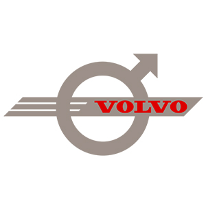
From 1970 to 1999, the change on the logo was changed from a solid line to an empty circle with an arrowhead, outlined with thin lines on either side. The corners were softened to balance perfectly with the rounded base of the wordmark, and the typeface showed Volvo in blue to make it more visually appealing. During this period, the design of the logo continued to evolve, with a more modern, stylish look that reflected the changing automotive industry. It still clearly represents Volvo's mission to build cars that prioritize the safety and well-being of their occupants. Further strengthening Volvo's brand image.
-
1999 - 2013
From 1999 to 2013, Volvo's logo maintained its iconic iron emblem, symbolizing the brand's unwavering commitment to safety and durability. The diagonal slash, reminiscent of the ancient Roman symbol for Mars, represented Volvo's dedication to constructing sturdy and reliable vehicles. During these years, the logo's design underwent a refined and more contemporary update, reflecting the brand's evolving image. It continued to embody Volvo's mission to manufacture cars that prioritized occupant safety and well-being. This emblem was synonymous with Volvo's reputation for producing vehicles celebrated for their reliability and resilience, solidifying the brand's identity as a leader in safety and quality.
-
2013 - 2014
In 2013, Volvo introduced a subtle but notable update to its iconic logo. The familiar iron emblem remained, retaining its connection to safety and durability, with the diagonal slash inspired by the Roman symbol for Mars, the god of war. However, the overall design became sleeker and more streamlined, aligning with Volvo's modern image. This refined emblem reflected the brand's ongoing commitment to producing vehicles that placed safety at the forefront, emphasizing Volvo's reputation for reliability and resilience. The logo adjustment subtly signified Volvo's evolution while preserving its core values of safety, quality, and unwavering dedication to protecting the well-being of drivers and passengers.
-
2014 - 2021
From 2014 to 2021, Volvo's logo retains the iconic iron emblem but is now three-dimensional, with cleaner and more confident lines of type, and a combination of blue and silver that celebrates Volvo's values of quality and design, evoking the brand's strong commitment to reliability, safety and durability. During this period, the logo's design underwent a subtle yet sophisticated update, in keeping with Volvo's modern, progressive image.
-
2021 - 2023
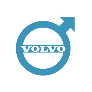
The style of the new logo is roughly the same as the previous one, which has been intact within a circular frame, but with a vacant gap in the direction of the arrow. The flat black symbol with a clean outline is placed on a white background. The typeface of the logo remains the same, but the font has been made smaller and more tightly spaced to fit nicely within the super recognizable circle with the arrow, and this updated logo subtly communicates Volvo's focus on the ongoing development of electric and sustainable mobility, in line with its vision of being a leader in environmental responsibility.
Advertisement
Description
Volvo's logo has witnessed a century of evolution while staying true to its core values. The iconic iron emblem with a diagonal slash, inspired by the Roman symbol for Mars, the god of war, represents Volvo's unwavering commitment to safety and durability. Over the years, the logo's design has modernized and refined, subtly adapting to reflect Volvo's evolving image. It symbolizes Volvo's reputation for producing robust and reliable vehicles, synonymous with safety and quality. Recent logo updates signify the brand's progressive shift towards electric and sustainable mobility. In essence, Volvo's logo encapsulates a century-long journey, embracing innovation, environmental responsibility, and a dedication to protecting occupants' well-being.
Shape
Volvo's logo shape has retained a consistent and distinctive design over the years. The classic iron emblem with a diagonal slash, inspired by the Roman symbol for Mars, remains a symbol of strength, safety, and durability. This logo shape has not only stood the test of time but has also evolved subtly to align with Volvo's modern image. It embodies the brand's commitment to building reliable and resilient vehicles while reflecting its core values of safety and quality. The enduring logo shape signifies Volvo's dedication to protecting the well-being of drivers and passengers, making it an emblem of trust, longevity, and steadfast commitment.
Color
Volvo's car logo color has predominantly been a shade of blue, signifying trust, reliability, and a sense of innovation. This color choice aligns with the brand's emphasis on safety and its commitment to precision engineering. Over the years, the logo's color palette has included variations of metallic and chrome finishes, which added a modern and sophisticated touch to the emblem. These metallic shades symbolized innovation and a contemporary aesthetic while maintaining a connection to Volvo's core values. In essence, Volvo's logo colors have consistently represented the brand's dedication to delivering dependable, stylish, and safe vehicles that resonate with a sense of trust, quality, and modernity.
Emblem
Advertisement
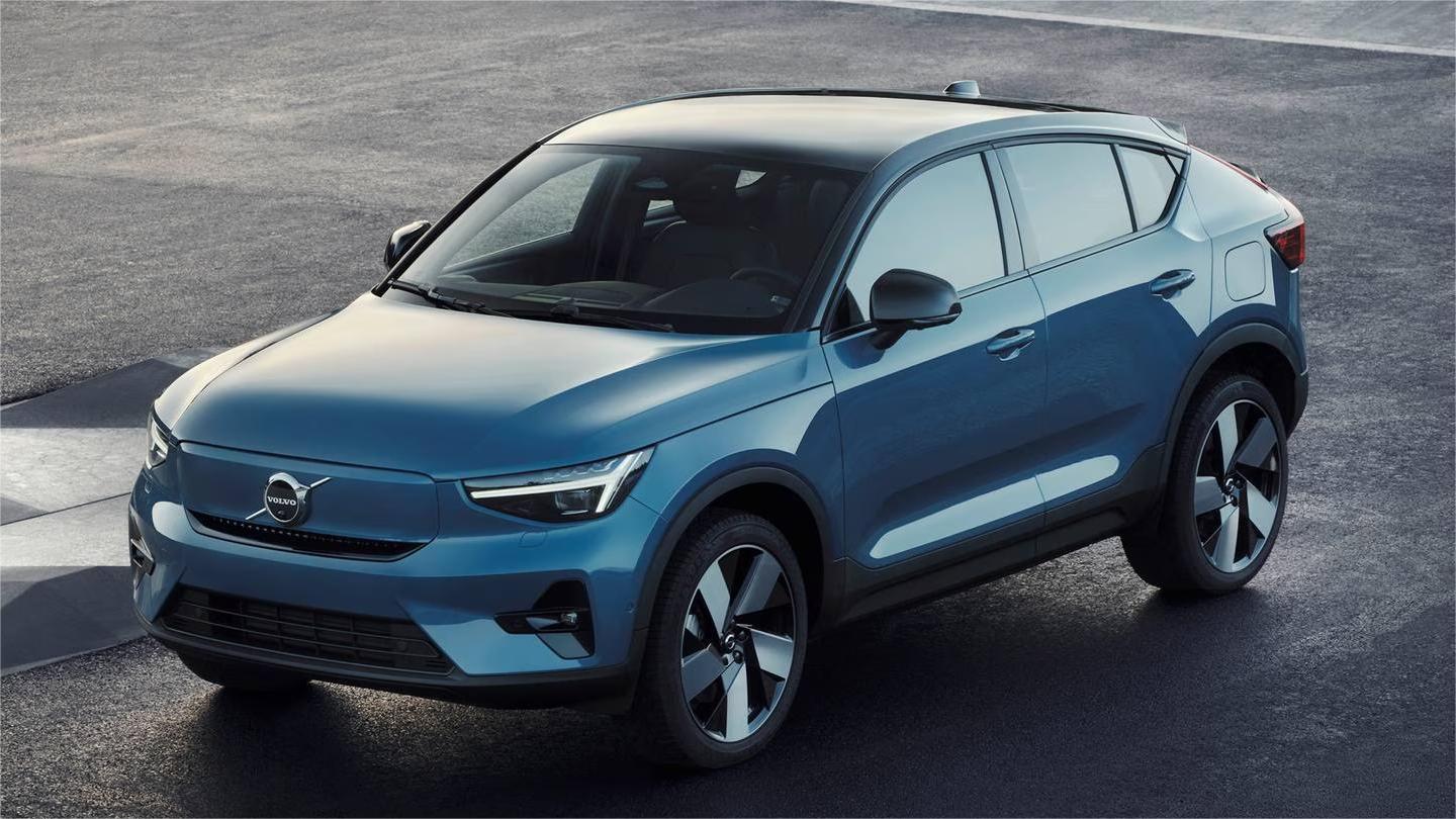
Cars Under This Brand
Advertisement


