Maserati Logo
Download JPG
Advertisement
Embark on a journey of Italian passion and performance with Maserati, where every drive is a harmonious blend of speed, style, and soul. Born in the heart of Modena, Italy, Maserati has been crafting automotive symphonies since 1914, becoming a symbol of elegance and exhilaration.
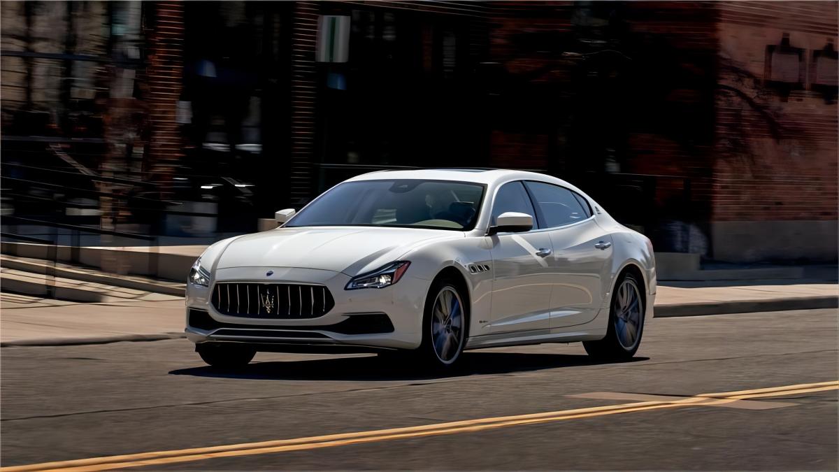
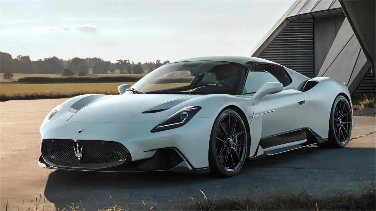
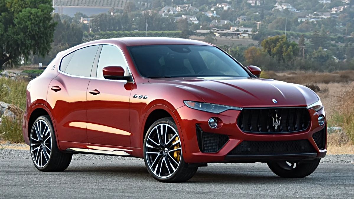
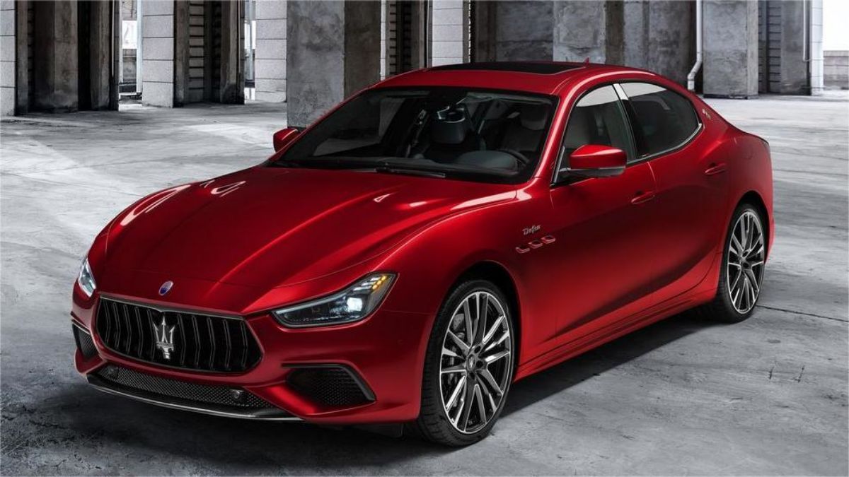
Maserati's lineup is a captivating ensemble of high-performance vehicles that redefine the boundaries of driving pleasure. From the seductive curves of the Maserati Ghibli to the commanding presence of the Levante SUV, each car is a testament to the brand's commitment to artistry and innovation.
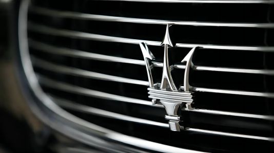
The Maserati trident, an emblem of power and precision, graces the front of these masterpieces, signaling a commitment to pushing the limits of performance and design. Step inside, and you're greeted by an interior where luxury meets technology, creating a cockpit that indulges the senses.
In a world where every journey is an opportunity for self-expression, Maserati stands as a beacon of Italian excellence. Unleash the power of a Maserati, and you'll find yourself immersed in a driving experience that transcends the ordinary—a celebration of speed, sophistication, and the unmistakable spirit of Italy.
Meaning and History
-

1926-1937
-
1937-1943
-
1943-1951
-
1951-1954
-
1954-1983
-
1983-1985
-
1985-1997
-
1997-2006
-
2006-Now
Advertisement
-
1926 - 1937
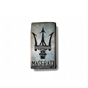
Introduced by the brand in 1926, the logo is a striking emblem featuring a meticulously crafted trident within a silver metal vertical rectangle. The detailed trident exudes an air of sophistication, capturing the essence of power and precision that defines the brand. Below this iconic symbol, a sleek sans-serif wordmark, rendered in all capitals, adds a touch of modernity and cleanliness to the overall design. The font's sharp and clean lines create a perfect counterbalance to the ornate intricacies of the trident, forming a visual harmony that symbolizes the brand's commitment to both tradition and innovation. This harmonious blend of elements reflects the brand's timeless identity, where classic symbolism meets contemporary aesthetics. The logo serves as a visual representation of the brand's ethos— a seamless integration of artistry and modernity, encapsulated in a silver rectangle that speaks volumes about the brand's legacy and forward-looking spirit.
-
1937 - 1943
In the transformative year of 1937, the brand underwent a logo redesign that marked a significant evolution in its visual identity. The rectangular canvas now embraced an oval, introducing a dynamic shift in the logo's composition. Within this oval, the trident underwent a bold transformation, adopting a simpler yet more impactful design. The once intricate details gave way to a bolder expression, radiating strength and clarity.Adding to the refined aesthetic, the wordmark found its new home at the bottom of the oval, elegantly separated from the top by a horizontal line. This strategic placement not only enhanced the overall balance and symmetry but also conveyed a sense of deliberate sophistication. The choice of a horizontal divider subtly delineated the trident's prowess above and the brand's name below, creating a visual hierarchy that spoke to the brand's commitment to clarity and precision.
-
1943 - 1951
In a transformative redesign in 1943, Maserati not only redefined its visual identity but also introduced a captivating new color palette. The iconic red trident, symbolizing power and precision, found its place on a vibrant blue oval. Crossing this dynamic backdrop was a horizontal rectangular emblem, featuring a substantial white inscription that demanded attention. This bold design choice added a layer of prominence and grandeur to the overall aesthetic.Complementing the trident and emblem, a solid and extended sans-serif wordmark graced the visual composition in capital letters. This choice of font exuded strength and modernity, echoing the brand's commitment to staying at the forefront of automotive innovation. The entire crest, outlined in silvery gray, added a touch of sophistication, framing the vibrant colors and symbols within a refined boundary.This redesign not only marked a visual evolution but also conveyed a sense of dynamism and authority. The harmonious interplay of red, blue, white, and silvery gray created a visual masterpiece that reflected Maserati's prowess on the road and its dedication to a visually compelling and impactful brand identity.
-
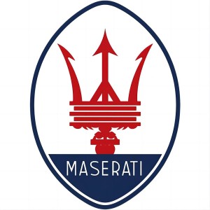
1951 - 1954
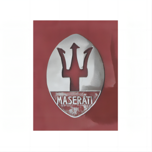
In a redesign during 1951, Maserati's emblem underwent a revitalizing transformation. The iconic red trident, reminiscent of the original emblem, made a striking return—this time, executed in a bold red hue. Nestled within an oval, meticulously divided horizontally into two sections, the trident took center stage. The expansive white upper portion provided a pristine canvas, allowing the red trident to shine as the focal point. Contrasting this, a smaller blue segment at the bottom cradled a delicately inscribed white text mark.The entire emblem was elegantly outlined in blue, creating a cohesive and visually captivating composition. This redesign not only echoed the brand's racing heritage but also introduced a harmonious interplay of color and form. The result was an emblem that stood as a timeless symbol of Maserati's commitment to precision, luxury, and aesthetic refinement.
-
1954 - 1983
In 1955, the Maserati logo underwent enhancements that elevated its visual impact. The transformative changes included a shift from the original blue color to a richer, darker shade, infusing the emblem with a newfound sense of depth and sophistication. Simultaneously, the lower blue portion of the oval was expanded, creating a more pronounced and balanced composition.The evolution wasn't confined to colors alone—textual elements underwent a makeover as well. The font size was increased, ensuring greater visibility and making a bold statement. These modifications collectively contributed to a refined and more commanding logo, aligning with Maserati's commitment to continuous improvement and visual excellence. The 1955 redesign not only heightened the emblem's aesthetic allure but also reflected Maserati's dedication to staying ahead in both style and substance.
-
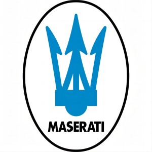
1983 - 1985
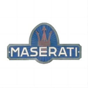
The logo unveiled in 1983 proved to be a short-lived experiment, enduring for a mere two years. A departure from its predecessor, this iteration presented a simplified design. At its core was a light blue trident, boldly outlined in thick lines, set against a clean white backdrop. The simplicity extended to a bold black inscription positioned at the bottom, creating a striking contrast. Within a white oval emblem, the black outline served to harmonize the robust lettering.Although fleeting, the 1983 logo represented a moment of exploration, opting for a more streamlined aesthetic. The light blue trident, set against the white canvas, conveyed a sense of clarity, while the bold black elements added a touch of modernity. This brief departure showcased Maserati's willingness to experiment with its visual identity while maintaining a commitment to visual balance and bold simplicity.
-
1985 - 1997
In a nostalgic revival, the emblem from 1954 made a triumphant return in 1985, albeit with a contemporary facelift. The lines and contours underwent meticulous refinement, breathing new life into the classic design. The 'Maserati' lettering, now in pristine white, adopted an elegant sans-serif typeface. This choice exuded sophistication and simplicity, creating a refined aesthetic that resonated with modern sensibilities.The newfound typeface, though lightweight, carried an air of luxury and style, perfectly aligning with Maserati's legacy of opulence. The clean and revised lines not only paid homage to the brand's heritage but also ushered in a fresh chapter of timeless design. The 1985 badge, with its harmonious blend of tradition and modernity, stood as a visual testament to Maserati's commitment to evolving with the times while preserving the essence of unparalleled elegance.
-
1997 - 2006
In the transformative year of 1997, Maserati's crest underwent a comprehensive makeover, marked by an expansion and refinement of all its elements. The once egg-shaped emblem evolved into a slender oval, imbuing the design with a newfound sense of sleekness and proportion. Concurrently, the wordmark received a bold transformation, with the font adopting a more substantial weight. This deliberate enhancement contributed to a visual equilibrium, providing the entire image with a harmonious and balanced appearance.The decision to enlarge and refine each element of the crest reflected a commitment to precision and aesthetic refinement. The narrow oval shape added a touch of modernity, while the bolder wordmark exuded a confident and commanding presence. The 1997 redesign was more than a visual evolution; it was a deliberate step towards achieving a well-proportioned and timeless emblem that encapsulated Maserati's dedication to continual refinement and visual excellence.
-
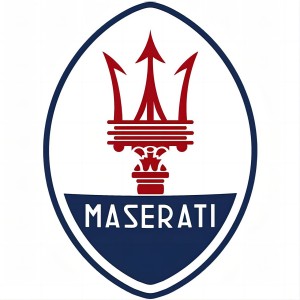
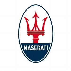
2006 - Now
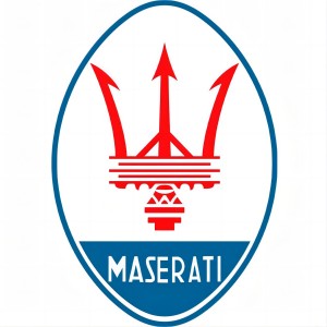
In the redesign of the 2006 emblem, notable modifications were introduced to enhance its visual impact. The lower blue segment of the oval was elongated, creating a more pronounced and balanced composition. Meanwhile, the iconic red trident underwent a subtle transformation, appearing more delicate and lighter against a white backdrop. This adjustment added a touch of finesse to the emblem, showcasing the brand symbol with refined intricacy.Not confined to color changes, the text mark underwent a significant evolution as well. The white text adopted a serif font, with sharp serifs mirroring the distinctive indentations found in the brand's iconic symbol. This deliberate choice in typography created a cohesive visual language, harmonizing the text with the emblem's elements. The 2006 redesign was a meticulous blend of proportion and detailing, embodying Maserati's dedication to precision and aesthetic continuity.
Advertisement
Description
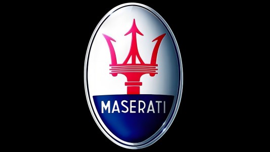
The Maserati logo, a trident in the iconic blue oval, holds profound significance. Inspired by Neptune's trident, it symbolizes strength, precision, and a bold maritime spirit. The blue background represents Maserati's homeland, the sky, and its commitment to excellence. Over the years, each logo evolution has reflected the brand's journey, blending tradition with modernity. The emblem embodies a legacy of Italian craftsmanship and racing heritage, uniting elegance with dynamic performance. It's more than a symbol; it's a visual narrative of Maserati's unwavering commitment to pushing boundaries and defining automotive luxury.
Shape
The current Maserati logo features a sleek, elongated oval, portraying a timeless and balanced aesthetic. The elongation of the oval, compared to previous designs, imparts a sense of modernity and sophistication. The iconic trident within, inspired by Neptune's symbol, embodies strength and prowess. The bold, clean lines signify precision and the brand's commitment to innovation. Against a background of royal blue, it reflects the brand's Italian heritage and connection to the sky. This contemporary logo encapsulates Maserati's fusion of tradition and forward-thinking design, serving as a visual testament to the brand's enduring legacy and commitment to automotive excellence.
Color
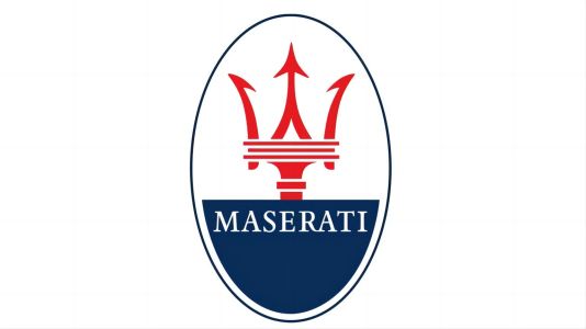
Maserati's current logo colors hold profound meaning. The royal blue background signifies the brand's Italian roots, evoking the sky and reflecting a commitment to excellence. The color red, notably present in the trident symbol, represents energy, passion, and the brand's dynamic performance. White elements, such as the text, convey purity and elegance, enhancing the overall visual balance. This color palette isn't merely aesthetic; it's a deliberate choice that weaves together Maserati's heritage, performance legacy, and dedication to a harmonious and luxurious driving experience, creating a logo that resonates with timeless sophistication and powerful symbolism.
Emblem
Advertisement
Cars Under This Brand
Advertisement


