BMW Logo
Download JPG
Advertisement
Founded in 1916, BMW, or Bayerische Motoren Werke AG, is a renowned German automobile and motorcycle manufacturer. Specializing in luxury vehicles, BMW has established itself as a global leader in the automotive industry, recognized for its innovative engineering, elegant design, and driving performance. With a rich heritage rooted in precision engineering and a commitment to quality, BMW has captivated enthusiasts worldwide with iconic models such as the 3 Series, 5 Series, and the flagship 7 Series. Embracing advancements in technology and sustainability, BMW continues to redefine the driving experience while upholding its legacy of luxury, craftsmanship, and driving pleasure.
Meaning and History
-

1917-1933
-
1933-1953
-
1953-1963
-
1963-1997
-
1997-Now
-
2020-Now


Advertisement
-
1917 - 1933
The first BMW logo featured a black circle, the company name "BMW" and an image of a propeller against a blue and white background. The design was inspired by the company's early history as an aircraft engine manufacturer and was a visual expression of its aeronautical heritage.
-
1933 - 1953
In 1933, the BMW logo was updated for the first time. While all of the colors in the logo remained the same, only the rounded outline in gold was slightly thicker than the previous version. In addition, at the top of the logo, the word "BMW" became clearer, simpler and more visible.
-
1953 - 1963
Another update came to the design in 1953. The designers chose a finer silver outline for the circular frame. The color of the BMW brand logo changed to grey, while the white and blue circle in the center became a lighter shade. However, these changes made the black ring more prominent, but ultimately made the BMW logo less bright.
-
1963 - 1997
In 1963, the second update presented contrasting blue, black and white coloring effects. The color of the text logo and the circular frame has been changed to white on top of the black circle. The white and blue areas in the center became more striking. The BMW logo was designed to be simpler and more attractive, symbolizing loyalty and authority.
-
1997 - Now
In 1997, the BMW logo was further improved to present a more powerful, distinct and modern image. This improvement reflected the dominance of the technological age and gave the logo a 3D appearance. The BMW logo is prominently featured on a silver-gray outline on a wide circular background, while the brand name is presented in white. In addition, the logo has added black lines dividing the quadrants from both ends, making them more visually appealing while creating a contemporary feel.
-
2020 - Now
After nearly three years of development, BMW decided to abandon its traditional 3D design in favor of a more modern 2D design. This shift has seen the logo's predominantly black frame replaced by a white one. In addition, the silhouette and BMW letters in the logo have been changed to gray, and the black lines that had been used to delineate the quadrants are no longer visible. Today, this new logo displays a calm, minimalist, powerful and clean character that is more in line with modern aesthetics.
Advertisement
Description
The current BMW logo is a blue and white motif with a deep symbolic meaning. The logo represents the blue sky, white clouds and the spinning propeller, symbolizing the long history of BMW and its past leadership in aero-engine technology. The logo also symbolizes the company's consistent purpose and goal: to satisfy the greatest wishes of customers with advanced technology and the latest concepts in a wide range of time and space. The logo reflects the company's dynamism and its new, ever-changing face.
Shape
BMW's current logo is a minimalist design presented in a flattened form, consisting of just a few simple colors. Compared with the three-dimensional metallic logo of the past, the new logo is more concise, intuitive, easy to recognize and remember. This flat design style has become a mainstream trend in today's brand identity design, which is more adaptable to the communication requirements of the digital era, with stronger visual impact and modernity.
Color
BMW's new logo consists of only two colors, blue and white, and this color combination not only provides clear recognition, but also fits the positioning and temperament of the BMW brand very well. Blue represents stability and high-end, while white represents purity, elegance and technology. The use of this blue and white color scheme makes the logo more concise and clear, and also gives more room for imagination, making it easier for consumers to establish an emotional connection with the brand.
Emblem
Advertisement
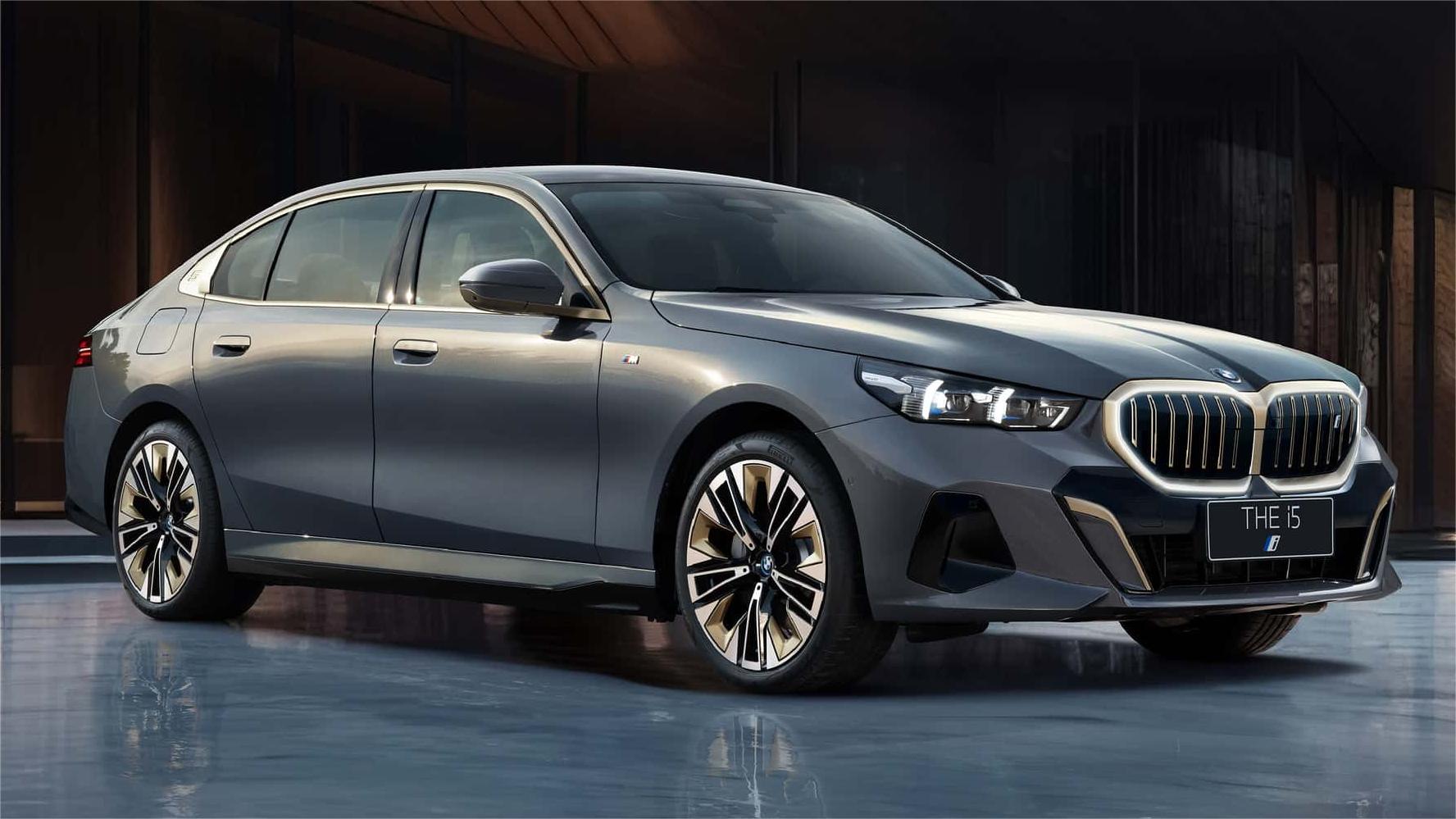
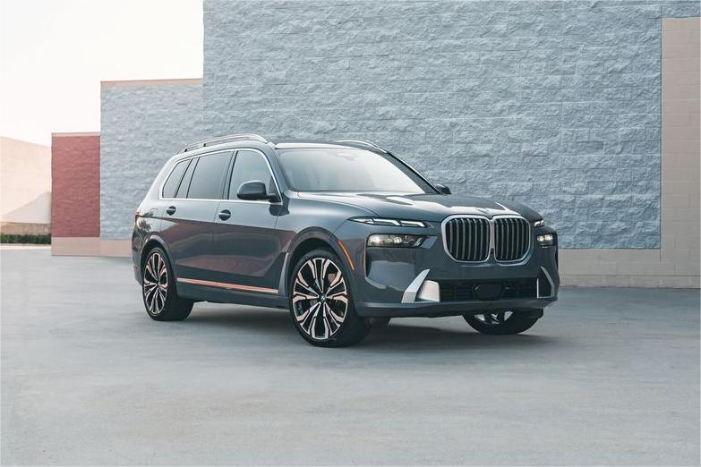
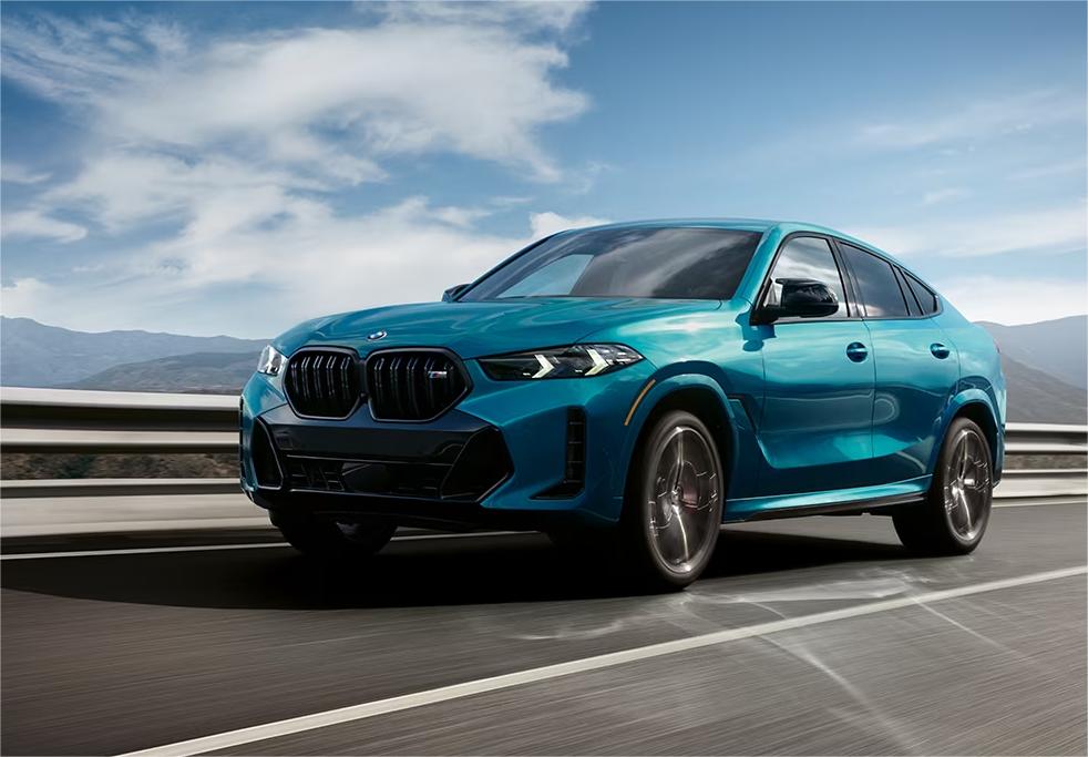
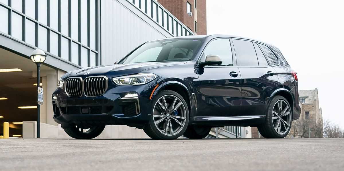
Cars Under This Brand


Advertisement


