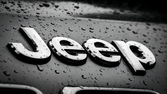
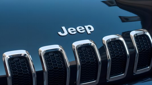
Jeep Logo
Download JPG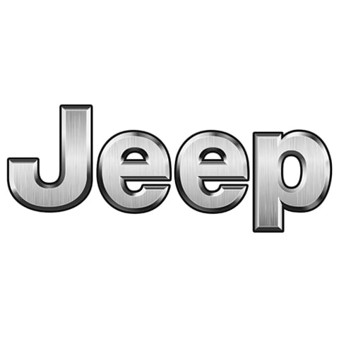
Advertisement
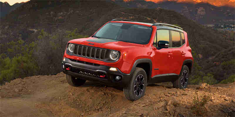
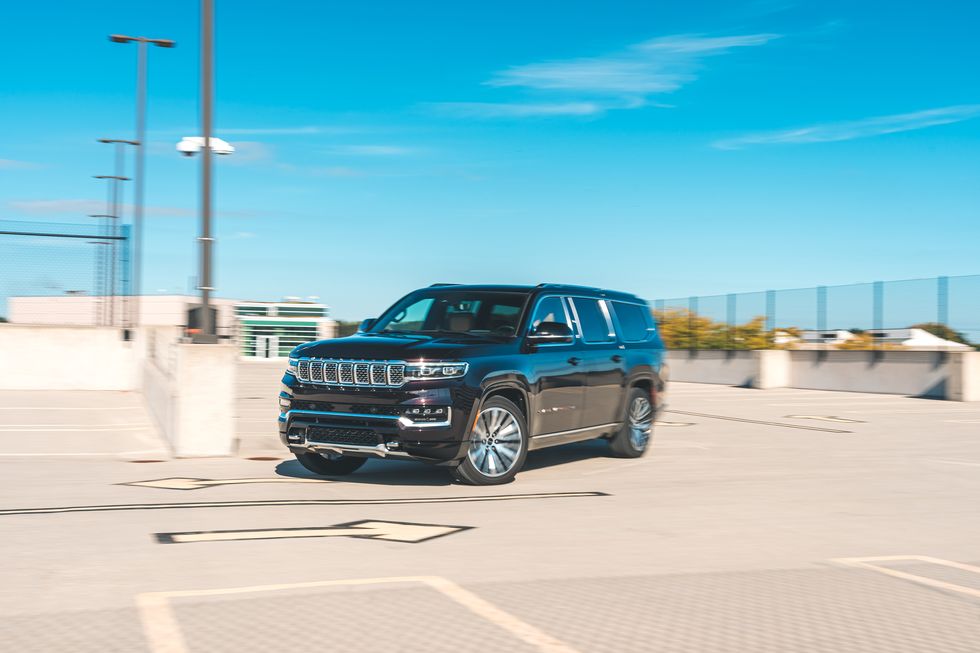
Welcome to the rugged world of Jeep, where adventure meets iconic design, and every journey becomes a story. Born in the heat of World War II, Jeep has evolved into a symbol of off-road prowess and open-air freedom. With a lineage rooted in military heritage, each Jeep vehicle carries the DNA of exploration and resilience.
From conquering challenging terrains to cruising city streets, Jeep has become synonymous with versatility and durability. The unmistakable seven-slot grille and the spirit of the open road define a brand that transcends boundaries. Whether you're navigating urban jungles or venturing into the wilderness, Jeep stands as a beacon of automotive freedom, blending rugged capability with modern luxury.
Jeep's commitment to innovation is etched in every model, from the iconic Wrangler to the sophisticated Grand Cherokee. It's not just a brand; it's a lifestyle—an invitation to embrace the extraordinary. So, buckle up and get ready to explore the world in a Jeep, where the road less traveled becomes your preferred route, and every drive is an opportunity for a new adventure.
Meaning and History
-

1941-1945
-
1945-1963
-
1963-1970
-
1970-1987
-
1987-1993
-
1993-Now


Advertisement
-
1941 - 1945
During World War II, the U.S. military asked three automobile manufacturers to design a general-purpose military light off-road vehicle. The Willys-Overland design was eventually adopted and named "Willys MB". The Willys MB badge is a simple yet tough design, consisting of red and black colours. The top text line is "JEEP" in red capital letters, with the "J" enlarged to represent the vehicle's power and off-road capabilities. The bottom text is in bold black sans-serif script and reads "Bantam", "Willys" and "Ford", representing the three manufacturers of the car.This badge was used throughout the war and became the iconic symbol of the Jeep after the war.
-
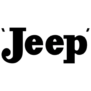
1945 - 1963
Jeep underwent a major rebranding in 1945 with the introduction of a monochrome logo that was simple and classic. The design of the word "Jeep" reflects the power and off-road capability of the Jeep. The ultra-bold serif font makes the typeface more eye-catching and emphasises the Jeep's power. Thin geometric serifs add elegance and a modern touch to the Jeep. Two delicate inverted commas add interest and personality to the logo. They blend with the word "Jeep" to create a unique visual effect. The 1945 Jeep logo is an important milestone in the history of the Jeep brand. Its simple yet classic design is still widely used today.
-
1963 - 1970
The bold and vibrant design of this badge captures the adventurous spirit of the Jeep. The red and dark yellow colours represent the Jeep's power and off-road capabilities. The silver colour, on the other hand, represents the ruggedness of the Jeep. The logo is also very cleverly designed. The light cream background makes the logo more eye-catching, while the red and dark yellow make it more colourful. The horizontal split of the logo also gives it a dynamic feel, as if the Jeep is moving forward. The 1963 Jeep badge is an important milestone in the history of the Jeep brand. Its vibrant colours and unique design are still enjoyed today.
-
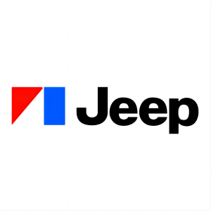
1970 - 1987
In 1970, Jeep introduced a logo that perfectly captured the spirit of the era – sleek, modern, and undeniably cool. The logo's centerpiece was a bold red triangle, its upper right corner seamlessly blending into a vertically aligned bright blue rectangle. This geometric fusion exuded a sense of dynamism and adventure, perfectly reflecting Jeep's reputation for off-road prowess.Encasing this geometric emblem was a solid black title box, bearing the iconic "Jeep" inscription in a full-form bold sans serif font. The clean lines and sharp edges of the lettering complemented the logo's overall modern aesthetic, adding a touch of sophistication to the rugged Jeep brand.The 1970 Jeep logo was a testament to the brand's ability to adapt and evolve while staying true to its core values. It represented a new era for Jeep, one where style and performance intertwined to create vehicles that were both capable and eye-catching.
-
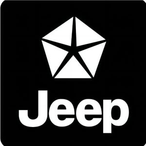
1987 - 1993
In 1987, Jeep unveiled a logo that marked a significant shift in the brand's identity. Replacing the familiar rectangular emblem was a sleek black square with rounded corners, symbolizing stability and resilience. The lower half of the square bore the word "Jeep" in a bold white sans serif font, the brand's name standing out with confidence and clarity.The most striking feature of the logo was the white pentagon at its center, its thin black rays extending to the corners of the square, forming a star-like emblem. This pentagon was a direct representation of Chrysler, Jeep's parent company, and its presence on the logo served as a tribute to the automaker's strength and unity.The 1987 Jeep logo was a bold departure from the brand's previous designs, but it retained the essence of Jeep – a rugged, capable vehicle that could conquer any terrain. The Chrysler pentagon added a layer of sophistication and corporate identity, signifying Jeep's place within the larger Chrysler family.
-
1993 - Now
In 1993, Jeep underwent a radical rebranding, stripping away all extraneous elements from its logo to reveal a minimalist masterpiece. The result was a bold statement of simplicity and confidence, perfectly reflecting the brand's reputation for ruggedness and off-road capability.By stripping away all unnecessary elements, the 1993 Jeep logo allowed the iconic name to take center stage, becoming a symbol of the brand's enduring legacy. The minimalist design also reflected the growing trend towards simplification in the automotive industry, with many brands adopting cleaner, more contemporary logos.The 1993 Jeep logo marked a pivotal moment in the brand's history, signaling its ability to adapt to changing trends while maintaining its core identity. It became a symbol of the brand's commitment to innovation, resilience, and the pursuit of adventure.
Advertisement
Description
The Jeep badge is a powerful emblem that embodies the brand's unwavering spirit of adventure and off-road prowess. Its evolution through the years reflects Jeep's ability to adapt and innovate while maintaining its core identity.The iconic "Jeep" lettering, rendered in a bold sans serif font, stands as a testament to the brand's ruggedness and resilience. The badge's simplicity and timeless design have made it a recognizable symbol of Jeep vehicles worldwide.The Jeep badge is more than just a visual identifier; it is a symbol that embodies the spirit of Jeep and its unwavering commitment to off-road adventure. It is a reminder that with a Jeep, anything is possible.
Shape
The curved-end lines symbolize the resilience and adaptability of Jeep vehicles, suggesting their ability to navigate any terrain or challenge. They also evoke a sense of motion, hinting at the adventurous spirit that lies at the heart of the Jeep brand.The bold lettering, rendered in a sans serif font, exudes confidence and strength, reinforcing the notion that Jeep vehicles are built to withstand the rigors of off-road exploration. The simplicity of the lettering ensures that the logo remains easily recognizable, even from a distance.The overall shape of the logo is both memorable and versatile, allowing it to adapt to various applications, from vehicle badges to merchandise. It has become a universally recognized symbol of the Jeep brand, instantly evoking images of adventure, capability, and freedom.
Color
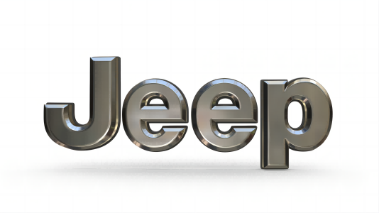
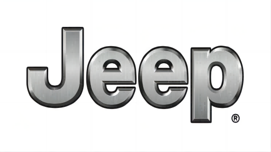
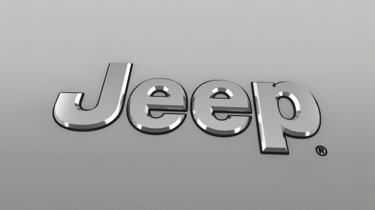
Throughout almost its entire history, Jeep's logo has been black. This enduring color choice likely stemmed from the brand's founders' focus on functionality and performance, rather than on elaborate visual concepts. The minimalist nature of the black logo perfectly complemented the rugged and utilitarian nature of Jeep vehicles.The modern Jeep logo, in silver, represents a subtle yet significant evolution, reflecting the brand's maturity and enduring appeal. The silver hue adds a touch of sophistication and refinement to the logo, while maintaining the boldness and strength that are synonymous with Jeep.The shift from black to silver underscores the brand's adaptability and ability to evolve while staying true to its core values. Jeep has always been about adventure, capability, and freedom, and these qualities are perfectly encapsulated in the sleek silver logo.
Emblem
Advertisement
Cars Under This Brand


Advertisement


