Lamborghini Logo
Download JPG
Advertisement
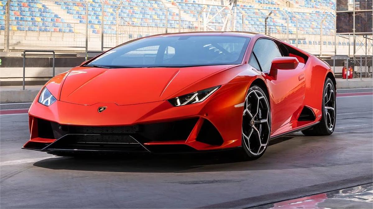
Welcome to the realm of automotive opulence and adrenaline-fueled exhilaration – welcome to Lamborghini. A name that resonates with power, precision, and unbridled luxury, Lamborghini stands as a beacon of Italian craftsmanship in the world of supercars. Since its inception in 1963, Lamborghini has redefined the boundaries of automotive excellence, producing machines that are not merely vehicles but rolling pieces of art.
Each Lamborghini creation is a manifestation of cutting-edge technology, aerodynamic brilliance, and a relentless pursuit of speed. From the iconic roar of the V12 engine to the unmistakable angular design, Lamborghini isn't just a car; it's a symphony of performance and style. The sleek lines, the Lamborghini emblem, and the thrill-inducing acceleration are all testament to a brand that doesn't just follow trends but sets them.
Buckle up as we embark on a journey where every drive is an event, and every Lamborghini is a masterpiece. Welcome to a world where pushing boundaries is not just encouraged; it's a way of life. Lamborghini – where the extraordinary is not an exception but the rule.
Meaning and History
-

1953-1963
-
1963-1972
-
1972-1974
-
1974-1998
-
1998-Now

Advertisement
-
1953 - 1963
The original Lamborghini logo was introduced in 1953 with a very simple design. These letters are basically an abbreviation for "Ferruccio Lamborghini Cento", written in sans serif (three different fonts due to the lack of any graphic rules at the time). This is very different from the iconic symbols we associate with luxury brands today.
-
1963 - 1972
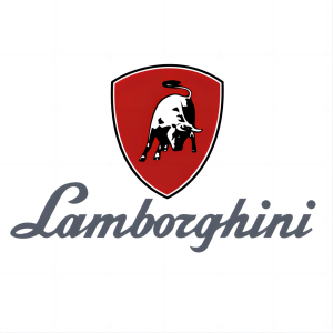
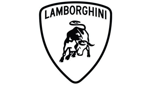
The 1963 version of Lamborghini's logo marked a pivotal moment in the brand's visual identity. Featuring the iconic bull emblem in motion on a vibrant red shield, it embodied strength and dynamism. The elegant sans-serif font, silver in color, exuded sophistication, with sharp lines and curves enhancing the premium aesthetic. This logo reflected Lamborghini's core values of luxury, performance, and power, setting the stage for the brand's prominence in the automotive world. As the logo evolved over the years, the enduring presence of the Bull crest and refined typeface underscored Lamborghini's unwavering commitment to innovation, design, and engineering excellence.
-
1972 - 1974
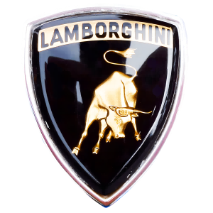
From 1972 to 1974, Lamborghini's logo underwent a refined transformation. The prototype featured a dynamic charging bull in monochrome, symbolizing power and speed against a black shield. The font embraced a modernized look with capitalized sans-serif letters, adding a touch of sophistication. The emblem retained its iconic essence, blending the strength of the bull with the luxury of the brand. This period emphasized Lamborghini's commitment to an evolving visual identity while preserving the core elements that define the brand. The logo became a symbol of dynamic elegance, reflecting the brand's pursuit of high-performance excellence in the world of luxury sports cars.
-
1974 - 1998
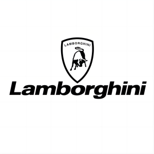
In 1974, Lamborghini unveiled a refreshed version of its iconic logo, building upon the success of the Taurus emblem. This iteration retained the familiar bull motif but adopted a single-color execution, complemented by a bold sans serif wordmark positioned below. The wordmark featured a modern italic font with crisp outlines and solid letters, bearing close resemblance to Neue Helvetica Paneuropean 83 Extended Heavy Oblique. This clean and contemporary design infused the brand with a sense of sophistication and modernity, aligning with the evolving automotive landscape of the time.The single-color palette streamlined the logo, allowing the bull motif to take center stage, symbolizing Lamborghini's raw power and untamed spirit. The bold sans serif wordmark, rendered in a modern italic font, provided a strong visual counterpoint, effectively communicating the brand's name and identity. The overall design exuded a sense of elegance and cutting-edge innovation, perfectly capturing the essence of Lamborghini's high-performance automobiles.
-
1998 - Now
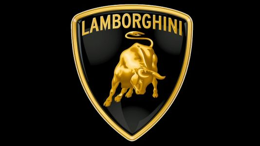
In 1998, Lamborghini took its iconic logo to new heights, unveiling a modernized interpretation of the 1970s-era emblem. The crest was expanded, gaining a broader silhouette, while the bull motif was enlarged, taking center stage with bolder proportions. The gold elements of the logo received a dynamic upgrade, employing a gradient effect that transformed them from flat surfaces into vibrant, lifelike depictions. This subtle yet significant change infused the logo with a sense of movement and energy, mirroring the raw power and untamed spirit of Lamborghini's vehiclesThrough this evolution, the Lamborghini logo retained its timeless elegance while embracing a more contemporary aesthetic. The expanded crest and enlarged bull motif projected an aura of strength and dominance, while the gradient-enhanced gold elements added a touch of sophistication and refinement. The overall design exuded a harmonious blend of tradition and innovation, perfectly capturing the essence of Lamborghini as a high-performance luxury automotive brand.
Advertisement
Description
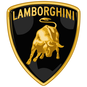
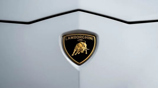
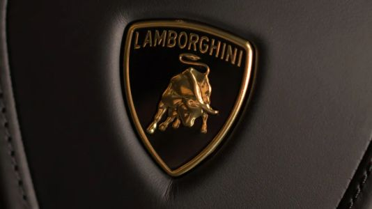
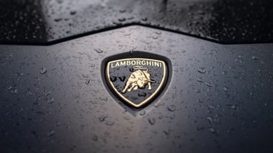
Lamborghini's logo design, evolved since 1963, stands as a testament to the brand's unwavering commitment to excellence. The charging golden bull, detailed with shadows and highlights, symbolizes power and vitality. Over the years, subtle refinements have modernized the emblem while preserving its iconic elements. The all-caps gold inscription ensures clarity, embodying a contemporary aesthetic against a black backdrop, radiating luxury. The gold outline enhances the premium look, creating a symbol universally recognized for performance, power, and sophistication. Lamborghini's logo is more than an emblem; it encapsulates a legacy of innovation, design, and engineering excellence in the automotive industry.
Shape
The current Lamborghini logo boasts a distinctive shield shape, encapsulating a dynamic and muscular golden bull in intricate detail. This shape symbolizes strength, resilience, and a relentless pursuit of excellence. The shield, a symbol of protection, mirrors Lamborghini's commitment to crafting vehicles that stand as powerful and formidable entities. The precise contours and gradients of the logo's shape reflect the brand's dedication to modernity and sophistication. As a visual representation of Lamborghini's legacy, the logo shape signifies not just an automotive emblem but an enduring symbol of the brand's dominance and uncompromising commitment to performance, power, and luxury in the automotive world.
Color
Lamborghini's current logo features a sophisticated color scheme. The golden bull, detailed with shadows and highlights, exudes a sense of opulence and strength. The gold elements, including the charging bull and all-caps brand name, convey luxury and prestige against the black shield. The gold-to-black gradient effect adds a touch of realism, symbolizing the brand's dynamic energy. This color combination enhances the logo's premium look, capturing the essence of performance and elegance. Against the black background, the gold elements stand out, creating a visually striking emblem that signifies Lamborghini's status as a pinnacle of automotive excellence, where power, luxury, and innovation seamlessly converge.
Emblem
Advertisement
Cars Under This Brand

Advertisement


